Lo-Res Monospaced (Latin + Central European)
Designed by Zuzana Licko in 2023. More...
Related fonts: Lo-Res, Lo-Res Outlined
Designing a typeface is a process of staying on the straight and narrow. Each glyph in the alphabet wants to be unique, yet needs to fit in a larger system of hundreds of glyphs with similar characteristics in order to make a comprehensive font. However, the process of drawing, redrawing, editing and searching for solutions easily leads one to stray. Ideas for glyphs are sometimes stretched to a point where they no longer fit the original scheme, but may show potential for an entirely new direction. Most of these distractions lead to dead ends, but others, on rare occasions, can turn into ideas for new fonts.
Lo-Res Monospaced is such a typeface. While working on a much larger family of fonts named Lo-Res Outlined, which are years in the making, Zuzana Licko stumbled upon the idea of making a mono spaced version. The idea was so energizing, she decided to shift focus and finish it before returning to her original designs. The result is close-knit family of six modular fonts.
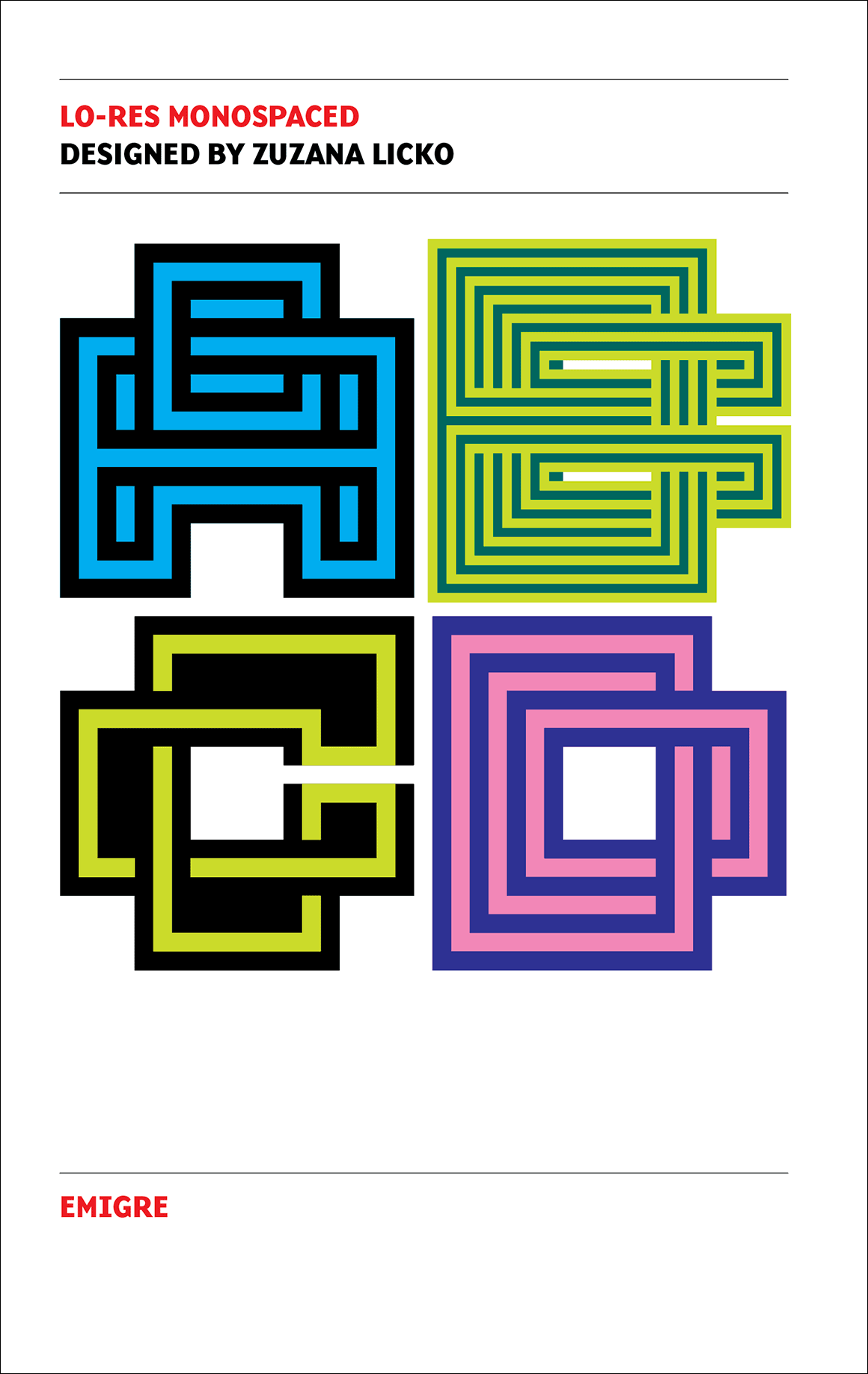
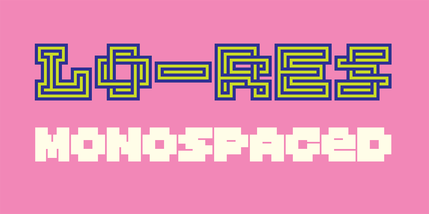
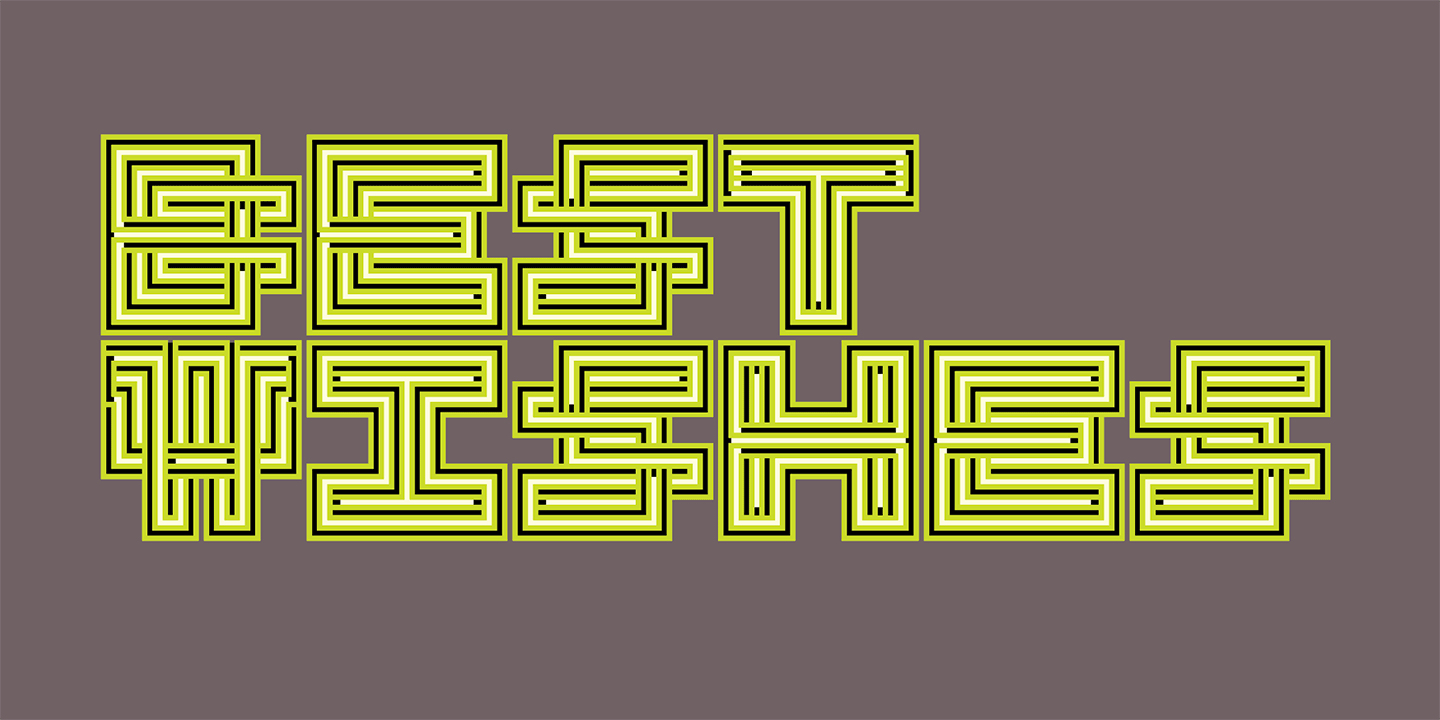
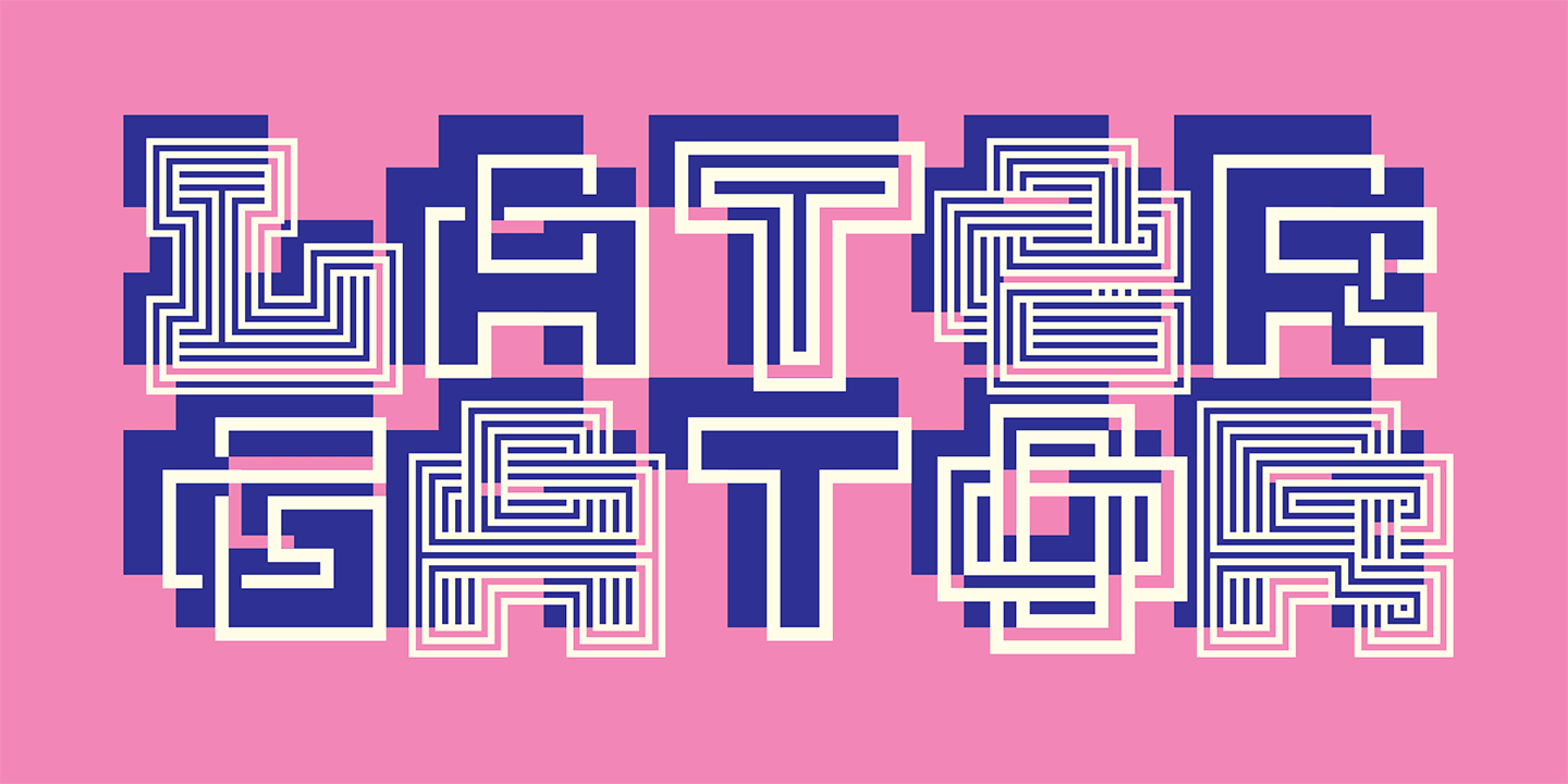
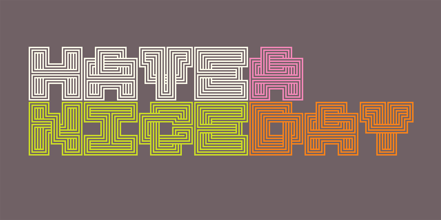
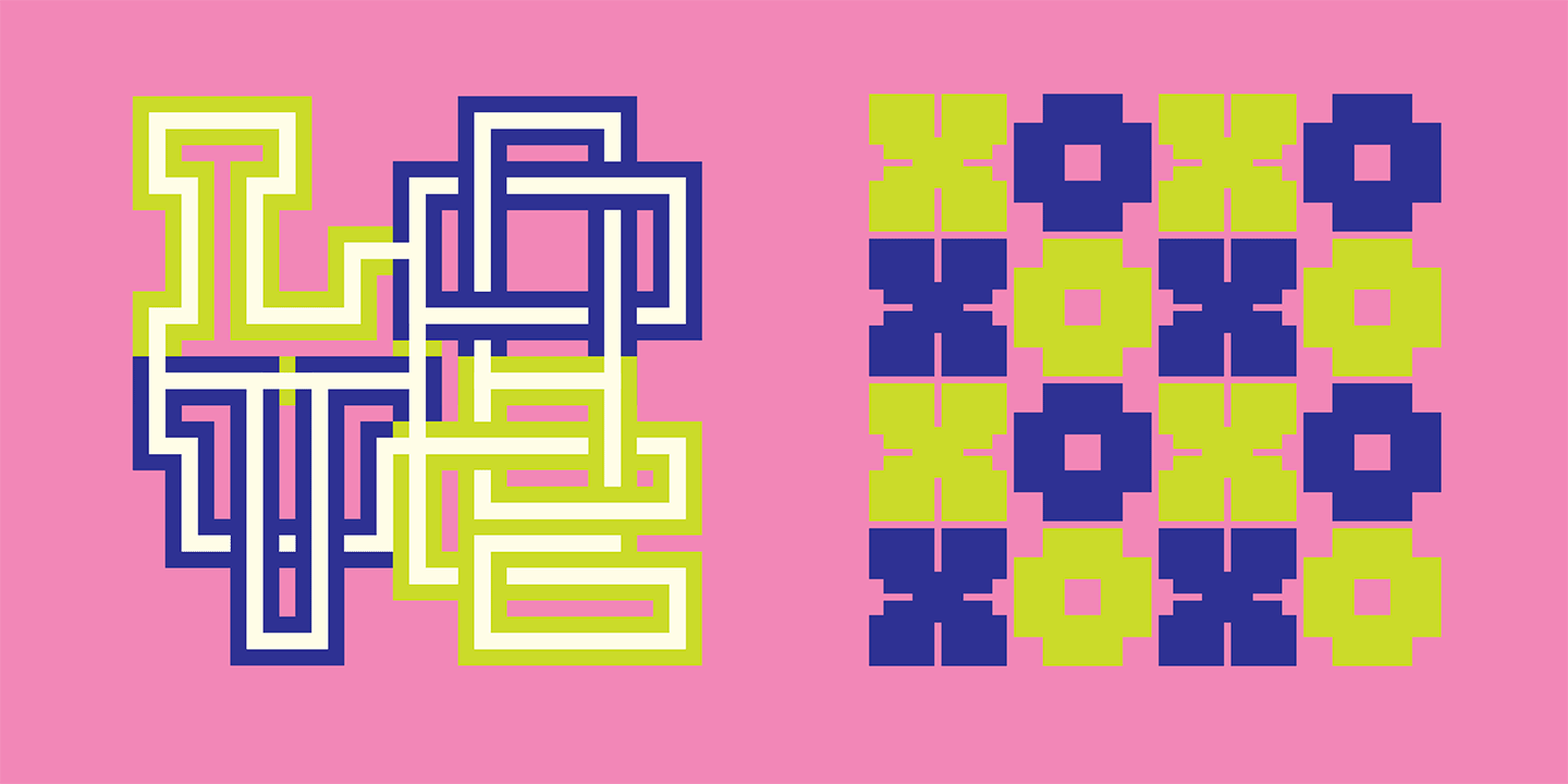
This mono spaced design takes its playfulness into the world of patterns with its abstracted, woven letterforms. The characters fill up an M-square entirely, thereby allowing the letters, when set without line spacing, to create dense patterns filling a square grid. It should be obvious that this design is intentionally sacrificing legibility for being highly expressive. And we expect that users will apply the font accordingly.
Lo-Res Monospaced was an idea born from happenstance, and from being receptive to the alternatives that present themselves during the design process. On the following pages we show you examples of how to combine and layer the six versions of this typeface. You might enjoy the creative challenge to further define its utility and expand upon its possibilities.
For more information about Lo-Res Monospaced, download the free type specimen.

