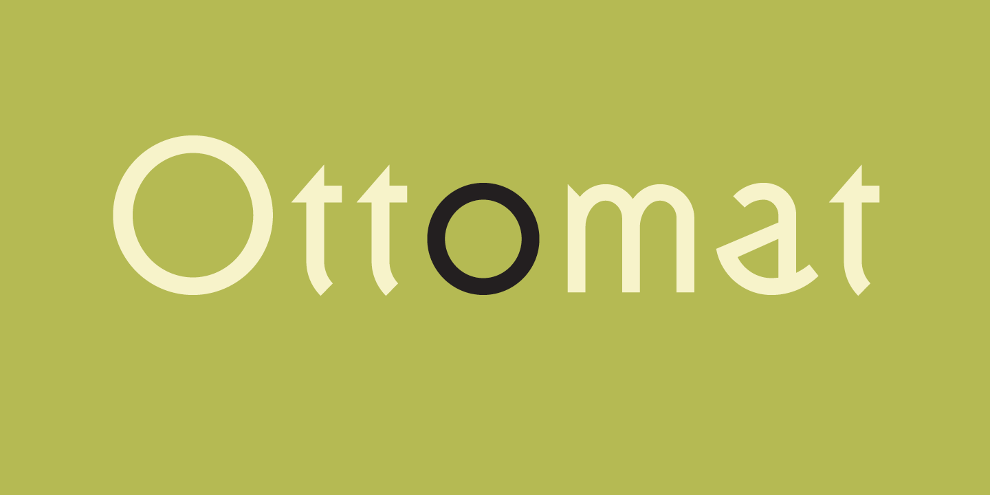

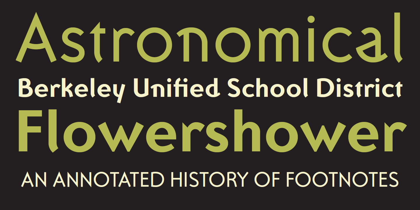
Ottomat
Designed by Claudio Piccinini in 1995. More...
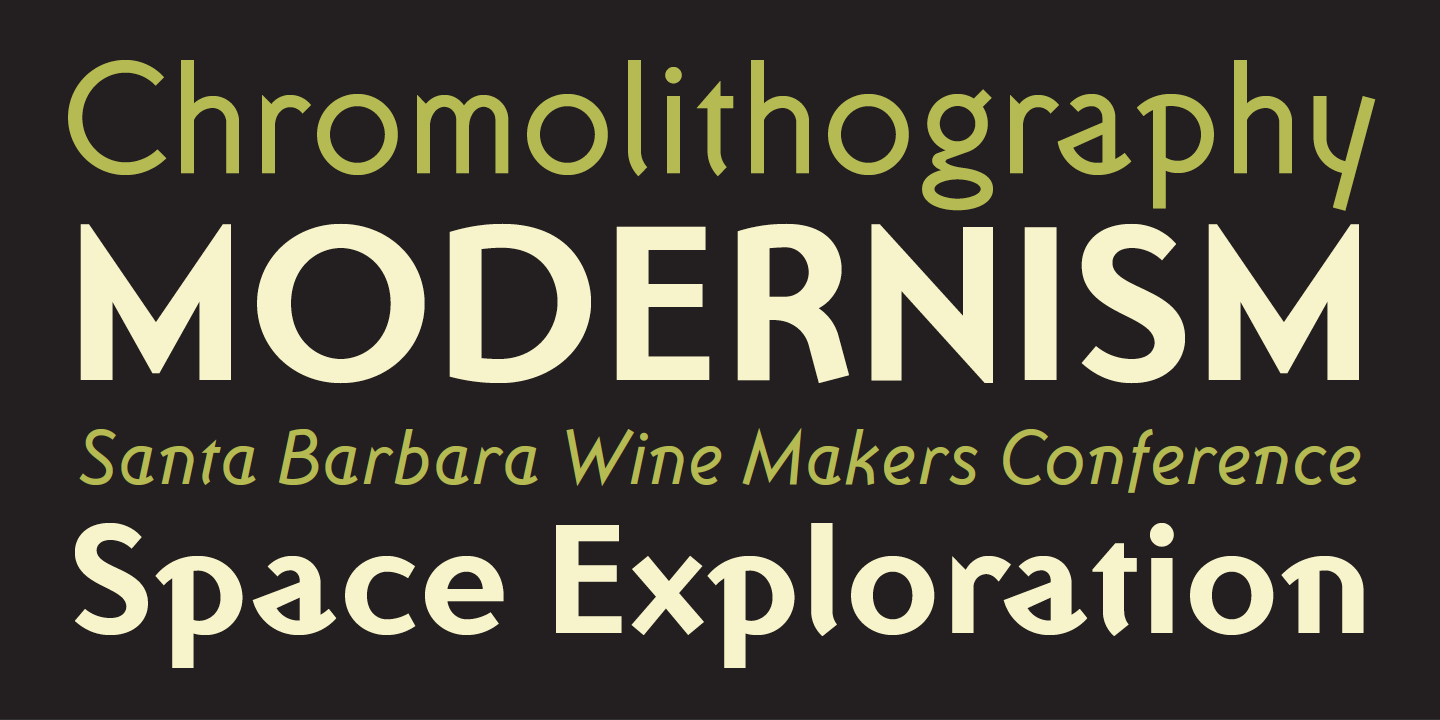
Ottomat started out as an type design experiment using basic geometric shapes and how these can be applied to a text face design. Instead of focusing purely on achieving ultimate legibility, or “neutrality,” Piccinini’s intent was to apply geometry in an intuitive and spontaneous manner, perhaps as seen in the geometric designs created by American Indian tribes. The resulting two-weight font plus italic accomplishes exactly what Piccinini set out to do: he created a text font that is legible without being neutral or bland.

