Remedy
Designed by Frank Heine in 1991. More...
In 1988 the London-based Thunderjockeys, consisting of Graham Elliott and John England, designed an album cover for the New York metal band Living Colour. The logo they drew for this cover was either the inspiration for a number of such curlicue typefaces surfacing in those days, or was simply a harbinger of these creations destined to come out due to that period’s interest in 60s and 70s styles. Prince’s Graffiti Bridge, Dee-Lite’s World Clique and almost all of the Cure album covers are just a few examples displaying similar hand drawn type.
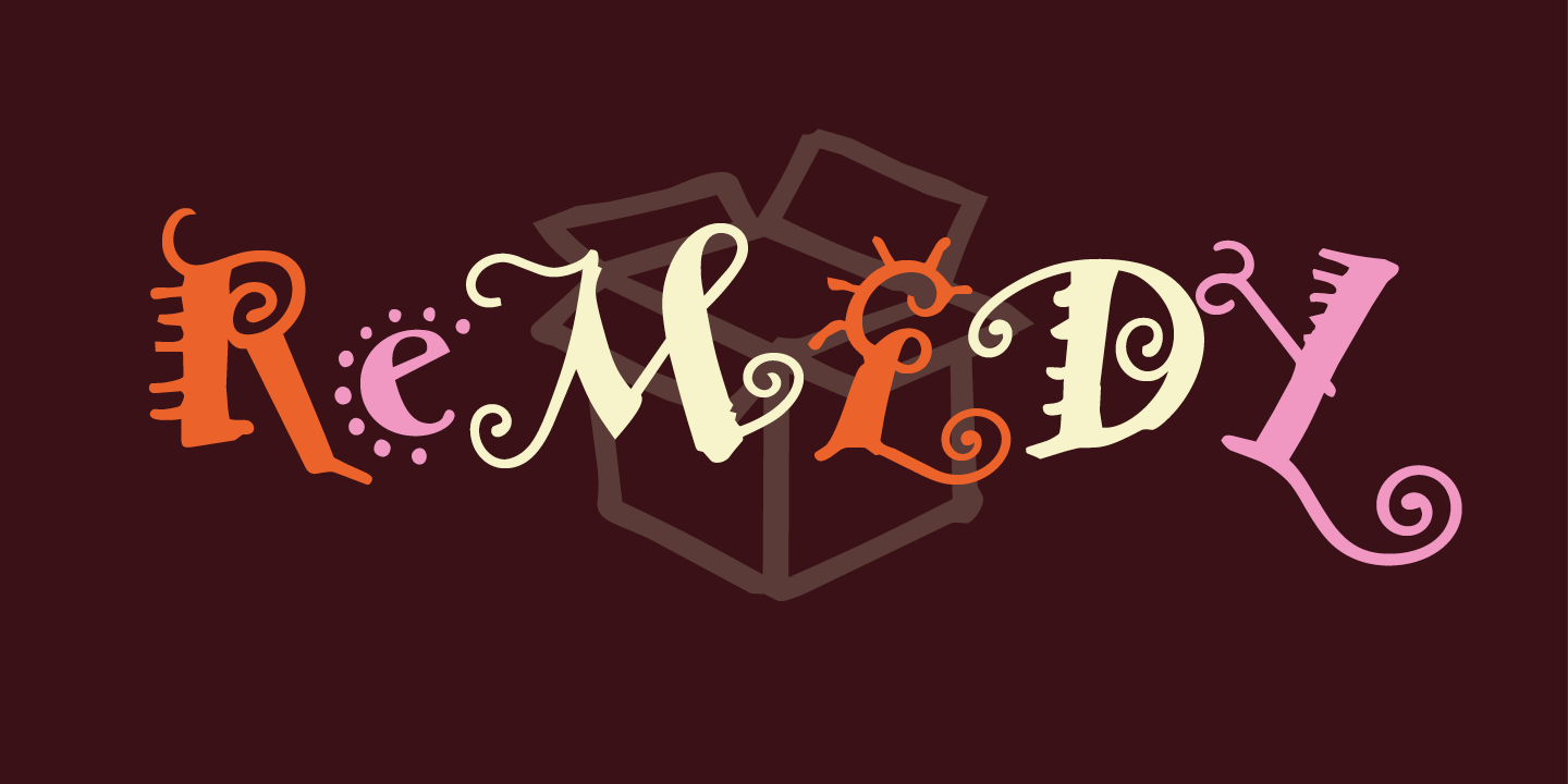
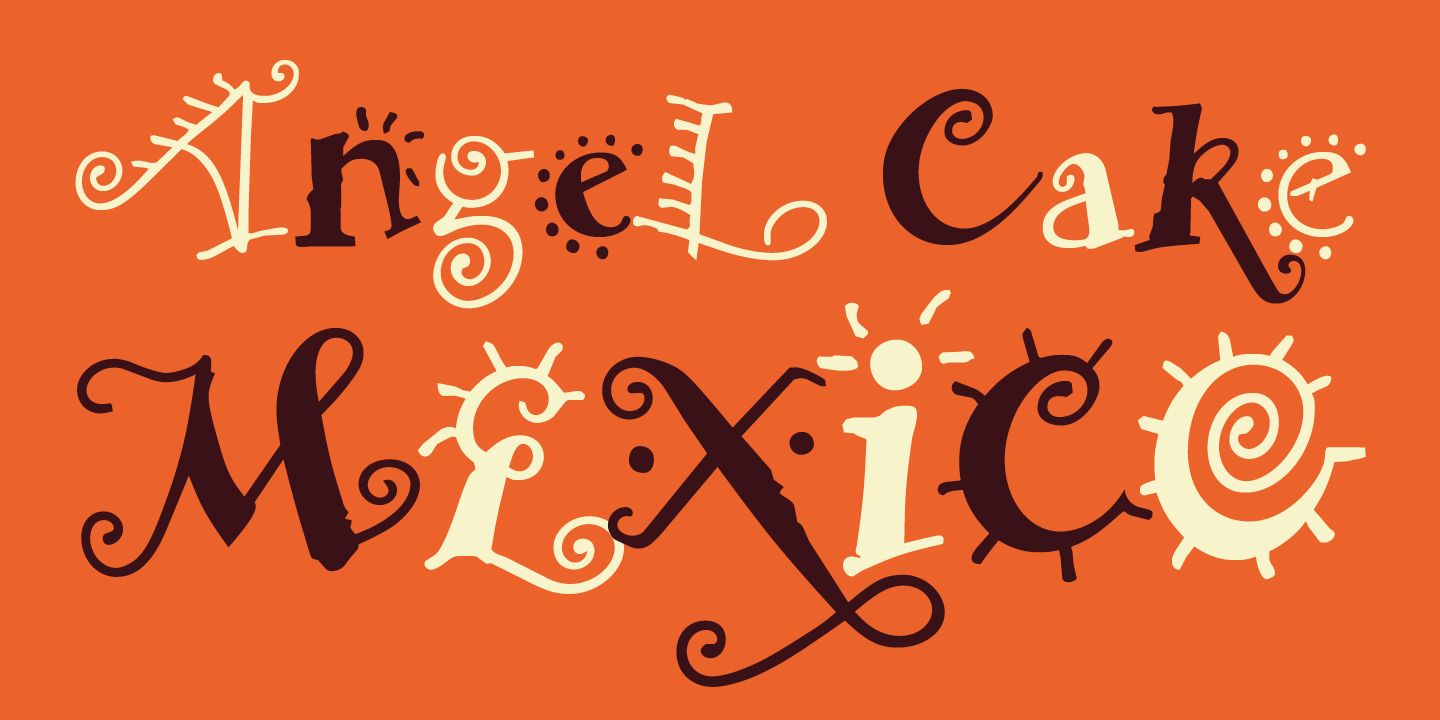
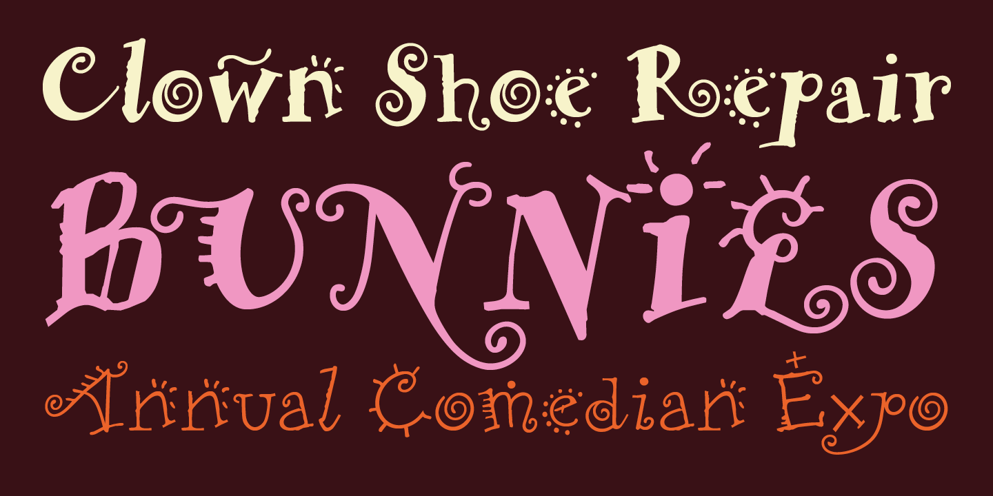
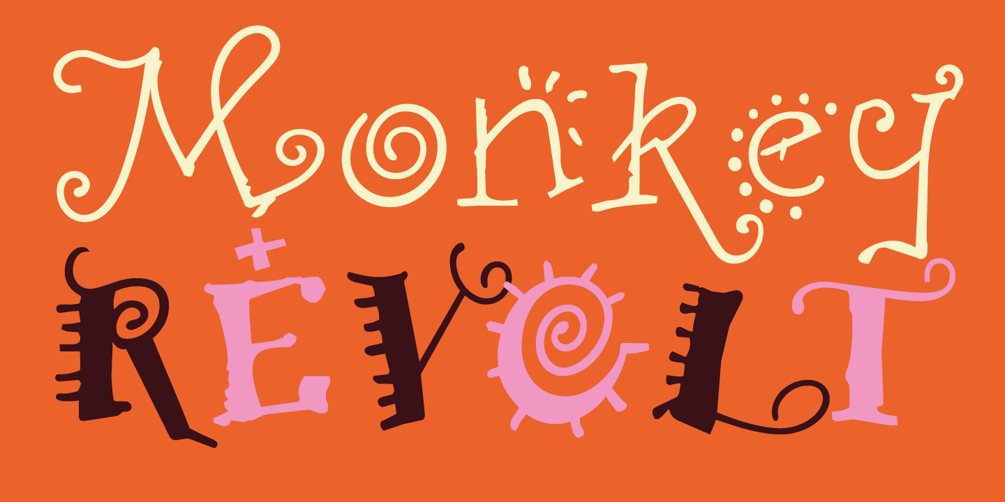
Then, out of Stuttgart, Germany came Remedy. Created by Frank Heine, Remedy is by far the most thoroughly conceived design inspired by these influences, and it became a major commercial success because of its own special qualities. It’s curlicue, free-style, comic appearance, provided a perfect counter to Emigre’s then primarily modular type designs.
Presented in two weights, featuring numerous alternate characters, flourishes and dingbats, Remedy is a perfectly whimsical typeface suitable for your most jovial celebratory communications.

