


Modula
Designed by Zuzana Licko in 1985. More...
Related fonts: Modula Round & Ribbed
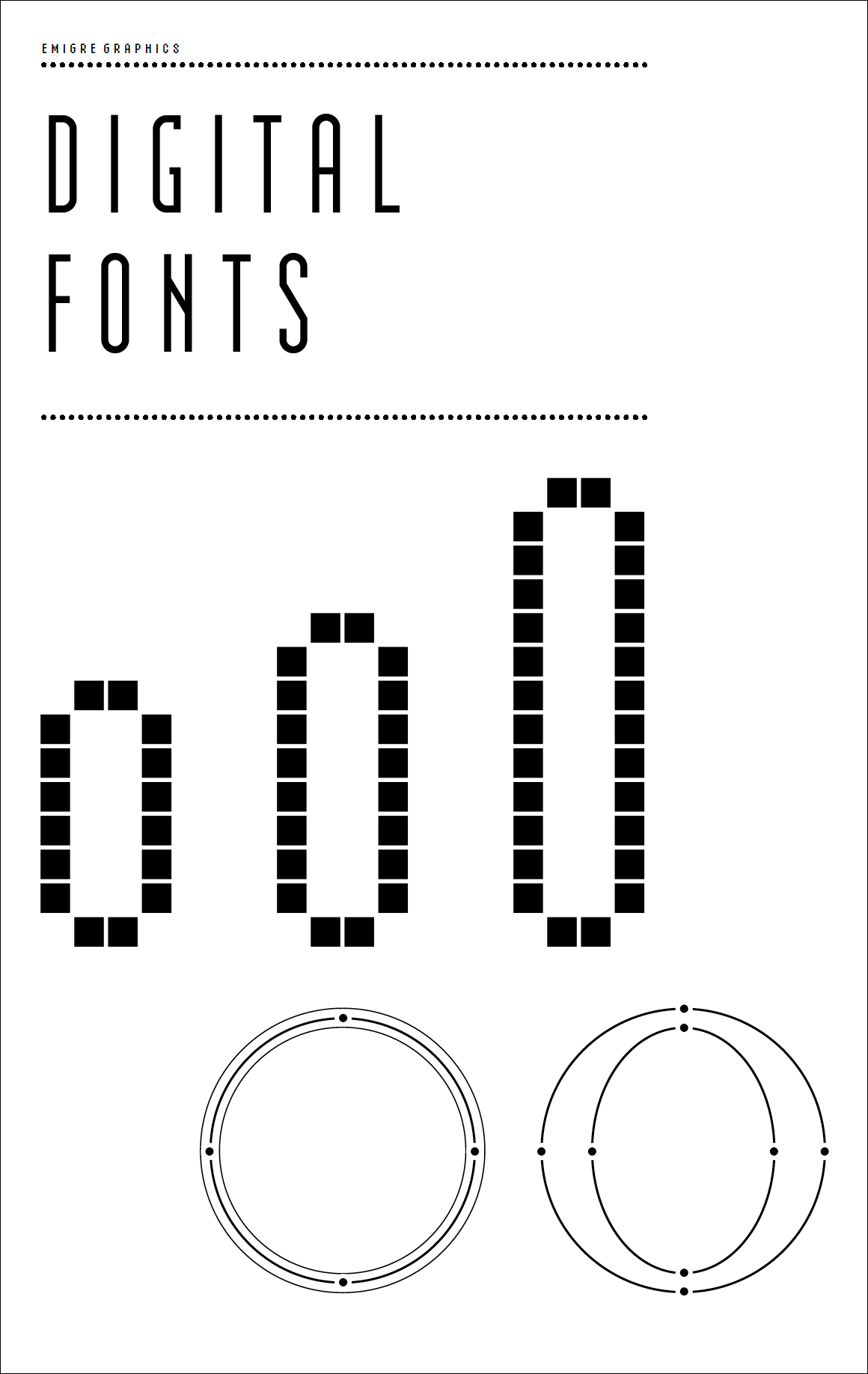
Modula was the first high resolution headline typeface that Licko designed using the Macintosh. It was created during a time when much of the industry’s digital font creation efforts were concentrated in the mechanical digitization of traditional photo or lead typeface designs. When digitizing existing analog fonts, the jagged lines of the resulting bitmap (or screen) fonts constructed hideous emulations of the original. Licko felt that through such imitations one failed to utilize the capabilities of the digital process. While she respected the nuances of our traditional typefaces and their evolution in conjunction with reading habits, she also felt that the forms of computer fonts must result as an integral part of the digital process, not in spite of it. Modula is firmly grounded in this idea.
In 1985, the computer was very crude as far as being able to produce subtle curves, but it was outstanding at producing perfect geometric elements. As a starting point for Modula, Licko used the proportions of her earlier Emperor Fifteen bitmap design and applied the precision of the computer’s geometric rendering abilities, as well as other technological quirks she stumbled upon while experimenting. For instance, she discovered that as a shortcut to increasing the resolution of bitmap typefaces from screen to printer some programs offered a “smooth” routine that polished stairstep pixels into smooth diagonal and circular segments. This smooth printing option provided by the early Macintosh inspired much of Modula’s basic look and feel.
Modula is available in both serif and sans serif versions, each with three weights.
For more information about Modula, download the free type specimen.

