Modula Round & Ribbed
Designed by Zuzana Licko in 1995. More...
Related fonts: Modula
When Emigre first started manufacturing fonts, the font format was still a very closed environment. Once the installable and downloadable files were manufactured, the user was limited to setting type with the typeface as it was designed. Years later, it became possible for designers to import the character outlines into drawing programs which enabled them to then alter individual letters in order to create customized letter and word combinations. Within a short time Licko began seeing mutated versions of Modula letterforms used in various applications, such as logotypes. Many of these had the diagonal serifs removed or the angular diagonal forms smoothed out. In answer to this Licko decided to expand the Modula family, incorporating some of these ideas.
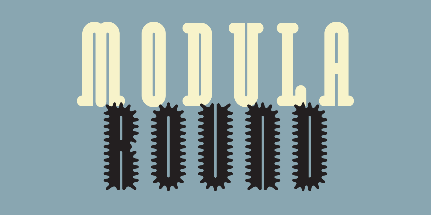
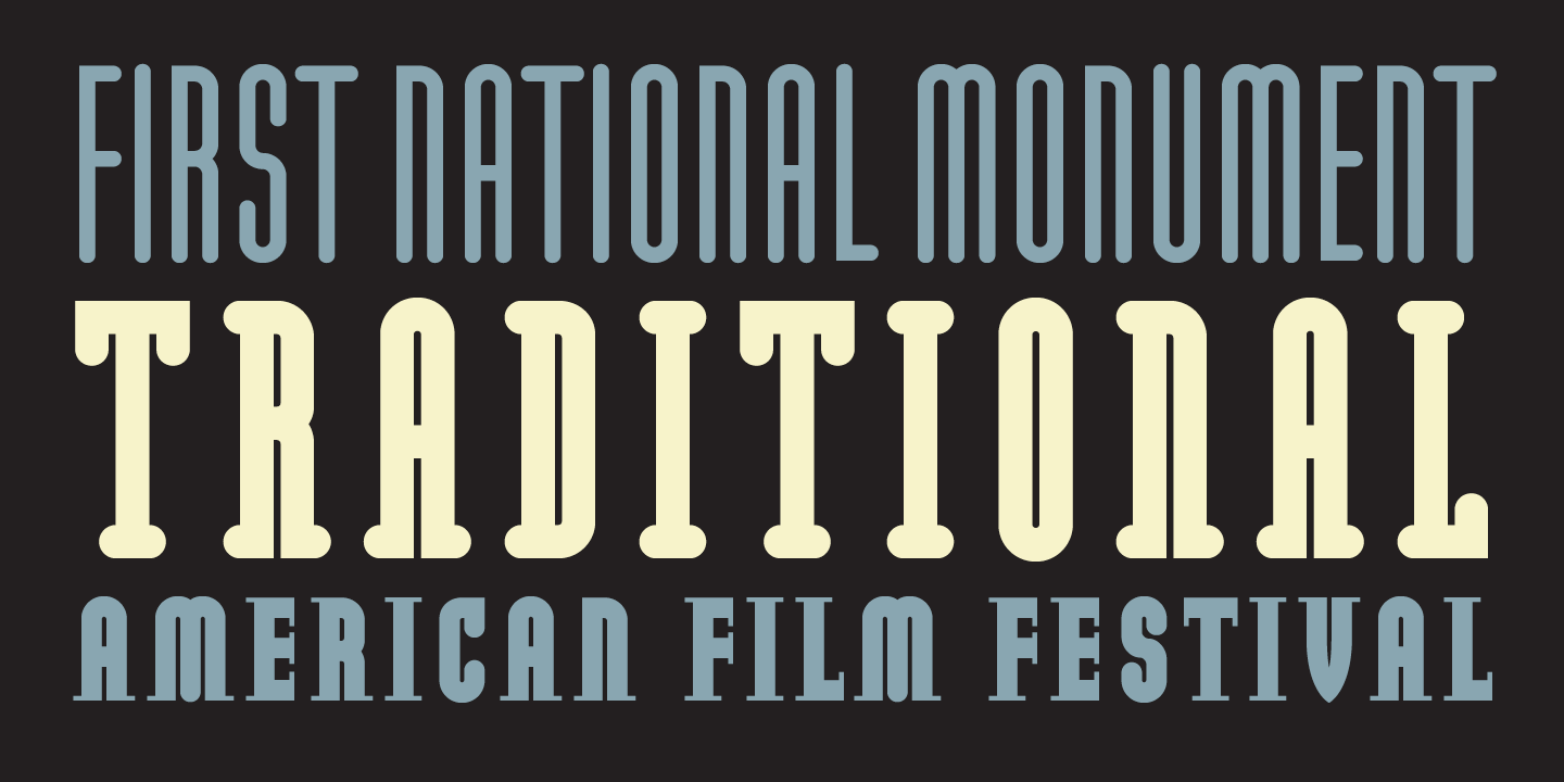
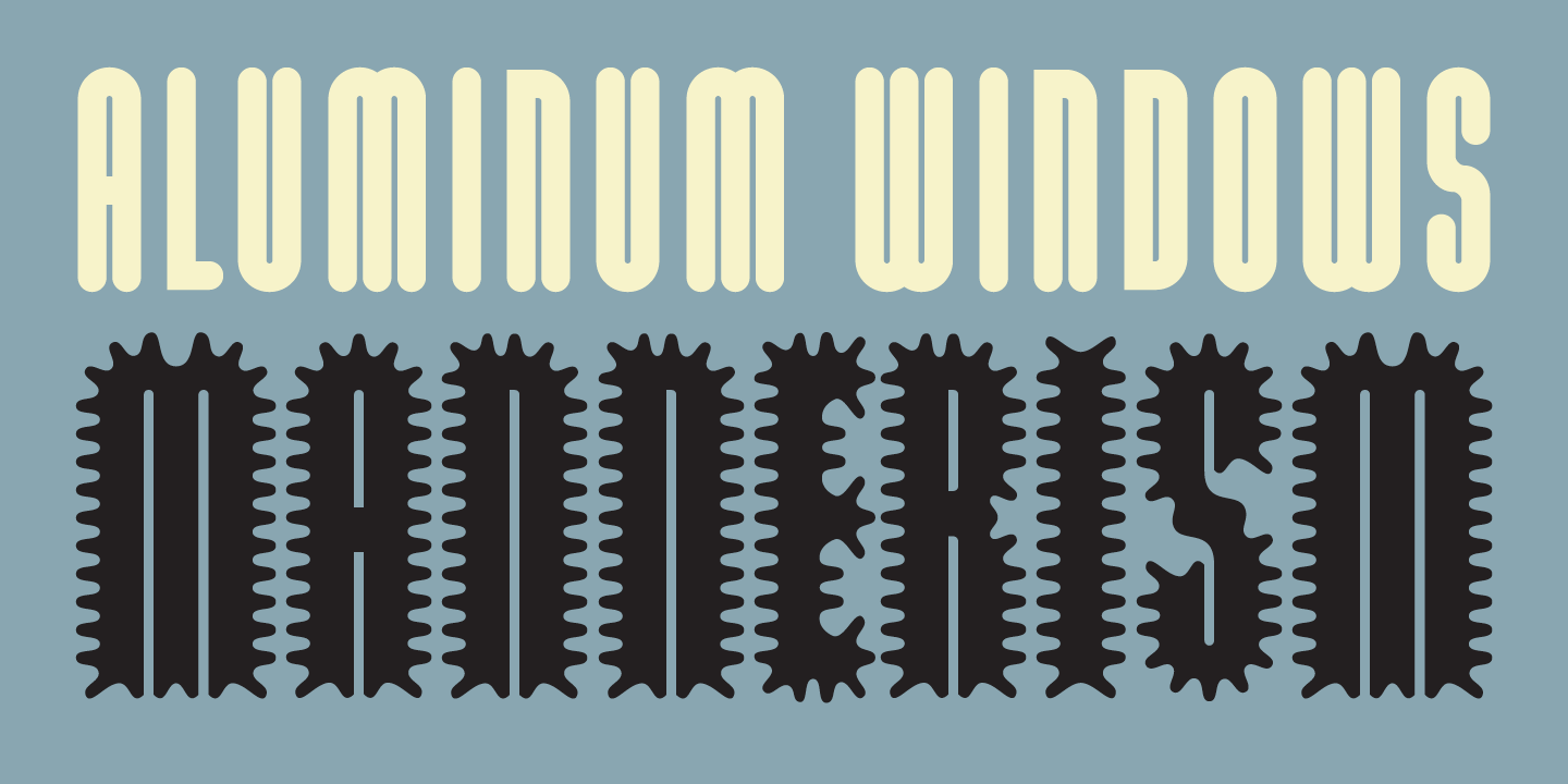
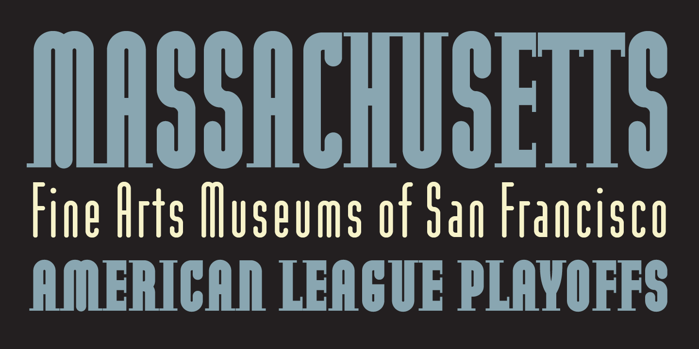
The first addition was a Round version, characterized by the abandonment of the diagonal serif elements, the addition of rounded end strokes, and the replacement of the angular diagonal strokes with flowing curved diagonals in characters such as the k x s and z. To dramatize it’s impact as a headline font, Licko also gave the Round version a narrower, more elegant proportion than the original Modula. To extend its usage and provide a wider variety of formal choices when composing headlines or logotypes, Small Cap versions were added as well.
In addition to the two Sans and four Serif versions in the Round series, there are also two decorative versions, Outlined and Ribbed, that resulted from further experiments with the advanced drawing tools in Fontographer.
The Ribbed version is a kind of spoof. It superimposes a graphic texture–much like fonts that have the American Flag, or a woodgrain pattern added to an existing typeface. Modula Ribbed is somewhat like that, except that the pattern (the ribbing) relates directly to the modular form of the underlying typeface, which would not have been as adaptable to many other typefaces.
The Outlined version is about counterspace, the shapes inside of letters, as well as about the connecting shapes between letters. It was started by creating outlines around the Round Sans version which were then opened up in certain spots, thereby opening up the boundary between positive and negative space. Serif-like connectors were added at the base of the characters to link any letter combination. A single modular connector glyph allows for tracking the characters while keeping them joined, creating interesting rhythms when stringing together letters into words.

