
Cholla
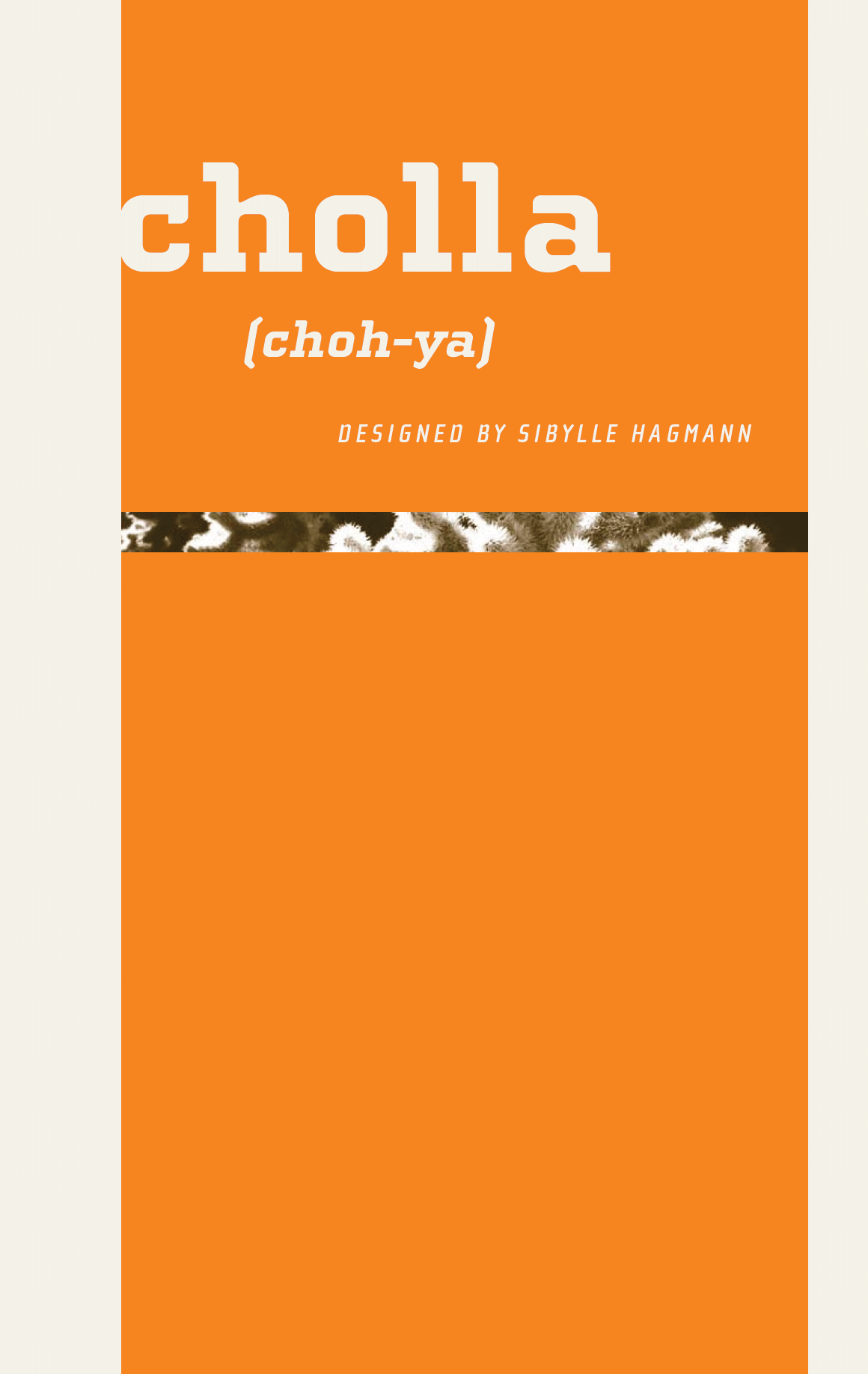
Designed by Sibylle Hagmann in 1999. More...
The Cholla typeface family was designed by Sibylle Hagmann in 1998-99 and named after a species of cactus she encountered in the Mojave Desert. Cholla was originally developed for the Art Center College of Design in Pasadena, California. There, art director Denise Gonzales Crisp and associate designer, Carla Figueroa, collaborated with Hagmann to create a series of fonts that would offer a great deal of variation. The variety was needed to echo the school's nine different departments, yet together the fonts had to exude a unified feel. It was first used in the radically designed 1999/2000 Art Center catalog which won a honorable mention in I.D. magazine and was featured in Eye No. 31.
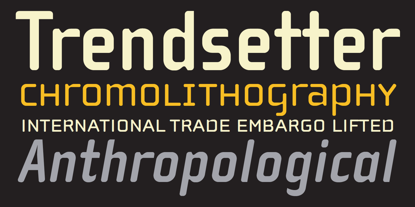
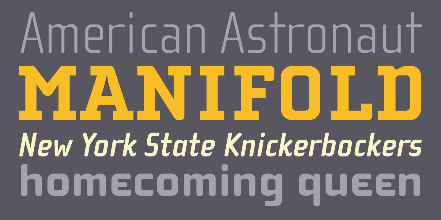
Originally Hagmann set out to design a typeface that, as she recalls, “I could feel comfortable making, first of all, and one that would serve a purpose and had a clear idea behind it, and something that I would want to use myself.” Stylistically Hagmann set out to create “12 cuts with slightly different personalities, with different ideas applied. For example the bold weight isn't simply the Regular with weight gain, but has bold letterforms with their own peculiar details. What all weights share and what is the necessary unifying detail is the tapered curve–marked out, for example, in the lowercase b’s left top and bottom of the bowl.” Gonzales adds: “The forms seemed classical as well. This combination could have a long life, and be timely. I also saw–at least in the beginnings of Cholla–forms that connoted hybrid, of inter-connection, of human and machine growing together. These notions seem appropriate for a school that teaches design and art.”
For more information about Cholla, download the free type specimen.

