

Platelet
Designed by Conor Mangat in 1993. More...
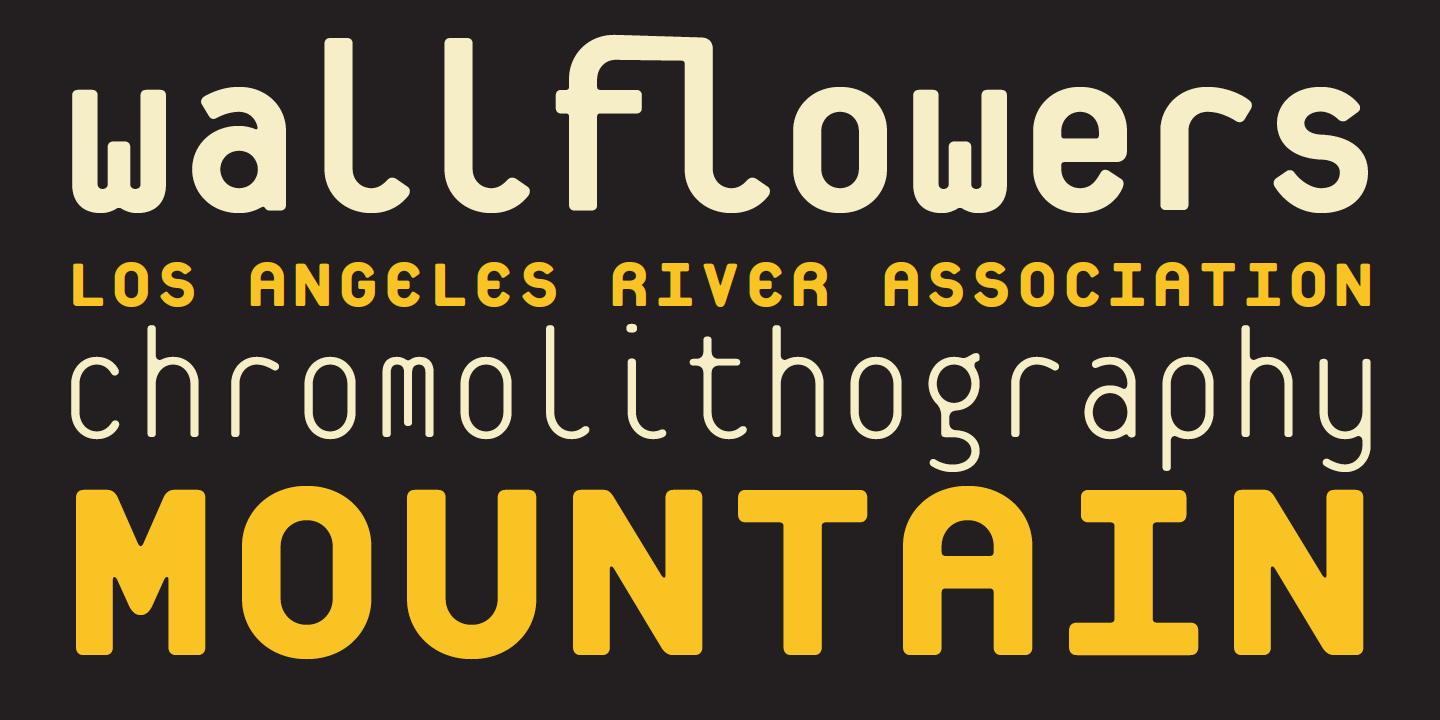
The inspiration for Platelet came from the California license plate. Similar to the composing restrictions of the typewriter, the manufacture of license plates also requires the use of monospaced type; not only for mechanical requirements, but also to fulfill the need of fitting a fixed number of characters onto each plate while maximizing their legibility at a distance.
Platelet contains some unexpected solutions to the various problems facing monospaced designs. It also offers solutions that address the reduced legibility of geometric designs, which have a tendency to render many characters indistinguishable, thus reducing their function for text applications. The “m” and “w” cleverly solve the density problem of the three stems by shortening the middle one. The “i” and “l” fill their width not with the standard extended serifs, but with a large curved lead-out stroke. Another creative solution is the lowercase “b,” which incorporates the upper case form within the lower case character. This increases the recognition factor of the “b,” which would otherwise be very similar to other characters, such as the “d,” due to the geometric rigidity of Platelet’s letterform construction.
For more information about Platelet, download the free type specimen.

