Littlebit
Designed by Rudy VanderLans and Zuzana Licko in 2022. More...
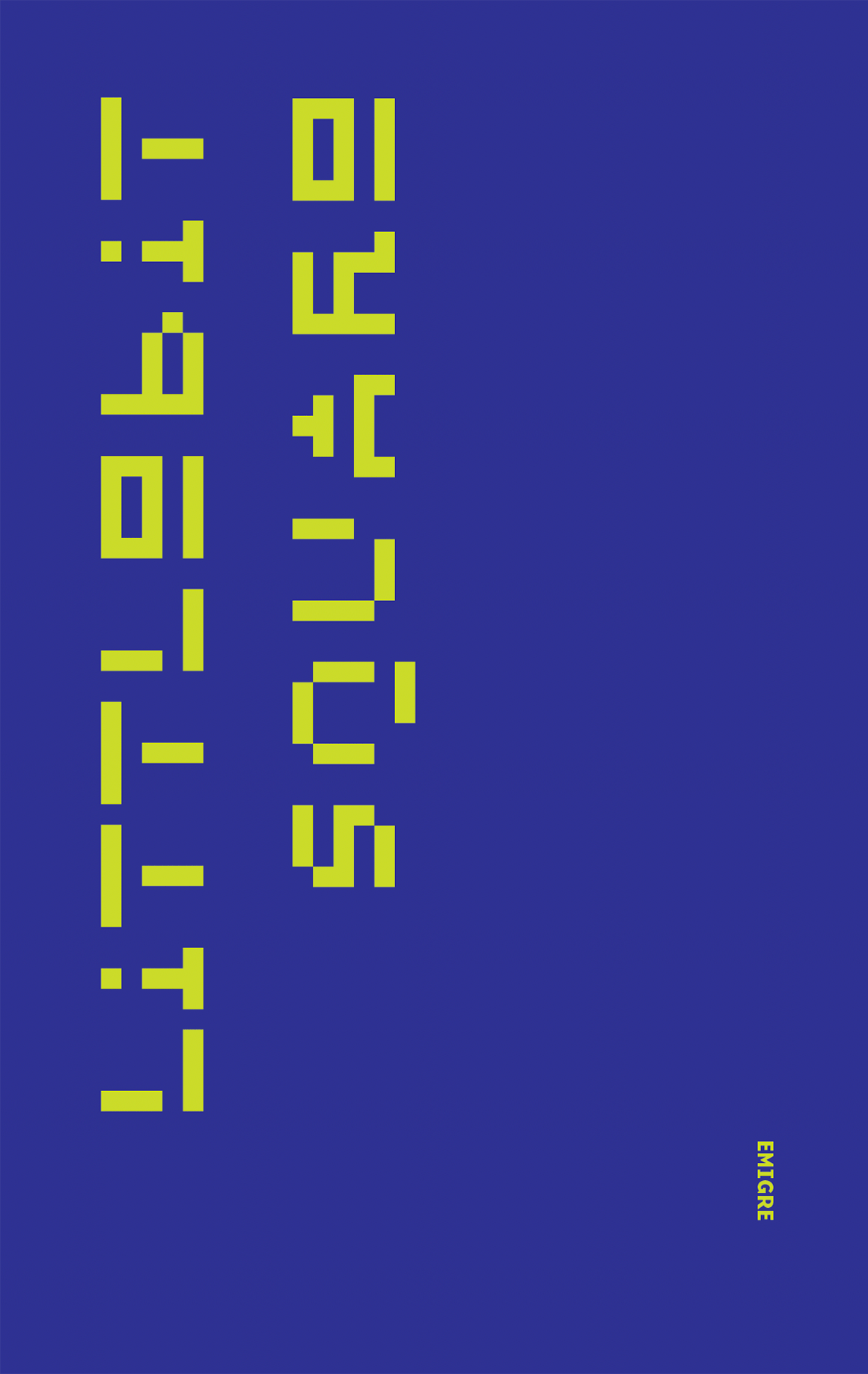
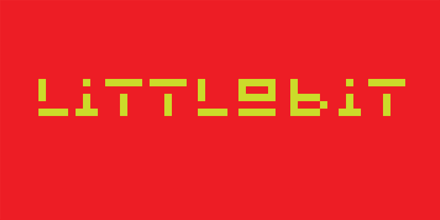
Sometimes we come across work that we created way in the past and it brings a smile to our faces. Littlebit is a typeface that was originally created by Rudy VanderLans in 1985, although it wasn’t called Littlebit back then. Actually it didn’t have a name, because it didn’t exist as an actual font. It was created as a series of letters using MacPaint, one of the first drawing programs that came standard with the Apple Mac 128K. To set words, VanderLans would simply “cut and paste” the letters together in MacPaint.
Those letters were first used in Emigre #3 (1985) to create a headline that read “Boundaries Ignored.” It was used again in the same headline configuration in Emigre #4 (1986). It was also used on a postcard. Then we never used it again. We’re not sure why. Probably it was pushed aside or forgotten by an onslaught of new type designs we were working on in those days.
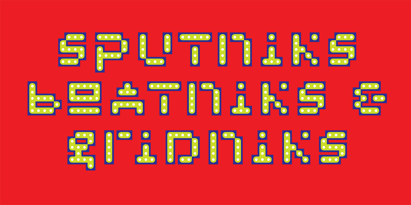
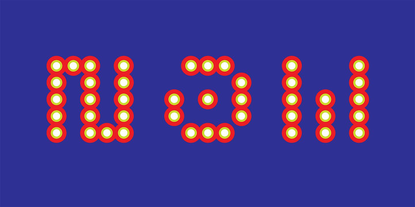
So after 37 years we removed the cobwebs, blew off the dust, took a close look at it, and realized it would be worthwhile to complete the character set and turn it into a usable typeface. VanderLans particularly liked the idea that each character was unique. Of course all letters are unique, but with a reductionist font like Littlebit, it is tempting to turn an “m” into a “w,” a “p” into a “b,” a “u” into an “n,” etc., by simply rotating or flipping the characters. When redrawing some of the characters, we tried to resist the urge for repetition and instead emphasized distinctiveness.
Of course, since we are designers, who can’t leave well enough alone, we made a few changes, mostly to the proportions and to some of the character shapes, and then also added 19 variations based on the same basic model.
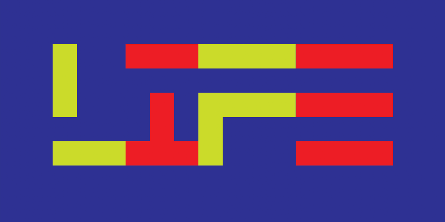
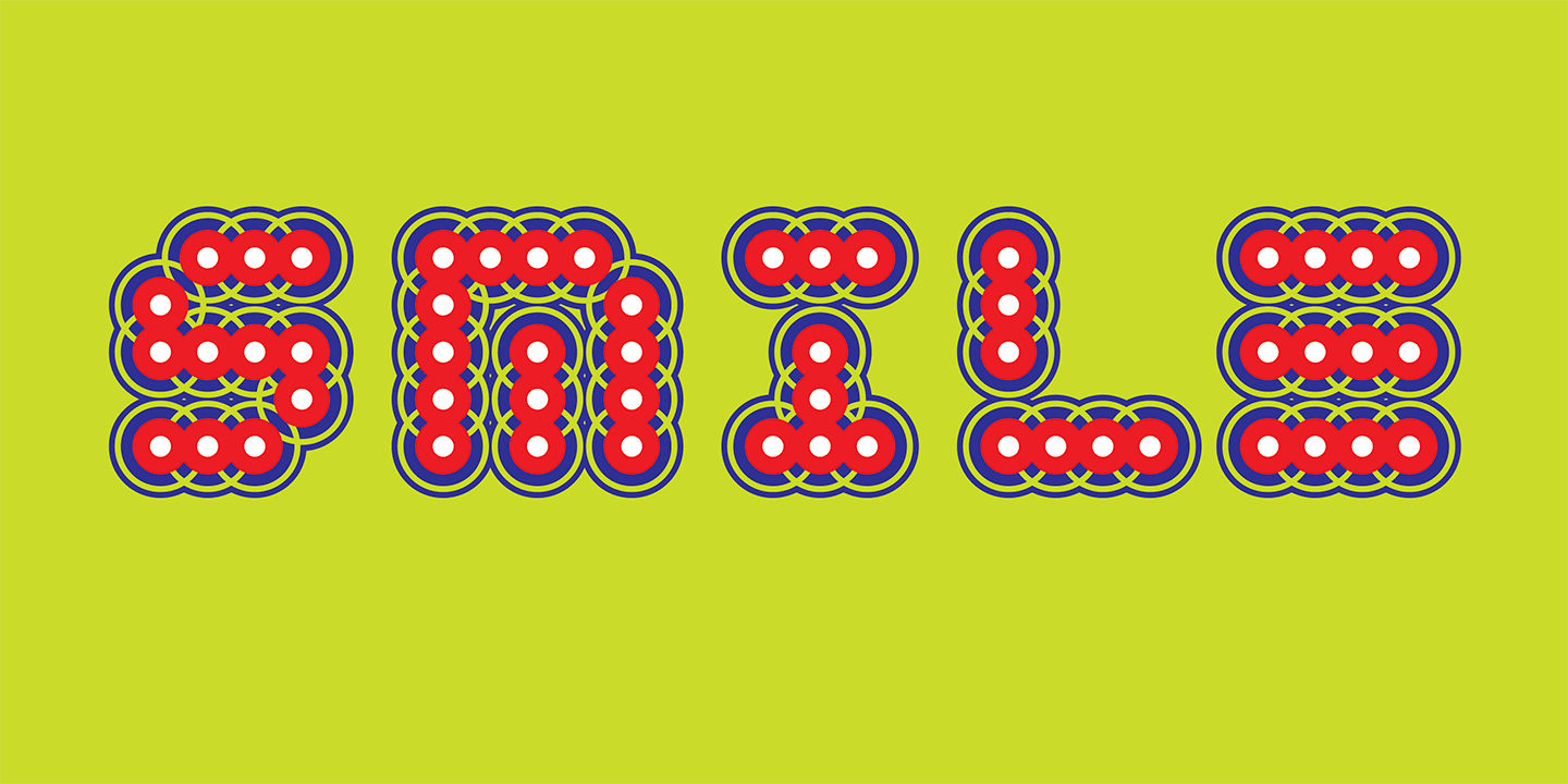
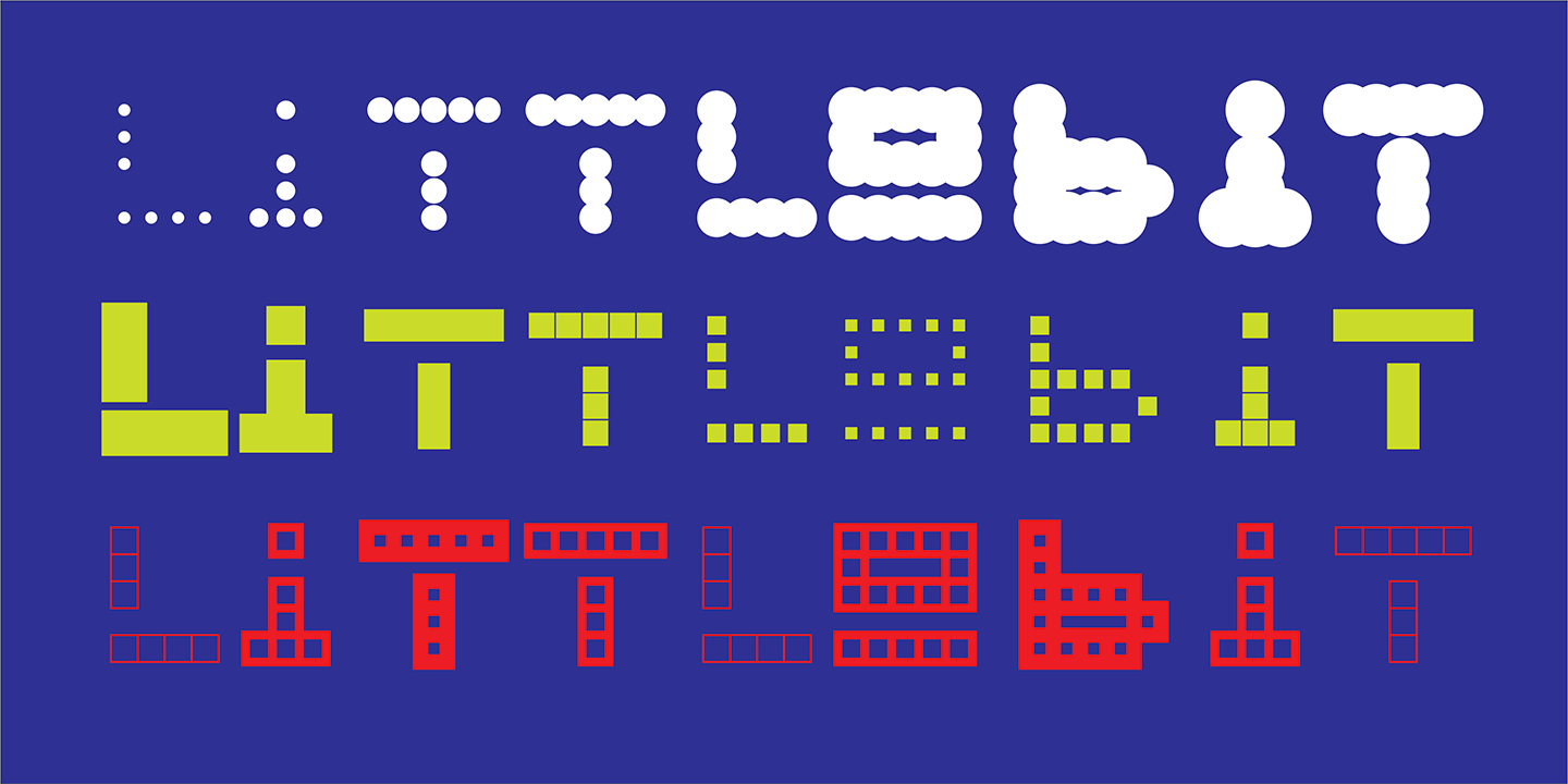
As the name implies, Littlebit Square is composed from square pixels, just like the original bitmap design. But pixels need not be square anymore, so we had a bit of fun trying out different shapes. First we settled on a variant that switches out the square bit with a loop, named Littlebit Loopy, which was reminiscent of slinky and spirograph toys. Then we also generated a series of variants composed from dot-shaped pixels, named Littlebit Dotty, and two versions that emphasized the underlying bitmap grid of the original design named Littlebit Blocky and Littlebit Griddy. We added Littlebit Twisty as a final variation, satisfied that we had thoroughly exhausted the idea of the original Littlebit design.
Three of the six Littlebit designs come in a number of “weights.” For instance, Dotty, which replaces Littlebit’s square pixels with dots, has eight different dot weights, while Blocky has six block weights, and Griddy has three grid weights. For those designers who want something in between the weights we offer, we also made variable font versions of Dotty, Blocky and Griddy, allowing a continuous range of weights through on-the-fly interpolation.
Working on Littlebit felt like we’ve come full circle, back to where we started when we were using bitmaps as our building blocks to make letters. And while the tools to produce fonts are now extremely sophisticated, allowing for unlimited formal expression, it’s still creatively satisfying, sometimes, to set restrictions and reduce choice to generate simplified yet readable letter forms.
By the way, we don’t suggest you use this font to set lengthy text, or any text for that matter. It works best in short headlines, word logos, drop caps and the like. Remember, sometimes a little bit goes a long way.
For more information about Littlebit, download the free type specimen.

