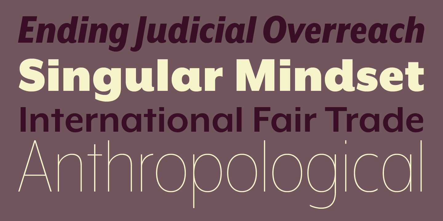
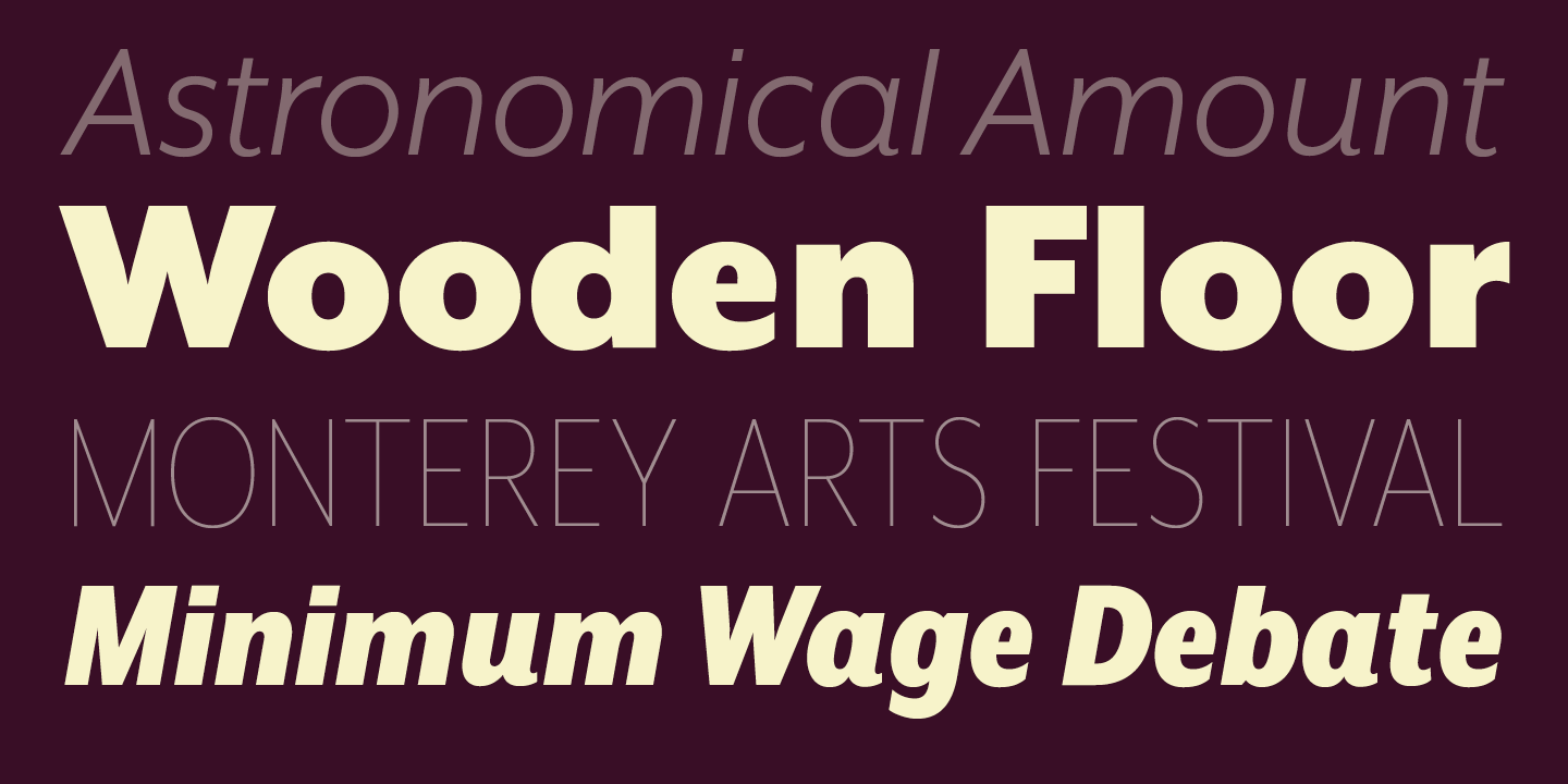
Mr Eaves XL Sans, Modern & Narrow
Designed by Zuzana Licko in 2009. More...
Related fonts: Mr Eaves Sans & Modern, Mrs Eaves, Mrs Eaves XL Serif & Narrow
This XL version of Mr Eaves completes the fourth quadrant of the Mrs Eaves and Mr Eaves families.
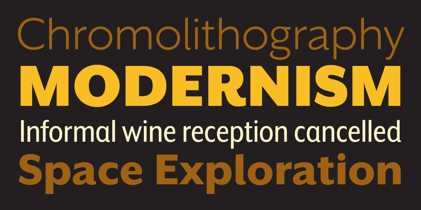
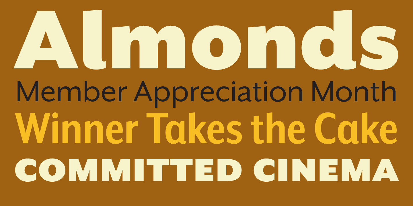
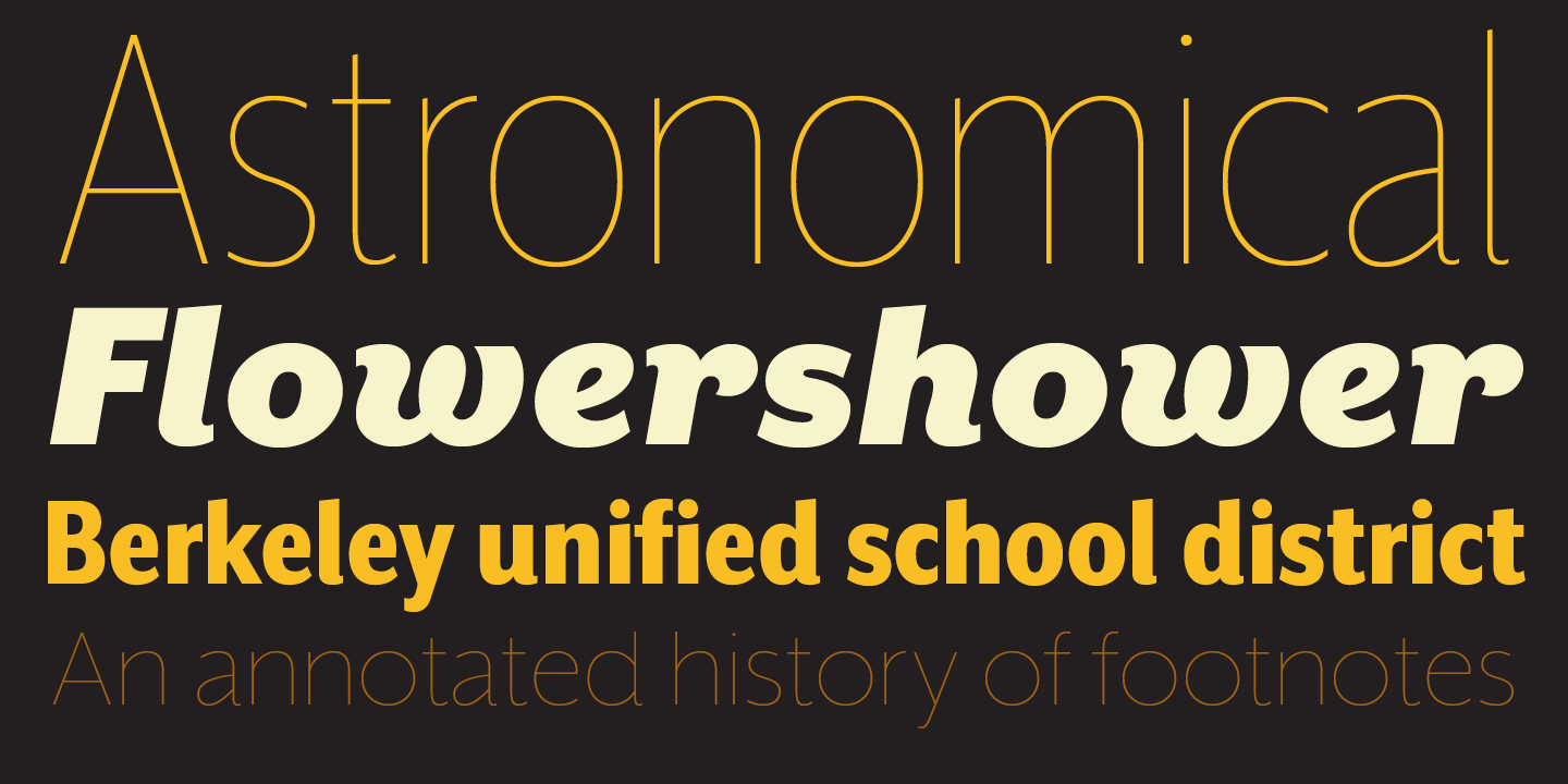
Mr Eaves XL Sans features a larger x-height than Mr Eaves Sans with shorter ascenders and descenders and overall tighter spacing. Mr Eaves XL allows for a wide variety of uses and is perfectly suitable for lengthy text settings. The larger x-height also maintains superior readability at smaller point sizes.
Like the Sans, the XL Sans version relates most directly to the serif version, noticeably in the roman lower case letters a, e, and g, as well as in subtle details such as the angled lead-in strokes, the counter forms of the b, d, p, and q, and the flared leg of the capital R, and the tail of the Q.
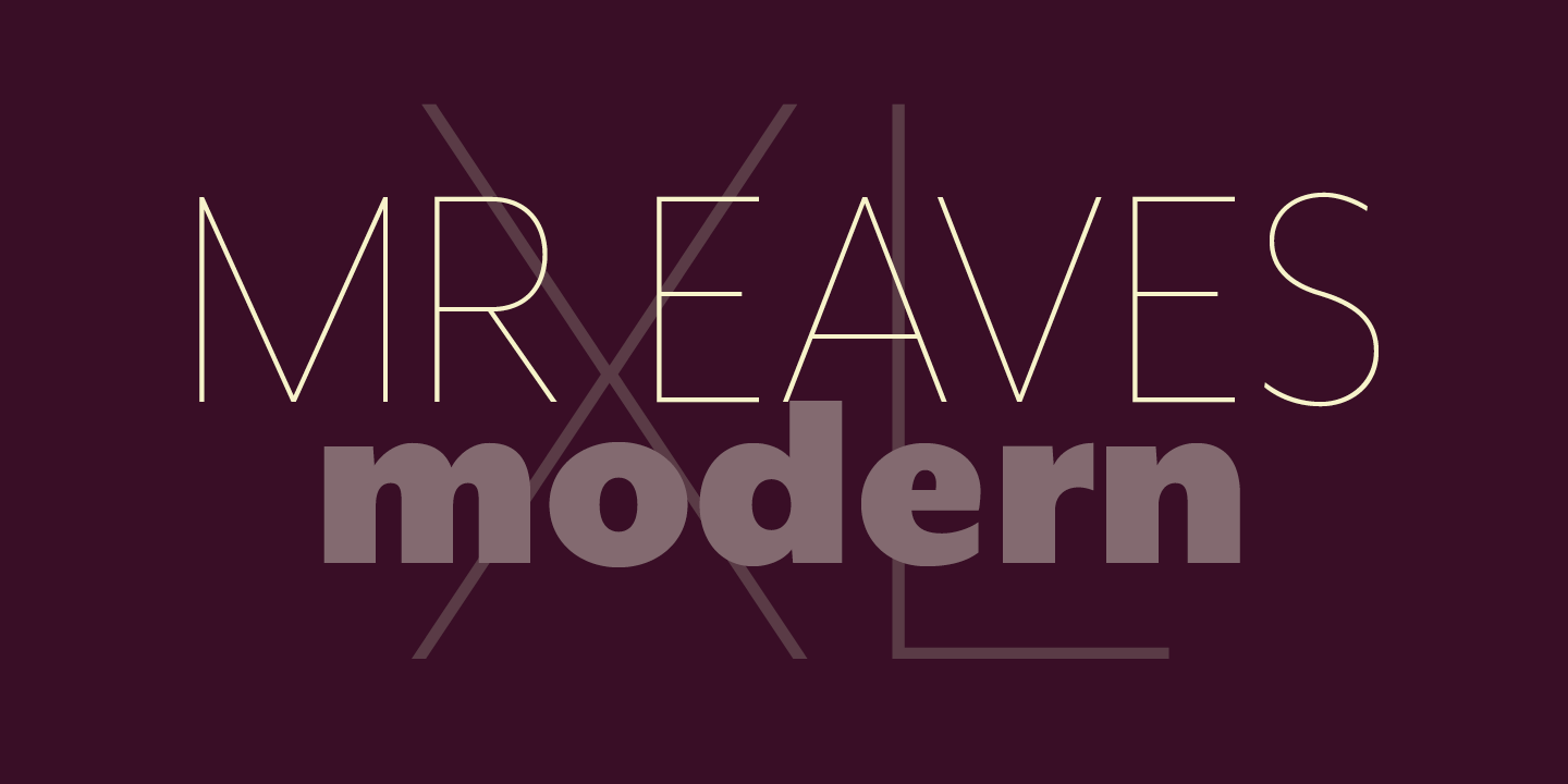
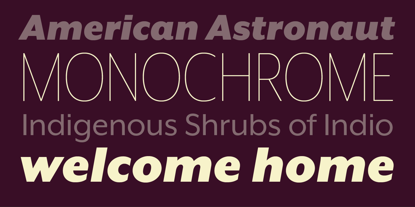
The matching Modern family provides an overall less humanistic look, with simpler and more geometric-looking shapes, most noticeably in the squared-off terminals and symmetric lower case counters. This family has moved furthest from its roots, yet still contains some of Mrs Eaves’ DNA. The Modern Italic is free of tails, and overall the Modern exhibits more repetition of forms, projecting a cleaner look.
Mr Eaves XL Sans and XL Modern feature four weights with accompanying italics, small caps and alternate characters.
For more information about Mr Eaves XL Sans, Modern & Narrow, download the free type specimen.

