

Base Monospace
Designed by Zuzana Licko in 1997. More...
Related fonts: Base 9 & 12
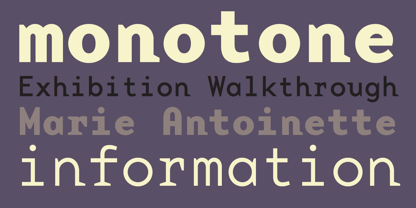
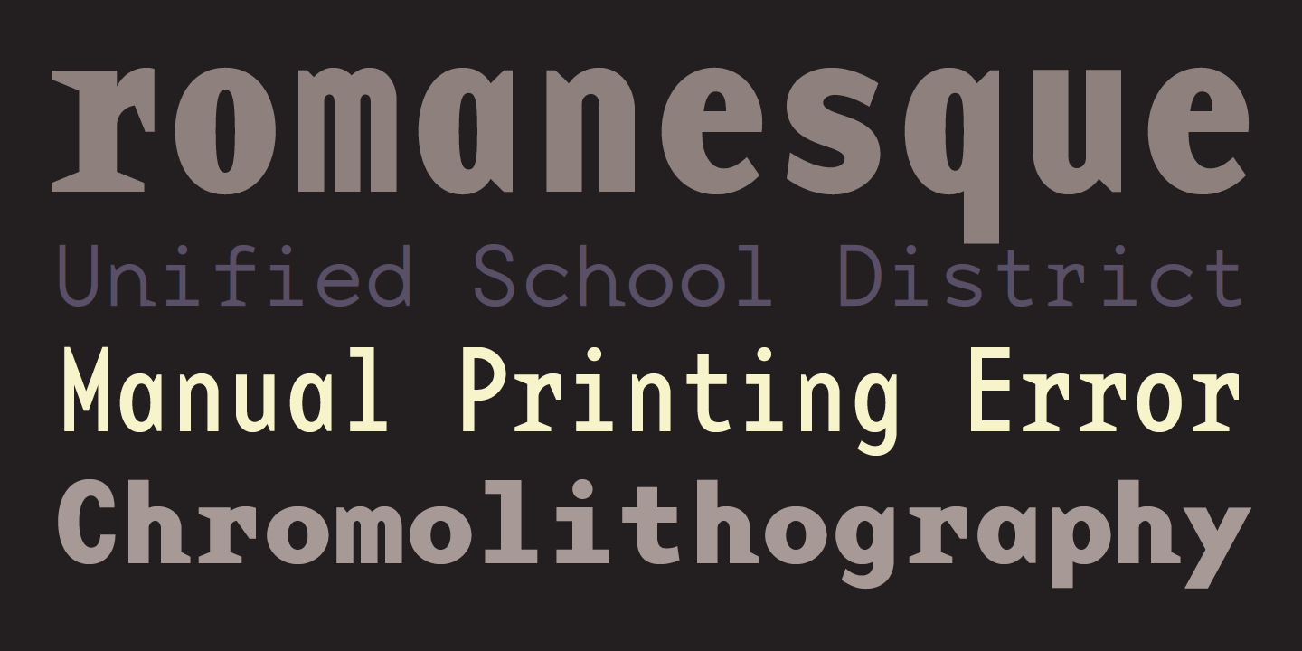
Base Monospace, as its name implies, belongs to a category of typefaces characterized by letter designs that each occupy a single set width, like the infamous typewriter font Courier (designed in 1956 by Howard Kettler), and the many other monospaced fonts that inspired its design.
Monospaced typefaces live on the “vernacular” side of legibility. When set in text, they do not generate a silky smooth image on the page. The “i” “l” and “j” usually float in their spaces, while the “m” and “w” are squeezed in, creating a somewhat jarring text image. Still, monospaced typefaces might have a leg up in the legibility department. Since the typewriter was an affordable and easy to use typesetting tool, it rapidly became the standard for academic, business and legal writing, and for formal and informal correspondence. Despite its esthetic handicaps, it was able to establish a look and feel that became accepted as a highly functional means of communication all over the world. If it is true that people read best what they read most, then monospaced type must contain plenty of features worth considering when exploring legibility.
For more information about Base Monospace, download the free type specimen.

