Elektrix
Designed by Zuzana Licko in 1989. More...
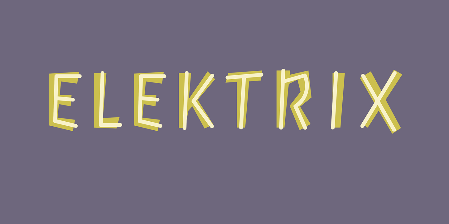
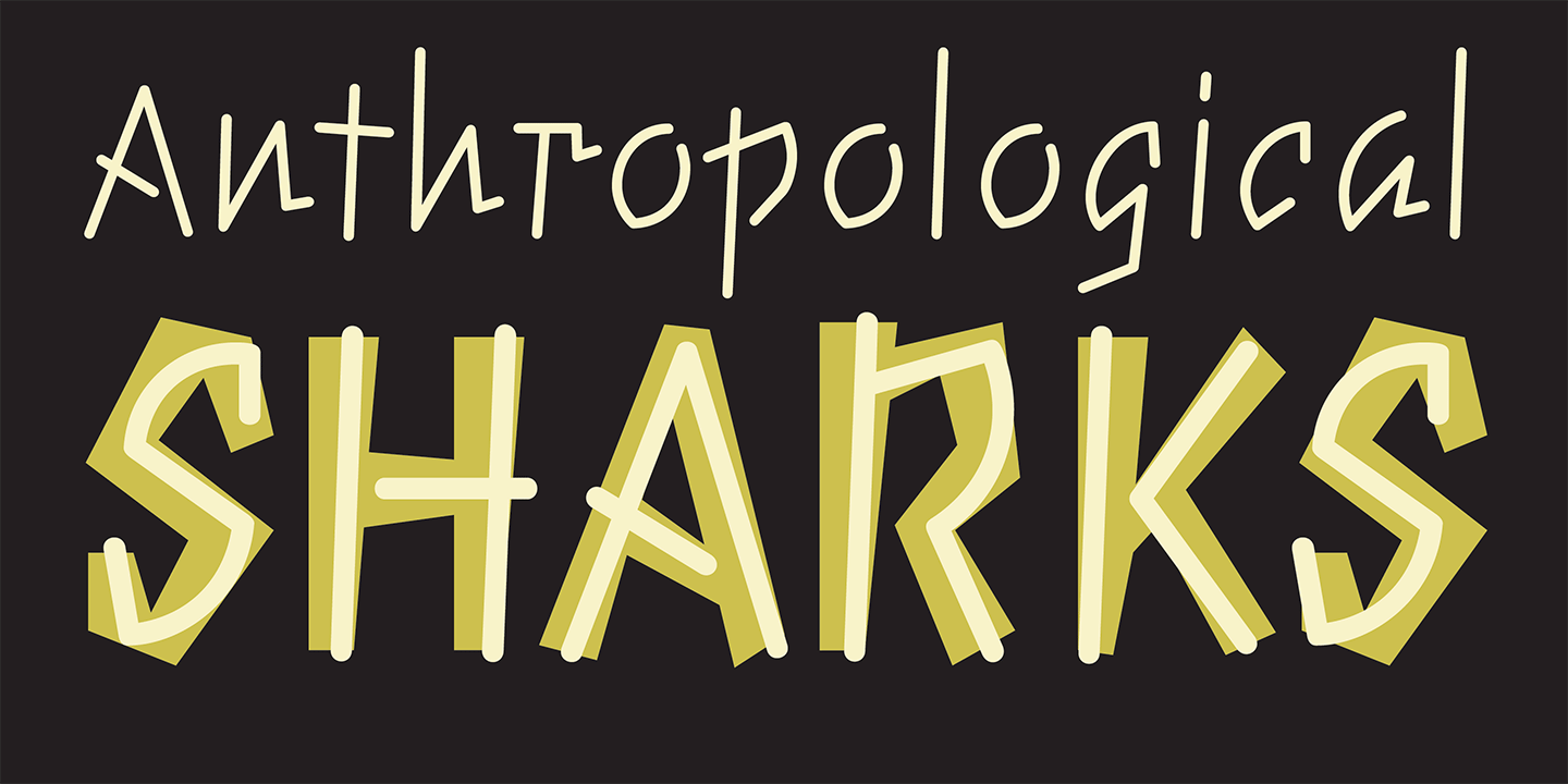
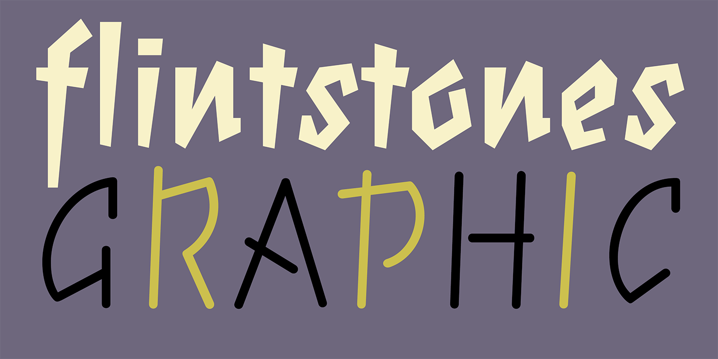
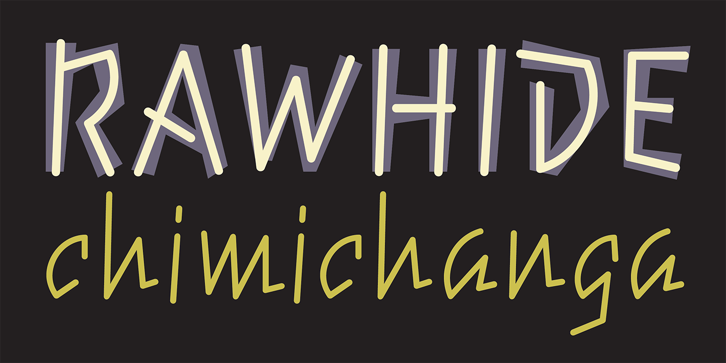
Elektrix was inspired by Choc and Mistral, two typefaces designed by Roger Excoffon, which are Licko’s favorite informal script faces. She set out to capture their feel by using only straight lines, and came up with Elektrix Bold. This was back when curves were difficult to draw and preview with the non-aliased coarse computer screen display.
For the light companion font, she took a different approach. To contrast with the blockiness and impact of the bold, she decided to construct the light version from a uniform line weight. She took advantage of the stroke feature in the Fontographer drawing program, which allowed her to draw the center line, and then expand the line weight. The curves were easier to draw this way because she drew only the center of the curve and didn’t have to worry about how the inside and outside curves interacted, which comes into play when drawing an outline letterform.

