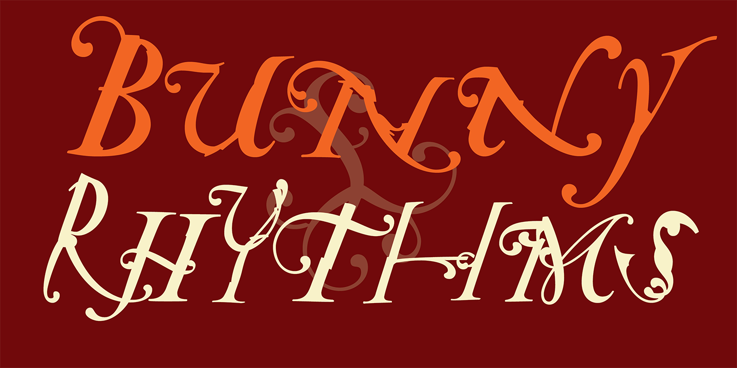
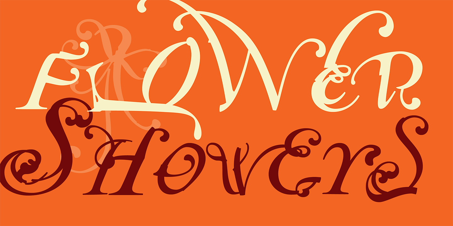
NotCaslon
Designed by Mark Andresen in 1991. More...
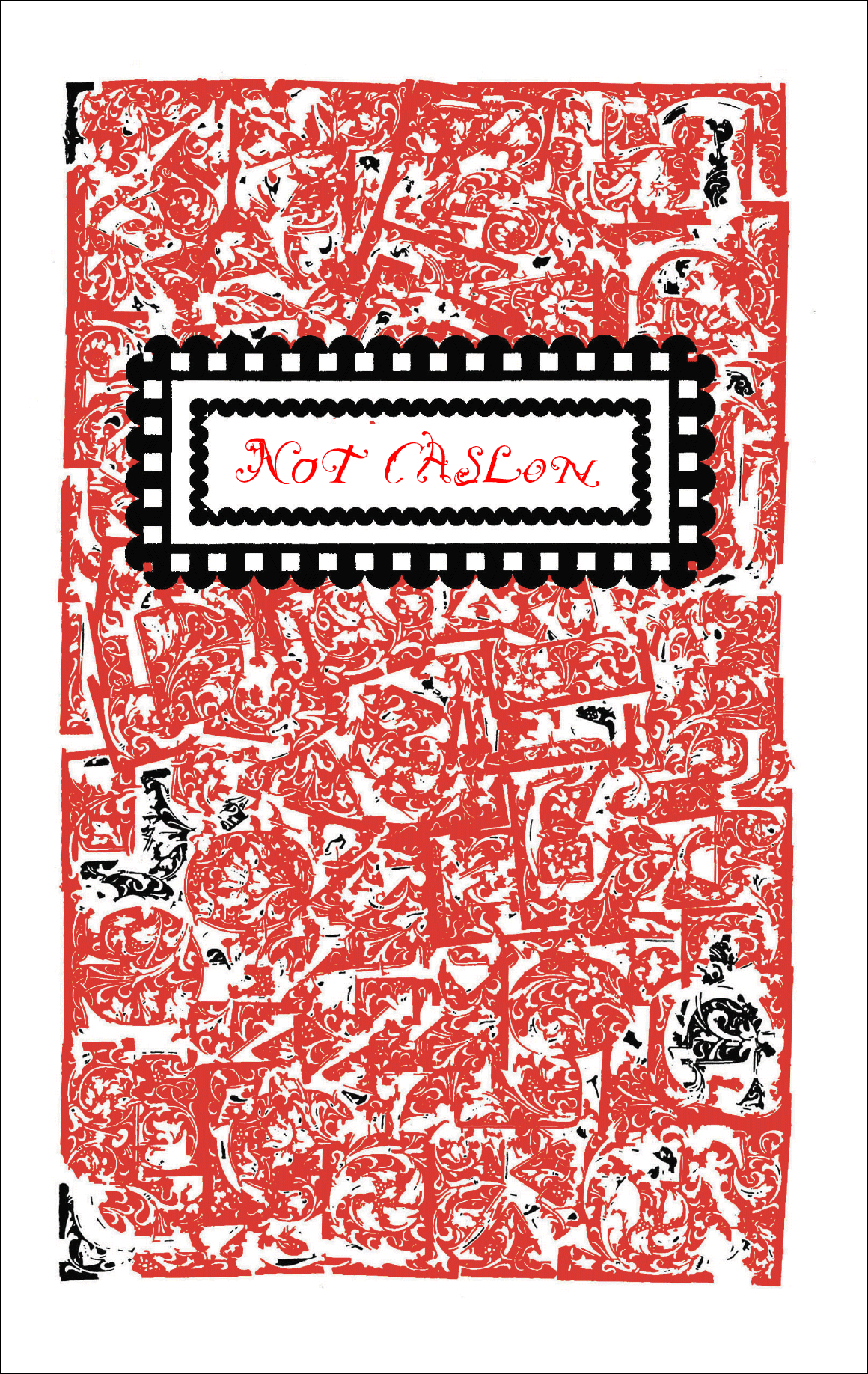
This collection of initials was created by illustrator Mark Andresen who rubbed down bits and pieces of dry transfer lettering: flakes, nicks, and all. It was digitized by Zuzana Licko.
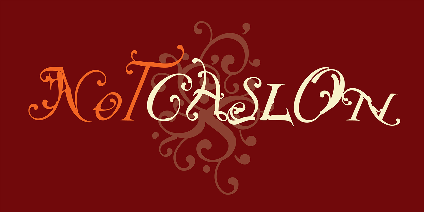
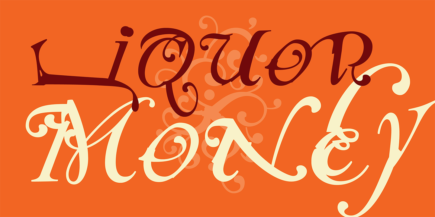
The main influence for NotCaslon is New Orleans, with its 18th and 19th century French Quarter balconies, old cemetery crosses and Voudou veve designs. The peculiar swashes and inconsistent italic letterforms are all pieces of Caslon Swash Italic broken press type, rearranged and spontaneously formed.
Sign painter and typeface designer John Downer adds the following: “Not Caslon, as the name implies, is surely one of the most comical and exuberant works of alphabet art that owes any (in this case, literally every) part of its being to swashy, 20th-century American, Caslon-inspired italics. It seems most unlikely that this collection will be able to float alone, but it may find a place next to numerous time-tested typefaces, if for no reason other than its outstanding entertainment value. Several interesting touches, whether included by accident or design, make for great amusement: wrong font letters like a monoline L and x, a bold weight F, a ‘shoelace’ X, miscellaneous lower case letters throughout, and even a flopped roman A (with modifications). What eighteenth-century printer's job case would be complete without a share of unexpected typographic variety?”
For more information about NotCaslon, download the free type specimen.

