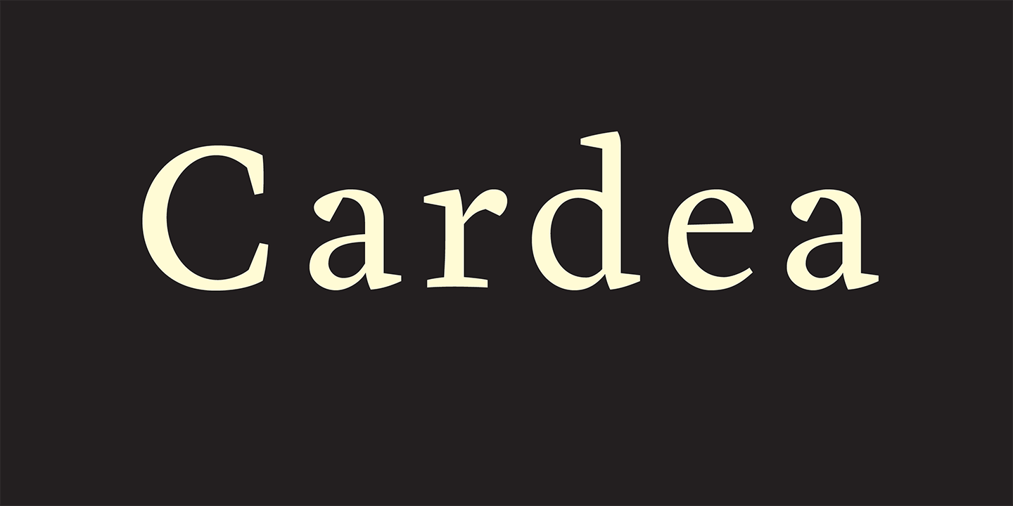
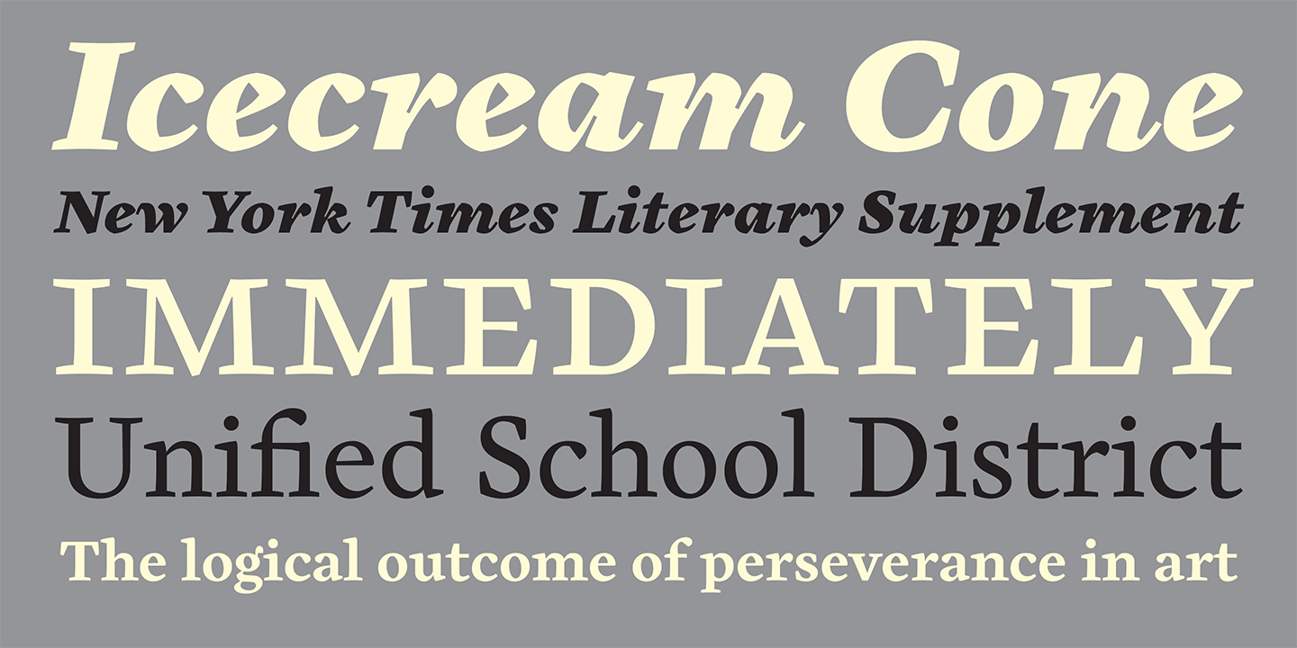

Cardea
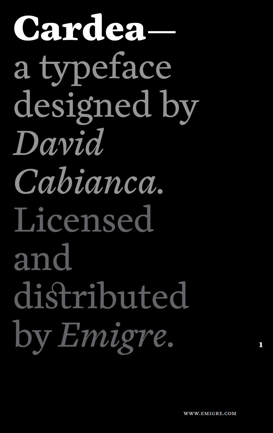
Designed by David Cabianca in 2004. More...
The Cardea family of typefaces is the outcome of David Cabianca’s 2003-04 MA Typeface Design experience at the University of Reading. With Cardea, Cabianca intended to mix classical and modern characteristics, and in the process he created a typeface that “sparkles” on the page, with high contrast, luster and crisp edges. The result is a type with a muscular or sculptural feel much like the work of artists like Arne Quinze or Mark di Suvero.
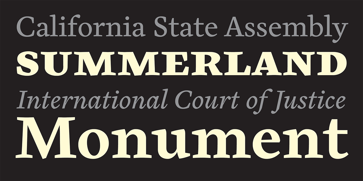
Cardea was designed to function as a text face. It features three weights each with accompanying italics, small caps and a variety of ligatures.
For more information about Cardea, download the free type specimen.

