Emigre Newsletter Archive
Fabrics, Pillows, Exhibits, and a new Book 06.27.2017
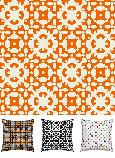
Zuzana Licko is applying some of her intricate pattern fonts to colorful fabric prints. Composed from Puzzler, Hypnopaedia and Tangly, these bold prints are now available as yardage and pillows.
You can choose from a variety of fabric materials, custom printed with Zuzana's pattern designs at spoonflower.
All prints in this collection are also available as pillows, napkins, or wallpaper at roostery.
Emigre in the UK
Two current exhibits in the UK feature work by Emigre.
The University of Reading is staging the exhibit Emigre magazine: design, discourse and authorship. The exhibition, which will run from June 12 to July 14, has been co-curated by Francisca Monteiro and Rick Poynor.
The show is divided into sections that reflect and examine the range of Emigre's activities – Rudy VanderLans as editor; The Emigre type foundry led by Zuzana Licko; VanderLans as graphic author; the Emigre Music record label; Emigre as a space for collaborative authorship for designers and writers; Emigre considered in context. A related essay by Rick Poynor on the influence of Emigre on graphic design was published in Creative Review.
Also in the UK, a number of Emigre magazine issues are included in the wonderful exhibition California: Designing Freedom at the Design Museum in London which runs from May 24 to October 17.
The exhibit explores how the ideals of the 1960s counterculture morphed into the tech culture of Silicon Valley, and how “Designed in California”became a global phenomenon.
Read about California designers Zuzana Licko, April Greiman, and Susan Kare and their influence on a generation of graphics in a review of the show at FastCompany.
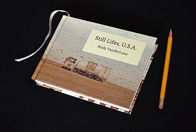
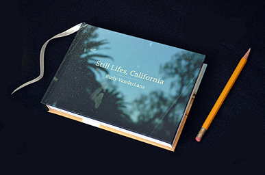
Still Lifes, U.S.A
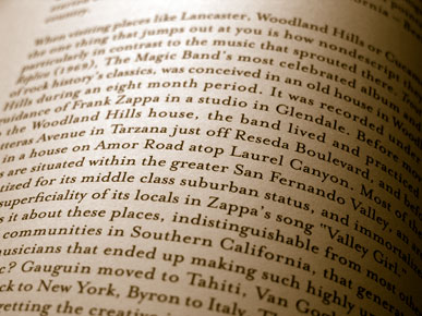
Upon his arrival in the US some 36 years ago, Rudy VanderLans embarked on a pan-American bus trip from New York to California. Overwhelmed by the experience, he rarely took out his camera, feeling unprepared for the challenge to do justice to the visual overload of the American environment.
In 2016 he set out to retrace his route, this time with camera in hand and a determination to record the experience. If the work seems familiar at times, VanderLans is quick to name his influences: “It’s through the photographs of Ruscha, Shore, Friedlander, Eggleston, and others that I learned to look at America more discerningly,”he says. “I use their examples as a jumping off point to distill my own impressions.”
The haunting work that resulted from his journey, titled Still Lifes, U.S.A., published exclusively in book form, creates the second entry in a trilogy of books that began with Still Lifes, California. These postcards from the road evoke both tranquility and solitude, entropy and loneliness in equal measures.
Published by Gingko Press.
Emigre Donates Archive 06.28.2016
We're happy to announce that we have donated the Emigre archive to Letterform Archive in SanFrancisco. This once-in-a-lifetime decision wasn't easy to make, but was made much easier by Letterform Archive's enthusiastic support and devoted staff. Our donation includes original paste-up boards for Emigre magazine and a complete run of the publication, plus press sheets, audio tapes of interviews, merchandise, ephemera, correspondence, typeface development files, and type catalogs.
We selected Letterform Archive to house and preserve our work because of its world-class type & design collection. It's also easily accessible to the public, it actively promotes itself to the design community, and it’s run by knowledgeable and dedicated professionals. We're honored to have our work sit alongside some of the world's best-known graphic design artifacts. Letterform Archive will incorporate this donation into their programs and services, to introduce a broader audience to Emigre’s history, and to put the collection online for type lovers near and far.
You can read more about this donation and Letterform Archive's many type-related events, including workshops, lectures, exhibitions, and publications on their website.
Two New Interviews Published
Check out the interview with Rudy VanderLans about Emigre's legacy and future on the Fontstand website. After more than three decades of activity, how does VanderLans see Emigre in 2016? And how does he feel about the aging of its body of work?
You can read a well-considered reply to the interview by Stephen Coles on his Typographica website.
Also, MyFonts just published a lengthy interview with Zuzana Licko. She answers questions about her roots, her approach to revivals, and how early digital technology inspired much of her type design output.
TDC Medal
On July 12th we will travel to New York City to receive the 29th Type Directors Club Medal. Over the past 49 years the TDC Medal has been awarded to individuals who excel in the field of typography and typographic design. We couldn't be more proud to be following in the footsteps of our personal heroes Matthew Carter, Erik Spiekermann, Herb Lubalin, Gerrit Noordzij and many other luminaries. The event will be held at Cooper Union.
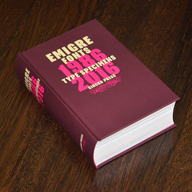
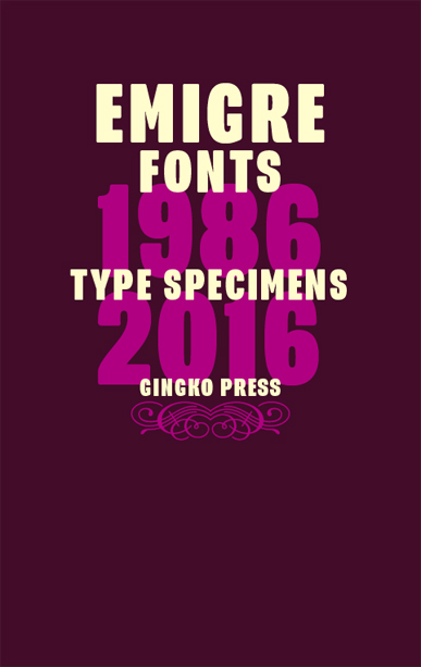
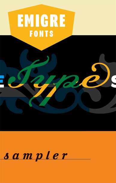
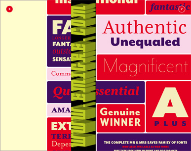
Emigre Fonts: Type Specimens 1986-2016 06.03.2016
Published by Gingko Press
Hot off the press, Emigre's latest book is a 752-page compilation celebrating the art of the type specimen. The book features reprints of Emigre's most remarkable specimen designs covering a period of 30 years. Besides displaying the virtues of the fonts and revealing the processes used to design them, these specimens go beyond their primary function as sales tools and can be enjoyed as much for the typefaces as for their esoteric content. If your collection of Emigre's popular type specimens is incomplete, or if you've missed out on these entirely, here's your opportunity to catch up.
You can read a review of the book at AIGA's Eye on Design.
Available in cool bookstores everywhere. Or you can order copies directly from Gingko Press or Emigre.
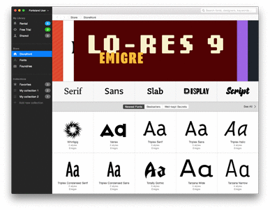
After 30 years of saying NO, we can finally say YES! to free font trials through the Fontstand service. Fontstand is a Mac OS X app that allows you to try fonts for free or rent them by the month for desktop use for just a fraction of the regular price. Even better, if you rent the font for 12 months it’s yours to keep.
We are kicking off this new venture by making a selection of the Emigre Font library available through this service, including such long-time favorites as Mr and Mrs Eaves, Filosofia, Matrix, Fairplex and many others.
We're excited to provide this additional choice to use our fonts. Give it a try, and let us know what you think on Facebook or follow Fontstand on Twitter.
Emigre Back Issues Sale 01.19.2016
We're lightening our archives and selling some of our most prized back issues of Emigre magazine.
This is a one time opportunity to add to your collection. Or, if you'd like to know what Emigre magazine was all about, this is your chance to check it out, purchase an issue, and own a little piece of design history. There are only one or two copies of each issue for sale, so act swiftly or they'll be gone.
These copies are all in good to fair condition with a few minor scratches, dents, and some slight color fading from moderate usage and storage.
Free Type Specimens 01.13.2016
We've added nine type specimens to our list of free downloadable PDFs!
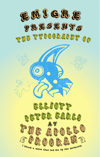
These catalogs are from the early days of Emigre and include a slightly reconstructed version of our very first catalog of low resolution fonts titled "Digital Fonts" (1986); the original catalog design for Mrs Eaves (1996); and a reconstructed catalog for Base Monospace which was originally published as a poster (1997). The list also includes PDF versions of specimens that have long since sold out for such classic typefaces as Platelet, Keedy Sans, NotCaslon, Poppi, Dalliance, and The Apollo Program.
And, for those who prefer printed type catalogs, we are happy to announce that we are working with Gingko Press to publish a 752 page book of reprints of Emigre's most popular type specimens. The title of the book is Emigre Fonts: Type Specimens 1986-2016. It is due out in May 2016.
Just in time for the holidays, new product from the Emigre team.
For his latest monograph, Still Lifes, California, Rudy VanderLans selected more than 100 photographs spanning a decade and thousands of miles of California highways. Along the way he’s captured vignettes that punctuate the beauty and absurdity of the California environment. Empty of people but littered with the traces of human enterprise, these often surprising and always beautifully composed images will give readers much to ponder. From Hopland to Hollywood and Modesto to the Mojave, this is California as uncovered by the ever-curious author.
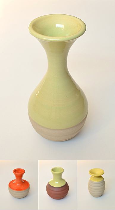
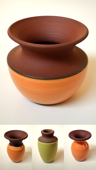
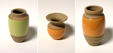
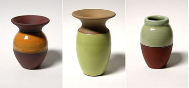
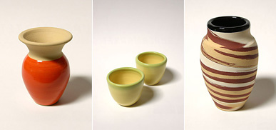
Also, a brand new collection of handmade ceramics by Zuzana Licko is now available. These one-of-a-kind vases are offered in a variety of colorful glazes applied to various shades of stoneware. Heights range from 9.5 to 2.75 inches. These vases usually sell out within days, so don't delay, act today!
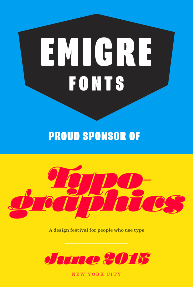
Emigre Sponsors Typographics 05.13.2015
Emigre is a proud sponsor of Typographics, a 10-day design festival devoted to contemporary typography, with talks, workshops, and tours. Featuring participants such as House Industries’ Ken Barber, Pentagram's Paula Scher and Abbott Miller, Alex Trochut, Erik van Blokland, Jonathan Hoefler and many, many others. June 8-18, 2015, New York City.
Stop by our Facebook page to pick up the promo code and save $50 on the conference. While you are there, give us a “Like.”
Handmade Ceramics by Zuzana Licko
A new collection of handmade ceramics by Zuzana Licko is now available. These one-of-a-kind vases are offered in a variety of colorful glazes applied to various shades of stoneware. Heights range from 2.5 to 8 inches.
Also, we've only recently joined Facebook and are still excited about it and we are posting daily. Come like us.
Emigre Fonts is on Facebook 01.05.2015
We know, we know, we're late to the party (did we miss anything?), but there we are, we've created an Emigre Fonts Facebook page! Check out our daily posts with lots of behind-the-scenes, blasts-from-the-past, and never-before-seen historical tidbits about the goings on at Emigre. Come like us.
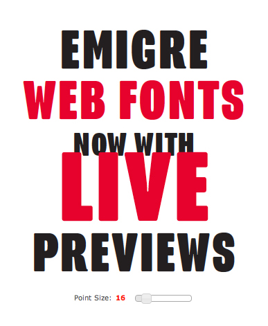
Self-hosted Emigre Web Fonts starting at just $39 11.18.2014
From the get go Emigre has been a DIY company, which is why we decided to offer self-hosted web fonts rather than any hosted or third-party solution. It’s not that we don’t trust third-party web font delivery; to us that was just one more complication and an area out of our control. Self-hosted web fonts couldn’t be simpler: add the CSS, move the font files over, and you're done.
One of the downsides of DIY, is that it can take a while to figure things out. So we are both excited and a little embarrassed that it’s taken this long to finally offer live previews of our web fonts. Change the text, fiddle with the size, it’s all there now live on our web site. Check it out!
If you're an IOS or Android developer, we also offer Mobile App Licenses starting at $390.
Do you have a licensing question? Email sales@emigre.com
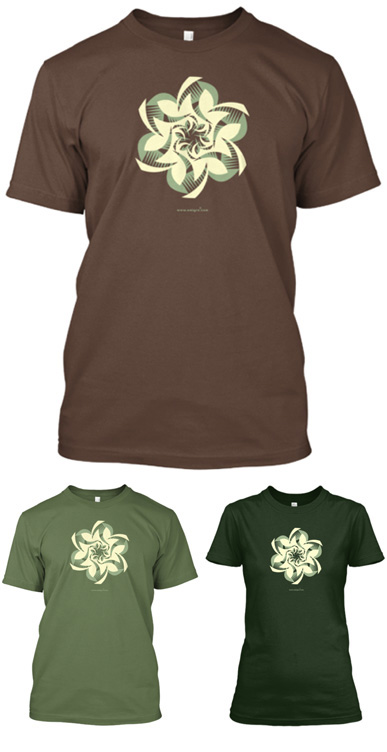
Wearable Whirligigs 11.14.2014
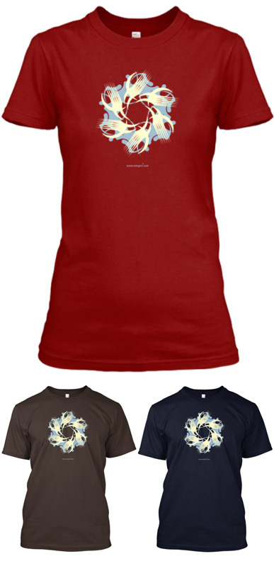
Just in time for the holidays, you can now elevate the mood with this festive wearable design. Available in a variety of color combinations in both men's and women's Tees. Choose from two different designs: Whirligig 1 & Whirligig 2. Graphics selected from the Whirligig illustrations designed by Zuzana Licko for Emigre Fonts. Campaign ends December 3rd, 2014.
Also, only three days left in the campaign to order the bold new Emigre Fonts logo shirts!
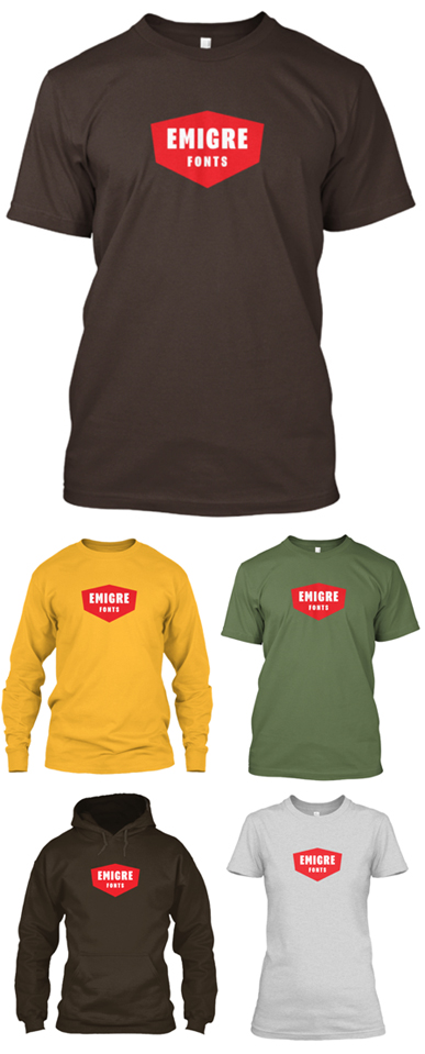
Emigre Fonts Wearables 11.30.2014
We're joining up with Teespring once again to offer a new wearable design. Show off your love for typefaces with Emigre's bold new Emigre Fonts logo shirts. Men's and women's Tees, Hoodies and Long Sleeved Shirts for every type of weather in a variety of colors. Prices range from $15 - $30. This campaign will end Wednesday, November 19th.
If you hurry, you can also still order the Design is a Good Idea shirts thru Tuesday, November 4th.
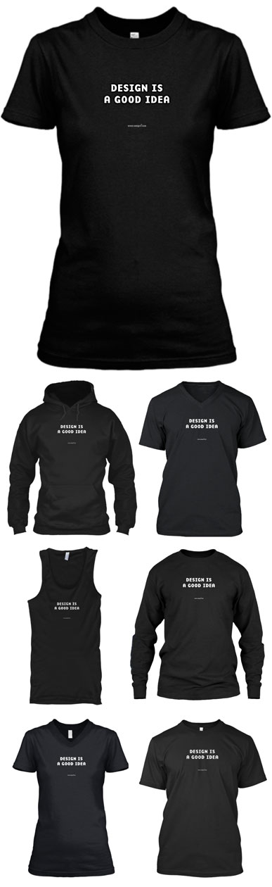
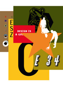
Design is a Good Idea - Premium 10.16.2014
After our first “Design is Good Idea”campaign with T-shirt manufacturer Teespring, we received many requests for additional shirt styles, so we launched this Premium campaign to include high quality women's tees, v-neck tees, tank tops, long sleeved shirts, and hoodies. Prices range from $18 - $30. This campaign will end Wednesday November 5th.
If you hurry, you can also still order the basic version of the “Design is a Good Idea”T-shirt thru October 19th. Hanes Tagless Tee $12.
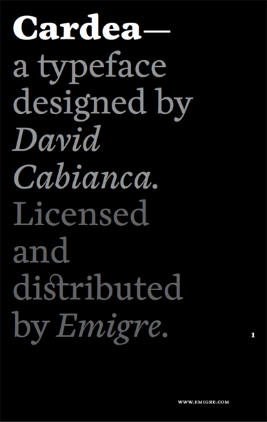
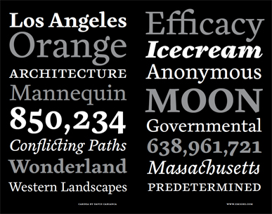
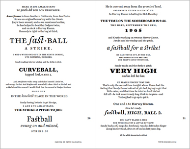
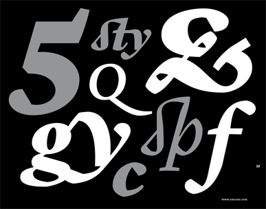
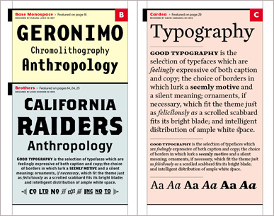
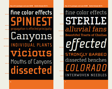
The Cardea family of typefaces is given its first serious test drive in this 32-page type specimen catalog designed by Emigre's art director Rudy VanderLans.
Cardea is the outcome of David Cabianca’s 2003–04 MA Typeface Design experience at the University of Reading. Cardea was designed to function as a text face. It is characterized by high contrast, subtle curves and crisp edges to create a typeface that is not shy to sparkle on the page while appeasing the reader with remarkable readability. It features three weights, each with accompanying italics, small caps, and a large variety of ligatures and numerals, making it an excellent typeface for setting lengthy texts in books, journals and annual reports.
You can download a FREE copy of the Cardea catalog here.
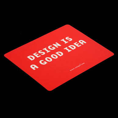
Design is a Good Idea Mousepad 06.04.2014
Requests for this popular item never ceased, even though it sold out years ago. So we decided to bring back Emigre's Design is a Good Idea mousepad. 8.5" x 7.5" x 1/8", with hard top (Lexan) surface. Only $24 (including shipping, worldwide), or FREE if you're in the U.S. and you place an order on the Emigre web site for $150 or more.
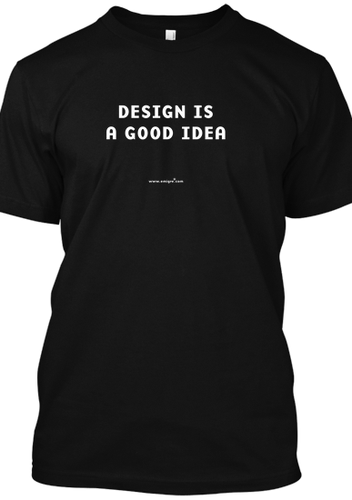
Design is a Good Idea 06.04.2014
It turns out that design is still a good idea. Due to popular demand, we are bringing back the "Design is a Good Idea" T-Shirt! This has been by far Emigre's most popular T-shirt design. It's been sold out for years, but we decided to bring it back due to continued requests from our customers. The great folks at Teespring.com will be producing and fulfilling the orders. White printing on a black Hanes Tagless Tee. Only $12.00 plus shipping. To place your order, go to Teespring.com/emigre
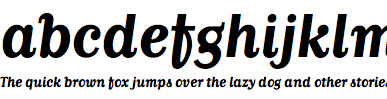
Cardea Font Release 05.08.2014
The Cardea family of typefaces is the outcome of David Cabianca's 2003–04 MA Typeface Design experience at the University of Reading. With Cardea, Cabianca intended to mix classical and modern characteristics, and in the process he created a typeface that “sparkles”on the page, with high contrast, luster and crisp edges. The result is a type with a muscular or sculptural feel much like the work of artists Arne Quinze or Mark di Suvero.
Cardea was designed to function as a text face. It features three weights each with accompanying italics, small caps and a variety of ligatures.
Emigre Fonts Type Sampler 04.24.2014
If you missed out on receiving a printed copy of the latest Emigre type catalog, here is your opportunity to catch up. You can order a copy of this 64-page type specimen for only $3.00 ($10 outside U.S) and receive an additional five type specimens including the Mr & Mrs Eaves, Alda, and Vista catalogs. Or, if a printed catalog is not your cup of tea, or you're in a rush, you can now download a copy in PDF format for free.
Program Type Specimen 05.13.2013
If you missed out on receiving a printed copy of the latest Emigre type catalog, here is your opportunity to catch up. You can order a copy of this 32-page type specimen for only $3.00 ($10 outside U.S) and receive an additional five type specimens including the Mr & Mrs Eaves, Alda, and Vista catalogs. Or, if a printed catalog is not your cup of tea, or you're in a rush, you can now download a copy in PDF format for free.
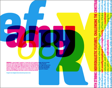
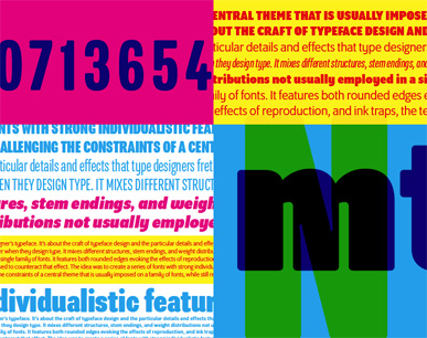
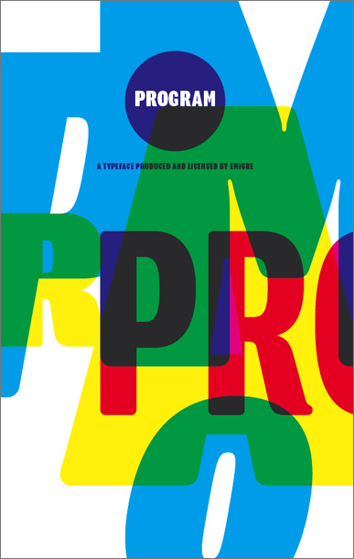
Program Font Release 04.03.2013
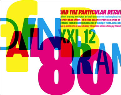
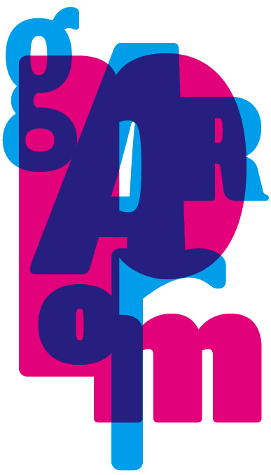
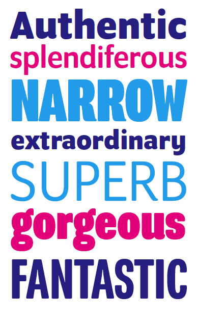
Designed by Zuzana Licko, Program is a type designer's typeface. It's about the craft of typeface design and the particular details and effects that type designers fret over when they design type. It mixes different structures, stem endings, and weight distributions not usually employed in a single family of fonts. It features both rounded edges evoking the effects of reproduction, and ink traps, the technique used to counteract that effect. The idea was to create a series of fonts with strong individualistic features, challenging the constraints of a central theme that is usually imposed on a family of fonts, while still relating to each other in terms of overall look and feel.
Mr Eaves XL Narrow Type Specimen 11.13.2012
If you missed out on receiving a printed copy of the latest Emigre type catalog, here is your opportunity to catch up. You can order a copy of this 32-page type specimen for only $3.00 ($10 outside U.S) and receive an additional five type specimens including the Mrs Eaves, Alda, and Vista catalogs. Or, if a printed catalog is not your cup of tea, or you're in a rush, you can now download a copy in PDF format for free.
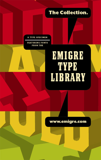
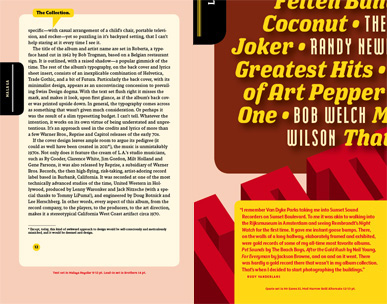
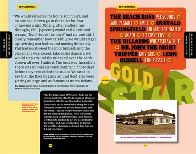
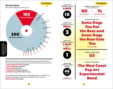
The Collection Type Specimen 04.11.2012
If you missed out on receiving a printed copy of the latest Emigre type catalog, here is your opportunity to catch up. You can order a copy of this 64-page type specimen for only $3.00 ($10 outside U.S) and receive an additional five type specimens including the Mrs Eaves, Mr Eaves, Alda, and Vista catalogs. Or, if a printed catalog is not your cup of tea, or you're in a rush, you can now download a copy in PDF format for free.
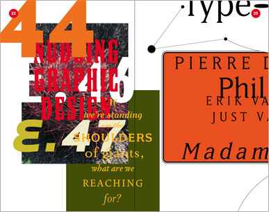
A type specimen can be about anything or nothing, as long as the featured typefaces are prominently displayed. It‘s all about exploring and exhibiting the versatility of the typefaces. As such, designing a type specimen can easily become an exercise of style over content, the proverbial crystal goblet turned inside out the goblet intentionally obscuring the content because the content is fake.
But type specimens need not be limited to stacked and justified compositions of arbitrary words and phrases. Although the text is necessarily subservient in the typographic exercise, there‘s no reason to neglect the content.
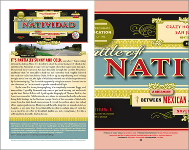
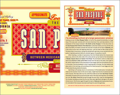
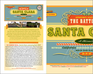
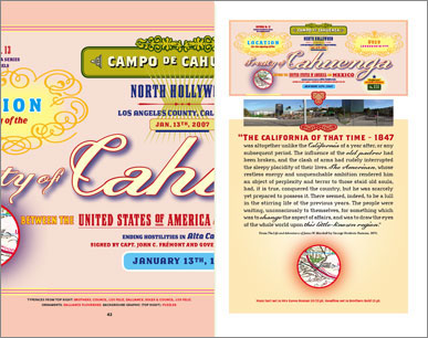
The story at the center of this new Emigre Type Catalog starts in 1971. It encompasses the analysis of a record collection, a series of 17 architectural photographs of historically significant buildings and sites in Los Angeles, and a selection of anecdotal quotes about music recording. It fuses these disparate elements into a visual presentation serving the dual purpose of showcasing selections from the Emigre Type Library while providing a story that can be enjoyed like a nice goblet of wine.
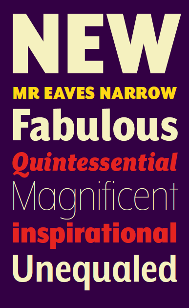
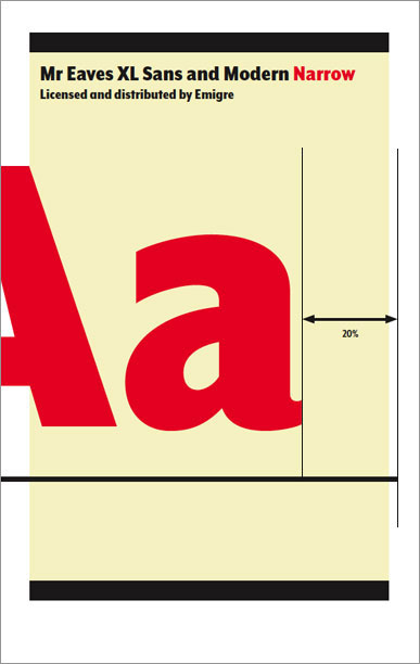
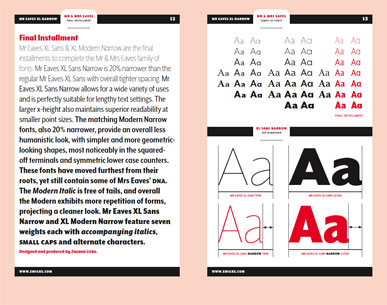
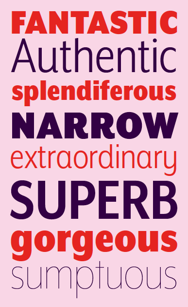
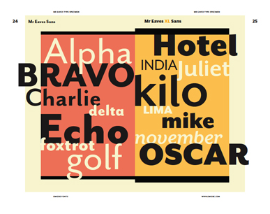
A Narrow Mr Eaves XL 03.28.2012
Mr Eaves XL Sans & Modern Narrow are the final installments to complete the Mr & Mrs Eaves family of fonts.
Mr Eaves XL Sans Narrow is 20% narrower than the regular Mr Eaves XL Sans with overall tighter spacing. Mr Eaves XL Sans Narrow allows for a wide variety of uses and is perfectly suitable for lengthy text settings. The larger x-height also maintains superior readability at smaller point sizes.
The matching Modern Narrow family, also 20% narrower, provides an overall less humanistic look, with simpler and more geometric-looking shapes, most noticeably in the squared-off terminals and symmetric lower case counters. This family has moved furthest from its roots, yet still contains some of Mrs Eaves’ DNA. The Modern Italic is free of tails, and overall the Modern exhibits more repetition of forms, projecting a cleaner look.
Mr Eaves XL Sans Narrow and XL Modern Narrow feature seven weights each with accompanying italics, small caps and alternate characters.
View, order, and read more about the Mr Eaves XL Narrow family here: http://www.emigre.com/Fonts/Mr-Eaves-XL-Sans-and-Modern
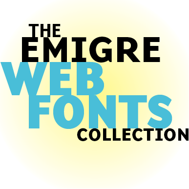
The Emigre Font Library is now available in Web Font format for use in web sites.
Emigre Web Fonts are provided in both WOFF and EOT formats for use with the CSS @font-face rule. The combination of WOFF and EOT formats allows the Web Fonts to function on most currently used browser types.
Emigre Web Fonts are licensed for self hosting, with a choice of a 5 year renewable term, or a one time perpetual term option, giving you full control over server performance, and eliminating monthly or annual subscription fees.
We have optimized our web fonts hinting for screen display. However, as the technology remains in flux, the variables of the different platforms, screens, rasterizers, browser defaults, and user preference settings, sometimes generate inconsistencies beyond our control.
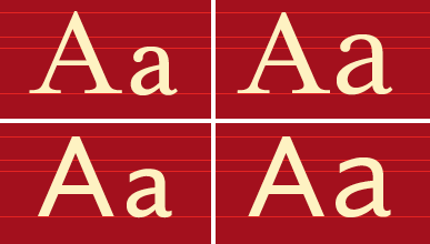
Look for the Emigre Type Director's Picks for Web Fonts that perform best across all browsers and sizes. Below are sample Mac screen renderings from 19 of the 189 current Type Director's Picks.
Base 900 at Walker Art Center 11.15.2011
To celebrate the inclusion of Base 900 in the current Walker Art Center exhibit we have just added the Base 900 Type Specimen to our list of free downloadable PDF catalogs.
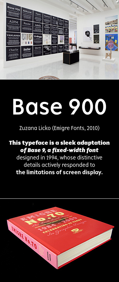
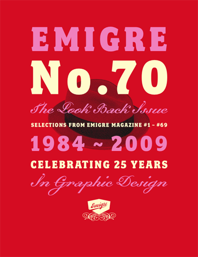
Emigre at The Walker Art Center, Minneapolis
The Emigre typeface Base 900 and the book Emigre No. 70: The Look Back Issue are featured in the exhibit Graphic Design: Now in Production at the Walker Art Center in Minneapolis. This major international exhibition explores how graphic design has broadened its reach dramatically over the past decade, expanding from a specialized profession to a widely deployed tool. Graphic Design: Now in Production is the largest museum exhibition on the subject since the Walker's seminal 1989 exhibition Graphic Design in America: A Visual Language History in which Emigre's work was also represented.
You can still purchase Emigre No. 70 directly from Emigre. But only 40 copies are left in our inventory (sold out elsewhere, including Amazon), so don't delay, act today!
Ceramic Vases
And, just in time for the holidays, a brand new offering of handmade ceramics by Zuzana Licko is now available. These one-of-a-kind vases, sake cups and bowls feature an assortment of colorful glazes applied to various shades of stoneware. Heights range from 2.5 to 7 inches.
Emigre Magazine Back Issues
If you'd like to surprise your designer friend with a nice holiday gift, or want to complete your own collection with some hard to find back issues of Emigre magazine, now is your chance. We have made available a very limited number of issues that have long been on the sold out list. These were taken from the Emigre archives and will sell out very fast!
Emigre Fonts PDF Catalogs 09.13.2011
Emigre's award winning type specimen catalogs are now available for free as downloadable PDF files. Many have been long out of print and some have reached collector item status. So if you haven't received these in the past, or have lost your copy, here is your opportunity to receive these beautifully designed type catalogs delivered directly to your computer for immediate typographic perusal.
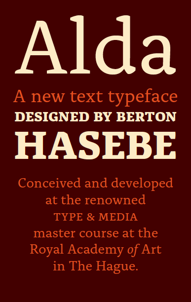
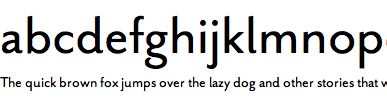
Introducing Alda by Berton Hasebe 06.07.2011
Conceived and developed at the renowned Type and Media master course at the Royal Academy of Art (KABK) in The Hague, Alda wears its local heritage on its sleeve. It hints at a range of Dutch types, from Jan van Krimpen's Lutetia to Underware's Dolly, yet it differentiates itself as a unique type family bearing distinctive and easily recognizable features.
Alda distinguishes itself most visibly by infusing its three weights with characteristics that are seemingly incongruous. Featuring a bold weight that is robust and angular, and a light weight that is delicate with swooping, fluid lines, Alda's three weights merge details derived from both broad nib and pointed pen writing styles. Hasebe blends these two structurally divergent techniques into a remarkably beautiful synthesis.
Alda has already impressed the type cognoscente, as it was awarded the 2008 judges pick from the Type Directors Club in New York, and it was selected by the Tokyo Type Directors Club to be included in its annual publication.
A short interview with Hasebe about his experiences at Type and Media is posted in our essays and interviews section.
It's been a hectic first quarter at the Emigre Type Studio, with upgrades to some of our classics, and a number of new typeface releases being finalized. Here's a quick update on what we've been working on.
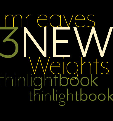
Mr Eaves
Zuzana Licko has just finished work on expanding the Mr Eaves family with three new weights of Thin, Light, and Book for both the Sans and XL Sans, with italics, small caps and alternates. These additions will expand the Mr Eaves family to over 78 styles. The fonts are available for purchase now.
Exocet
We have added a Medium weight to Jonathan Barnbrook's Exocet font family. An OpenType version of the font is now also available with alternate characters provided for the K, O, and T.
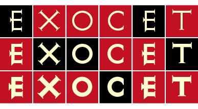
Since its original release in 1991, Exocet has been surprisingly successful and enduring. It has been used on a wide variety of products, from Goth album covers, to the top-selling computer games "Diablo" and "Quake", as well as the more genteel Tazo tea packaging. Its combination of modern and antiquated forms have ensured its longevity in the world of commercial design.
Coming Soon!
We're super excited about Alda, a new text typeface designed by Berton Hasebe, which is now in the kerning stages. Alda was designed by Hasebe while studying at the renowned Type and Media program at the Royal Academy of Art in The Hague, Holland (KABK). Alda has already impressed the type cognoscente, as it was awarded the 2008 judges pick from the Type Directors Club in New York. You can see Alda in its preliminary stage on Hasebe's website. Release date is set for Summer 2011.
Miscellany
If you haven't yet, be sure to put yourself on our mailing list to receive free copies of future type specimens. And don't forget about our ongoing "Free Gift" offer for all type orders of $150 and over.
Five Milestone Font Families 03.01.2011
In early January 2011, The Museum of Modern Art in New York made curatorial history when it acquired 23 digital typefaces for their Design and Architecture Collection. Besides such classics as Erik Spiekermann's FF Meta and Matthew Carter's Verdana, the acquisition also included five font families from the Emigre Type Library: Keedy Sans by Mr. Keedy; Mason Serif by Jonathan Barnbrook; Template Gothic by Barry Deck; Oakland by Zuzana Licko; and Dead History by P. Scott Makela.
These milestone fonts are synonymous with the early days of the digital era. In their designs they exhibit the experimental exuberance and technical challenges and opportunities brought to type design as a result of the introduction of the Macintosh computer. No type collection is complete without them.
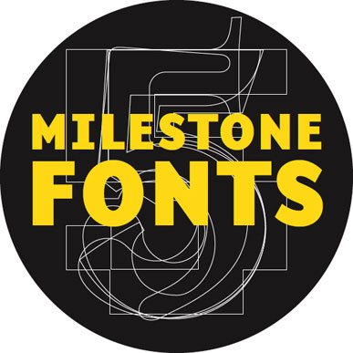
To celebrate this momentous occasion, Emigre also produced Departures, (see below) a 144-page pocket book based on the concept behind the accompanying MoMA exhibit Standard Deviations: Types and Families in Contemporary Design, which will run from March 2nd, 2011 through January 30, 2012.
For a limited time you can purchase a basic license for the Five Milestone Font Families in OpenType format for only $164 and receive a free copy of the pocket book. (This is less than half the regular price!) This specially priced offer expires January 30, 2012 and may not be combined with any other offer or upgrade.
Handmade Ceramics by Zuzana Licko
A new collection of handmade ceramics by Zuzana Licko is now available. These one-of-a-kind vases are offered in a variety of colorful glazes applied to various shades of stoneware. Heights range from 2.5 to 6.75 inches.
Our ceramics are a perfect holiday gift, hand-made by the designer of the popular Mrs Eaves typeface. They tend to fly off the shelves, so don't procrastinate and place your order right now.
New Catalog Out Now!
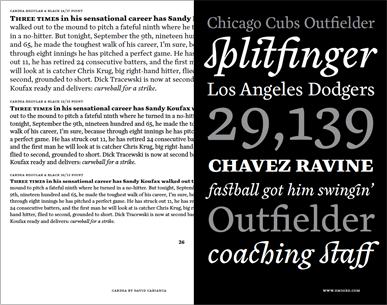
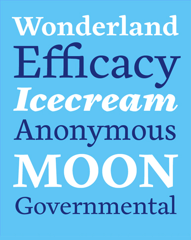
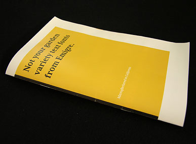
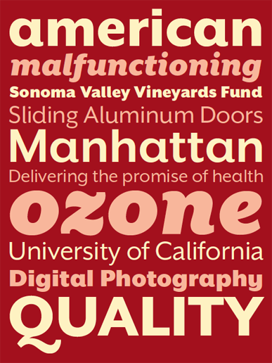
If you haven't received our most recent catalog, you can order one here. Not Your Garden Variety Text Fonts From Emigre is a 32-page type specimen featuring Emigre's best selling text fonts. While flaunting unique details, the fonts displayed in this catalog should not be mistaken for just a bunch of pretty faces. They are proven workhorses that can handle most typographic challenges encountered in setting lengthy and complex texts.
Recent Interviews with Emigre's Founders
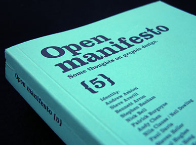
We have posted a number of interviews on our website that have been published during the past few years. They include an in depth interview with Zuzana Licko for the French graphic design magazine Etapes, and two interviews with Rudy VanderLans; one that focusses on the production of the Emigre book published in the German design magazine Page, and an interview conducted by Kevin Finn for the alternative Australian design journal Open Manifesto.
Holiday delivery
For delivery by December 23rd, place your express order by December 19th. Holiday delivery is guaranteed only for express orders within the U.S.
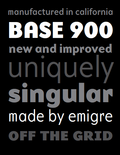
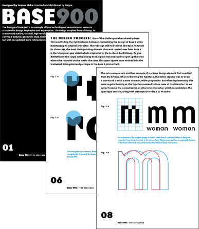
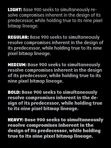
Base 900 Sans Font Release 09.14.2010
Introducing Base 900 Sans by Zuzana Licko
The Base 900 family is a high fidelity adaptation of the Base 9 design, a comprehensive family of screen fonts with companion printer fonts designed in 1994. Base 900 seeks to simultaneously resolve compromises inherent in the design of its predecessor, while holding true to its nine pixel bitmap lineage. The resulting Base 900 fonts still convey a modular, geometric style, reminiscent of the early computer technology era, but with an updated, more refined look made possible by a high resolution grid.
One of the challenges when drawing Base 900 was finding the right balance between normalizing the design of the original Base 9 while maintaining its unique character. The redesign still had to look like Base. Improvements were made to glyph outlines, spacing, and kerning, and three extra weights were added. But close attention was paid not to situate Base 900 in the overcrowded stylistic neighborhood of too many sans serif fonts that aspire to look "neutral." Subverting legibility in favor of a more unique visual quality would make some type purists cringe. But others, who feel that type should impart more than just legibility, will enjoy the undeniable singularity of Base 900.
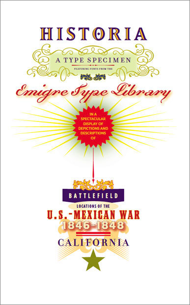
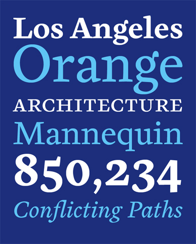
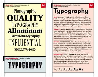
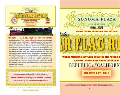
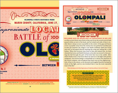
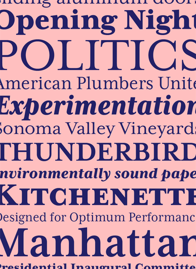
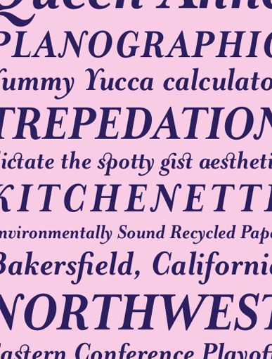
Historia Type Specimen 07.05.2010
The pairing and combining of different typefaces has always been a particular graphic design challenge. Lately, it has received much attention from a number of type foundries who offer constructive rules and suggestions on their web sites. It's also a recurring topic on type blogs where font afficionados often vent their usually contradictory opinions on the topic.
Emigre has its own take on this typographic technique. But instead of providing rules, which often render safe but bland results, we believe that ultimately any font can be successfully combined with any other font. It's not so much a matter of which font combinations to pick, it's a matter of how you use the fonts in combination. Size, color, tracking, contrast, layout and overall purpose determine how fonts can be combined successfully. It is to this end that we have published a new type specimen highlighting Emigre Fonts mixed and paired in a multitude of creative combinations.
Order a copy of this 64-page type specimen for only $3.00 ($10 outside U.S) and receive an additional five type specimens including the Mrs Eaves, Mr Eaves, Matrix II, and Vista catalogs.
View sample images from the Historia catalog with interactive links to typeface details.
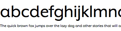
Mr Eaves XL Sans Font Release 01.27.2010
Introducing Mr Eaves XL Sans by Zuzana Licko
This XL version of Mr Eaves completes the fourth quadrant of the Mrs and Mr Eaves families.
Mr Eaves XL Sans features a larger x-height than Mr Eaves Sans with shorter ascenders and descenders and overall tighter spacing. Mr Eaves XL allows for a wide variety of uses and is perfectly suitable for lengthy text settings. The larger x-height also maintains superior readability at smaller point sizes.
The matching Modern family provides an overall less humanistic look, with simpler and more geometric-looking shapes, most noticeably in the squared-off terminals and symmetric lower case counters. This family has moved furthest from its roots, yet still contains some of Mrs Eaves’ DNA. The Modern Italic is free of tails, and overall the Modern exhibits more repetition of forms, projecting a cleaner look.
Mr Eaves XL Sans and XL Modern feature four weights with accompanying italics, small caps and alternate characters.
View, order, and read more information about the Mr Eaves XL Sans family here: https://www.emigre.com/Fonts/Mr-Eaves-XL-Sans-and-Modern
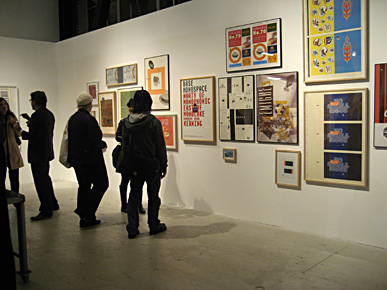
Emigre Cover Stories + Exhibit Closing Jan 30 01.21.2010
Emigre Cover Stories is a series of 10 digital collages created specifically for the 2010 exhibit Emigre at Gallery 16 celebrating Emigre's 25th anniversary. These digital pigment prints, measuring 34 x 46, are signed and numbered and printed in editions of 10 each. The prints are available exclusively through Gallery 16.
|
Emigre at Gallery 16
Last chance to catch the Emigre exhibit at Gallery 16, through January 30th, 2010.
Here's an excerpt from a review published in ArtForum:
"The show offers a nonchronological history arranged salon-style, an idea enhanced by a 2009 series of large digital prints composed of remixed elements from past projects. These new pieces reveal the suppleness of VanderLans and Licko's vision [...] Also included are pieces rooted in art and craft dialogues a series of hypnotic, pattern-intensive abstractions composed of typeface fragments, Licko's pottery, and VanderLans's New Topographics-style color photographs of dusty western landscapes. These may not feel game changing, but they affirm that the Emigres are still playing." - Glen Helfand
Gallery 16, 501 3rd Street, San Francisco, California, 94107
Monday - Friday, 10am - 5pm. Saturday 11am - 5pm.
Priori Acute Font Release 01.18.2010
Introducing Priori Acute by Jonathan BarnbrookPriori Acute is the latest addition to the Priori family. It is the result of a series of experiments into three-dimensional letter form design inspired by 19th Century display and artistic printing types. However, instead of simply adding drop shadows or fake relief to create the illusion of depth, the designers at Jonathan Barnbrook's studio took their cue from such diverse sources as the angles on the Stealth bomber and the visual conceit in the work of the Dutch graphic artist M.C. Escher.
The resulting forms are a playful exhibit of incongruous perspectives and twisting shapes that fold into themselves tricking the eye to shift the plane. At first glance and at small sizes the effect is subtle and the original letter forms themselves remain intact, retaining the history of British early 20th century typography, which was an inspiration for the original Priori family. But when blown up, the individual Priori Acute characters become beautifully animated and work well in selective situations such as initial caps, short headlines or logo design.

As a bonus, the Priori Acute font includes a collection of ornamental elements that can be combined into unlimited mesmerizing patterns.
Available in Macintosh, Windows or OpenType formats.
View, order, and read more information about the Priori Acute family here: http://www.emigre.com/Fonts/Priori-Acute
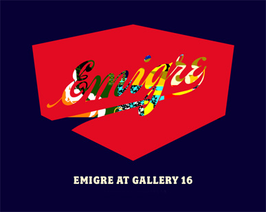
Emigre at Gallery 16 12.12.2009
The design work of Emigre will be on display at San Francisco's Gallery 16 from December 18, 2009 through January 30, 2010.
The exhibit, which coincides with the recent publication of Emigre No.70: The Look Back Issue (Gingko Press), features a selection of work spanning the entire Emigre enterprise, including a collection of press sheets of Emigre magazine covers, promotional posters for Emigre Music and Emigre Fonts, as well as books, prints, photographs, and much more. A series of six specially designed large-sized digital prints to celebrate Emigre's longstanding relationship with Gallery 16 will also be on view.
Emigre No.70: The Look Back Issue will be on sale and the authors will be available to sign copies during the opening reception.
December 18, 2009 - January 30, 2010
Gallery 16, 501 3rd Street, San Francisco, California.
Opening reception and book signing December 18th, 6-9 pm.
Emigre magazine is in the permanent design collections of the San Francisco Museum of Modern Art, the Museum of Modern Art in New York, the Cooper-Hewitt National Design Museum in New York, and the Denver Art Museum. Issues of Emigre magazine have recently been on display at the Centre Pompidou in Paris, the Museum of Modern Art in New York, and the Berardo Museum in Lisbon.
 Ceramic vases
A brand new offering of handmade ceramics by Zuzana Licko is now available. These one-of-a-kind vases, sake cups and bowls feature an assortment of colorful glazes applied to various shades of stoneware. Heights range from 2.5 to 11 inches.
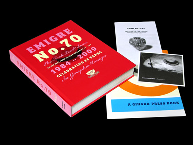
Emigre No. 70: The Look Back Issue
Selections from Emigre magazine #1 - #69
This 512-page book, designed and edited by Emigre co-founder and designer Rudy VanderLans, is a selection of reprints that traces Emigre's development from its early bitmap design days in the mid 1980s through to the experimental layouts that defined the so-called "Legibility Wars" of the late 1990s, to the critical design writing of the early 2000s. Featuring interviews with, among others, The Designers Republic, Allen Hori, Rick Valicenti, Vaughan Oliver, Mr. Keedy, Ed Fella, and essays by Lorraine Wild, Anne Burdick, Zuzana Licko, Kenneth FitzGerald, Andrew Blauvelt, Kalle Lasn, Rick Poynor and many more.
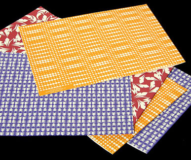
Order the Emigre book now, and receive a FREE set of the Puzzler Wrapping Papers (shown below) to turn this purchase into the perfect holiday gift for your designer friend. (Offer expires Dec 18, 2009.)
Emigre at Gallery 16
The design work of Emigre will be on display at San Francisco's Gallery 16 from December 18, 2009 through January 30, 2010.
The exhibit, which coincides with the recent publication of Emigre No.70: The Look Back Issue, features a selection of work spanning the entire Emigre enterprise, including a collection of press sheets of Emigre magazine covers, promotional posters for Emigre Music and Emigre Fonts, as well as books, prints, photographs, and much more. A series of six specially designed large-sized digital prints to celebrate Emigre's longstanding relationship with Gallery 16 will also be on view.
Emigre No.70: The Look Back Issue will be on sale and the authors will be available to sign copies during the opening reception.
December 18, 2009 - January 30, 2010
Gallery 16, 501 3rd Street, San Francisco, California.
Opening reception and book signing December 18th, 6-9 pm.
Holiday delivery
Emigre's standard shipping is UPS ground. For delivery by December 23rd, place your express order by December 18th. Holiday delivery is guaranteed only for express orders within the U.S.
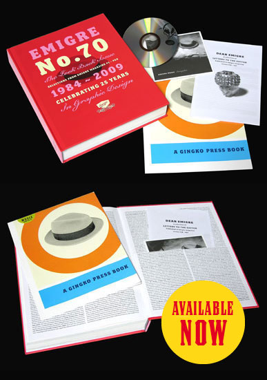
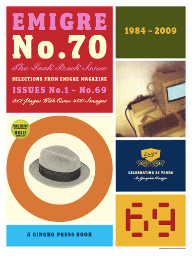
Emigre No. 70 - The Look Back Issue 10.29.2009
Selections from Emigre Magazine #1 - #69
It's here!
Finally, after years of planning, research, negotiations, editing, design and production, printed copies of the Emigre No.70 book have arrived at our warehouse.
This 512-page book, designed and edited by Emigre co-founder and designer Rudy VanderLans, is a selection of reprints that traces Emigre's development from its early bitmap design days in the mid 1980s through to the experimental layouts that defined the so-called "Legibility Wars" of the late 1990s, to the critical design writing of the early 2000s. Featuring interviews with, among others, The Designers Republic, Allen Hori, Rick Valicenti, Vaughan Oliver, Mr. Keedy, Ed Fella, and essays by Lorraine Wild, Anne Burdick, Zuzana Licko, Kenneth FitzGerald, Andrew Blauvelt, Kalle Lasn, Rick Poynor and many more.
The book also includes the following bonus material:
32-Page booklet of Letters to the Editor
CD with select audio tracks and video
15" x 20" Commemorative poster (see image below)
Attention collectors: A limited number of 200 copies of the first edition of the Emigre book will be signed and numbered by Emigre founders Rudy VanderLans and Zuzana Licko. These limited edition copies are sold on a first come first serve basis and are sold only on the Emigre website.
Regular edition: $49.95
Signed and numbered edition: $60.00
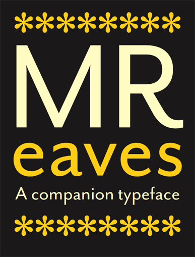
Mr Eaves Sans Font Release 10.19.2009
Introducing Mr Eaves Sans and Mr Eaves Modern
Mr Eaves is the often requested and finally finished sans-serif companion to Mrs Eaves, one of Emigre's classic typeface designs. Created by Zuzana Licko, this latest addition to the Emigre Type Library expands the versatility of the original Mrs Eaves with two complementary families: Mr Eaves Sans and Mr Eaves Modern.
Mr Eaves was based on the proportions of Mrs Eaves, but Licko took some liberty with its design. One of the main concerns was to avoid creating a typeface that looked like it simply had its serifs cut off. And while it matches Mrs Eaves in weight, color, and armature, Mr Eaves stands as its own typeface with many unique characteristics.
Stay tuned for the XL version of Mr Eaves Sans and Modern to accompany the Mrs Eaves XL Serif fonts.
View, order, and read more information about the Mr Eaves family here: https://www.emigre.com/Fonts/Mr-Eaves-Sans-and-Modern
Mr Eaves Sans Regular
Mr Eaves Sans Regular Italic
Mr Eaves Sans Bold
Mr Eaves Sans Bold Italic
Mr Eaves Sans Heavy
Mr Eaves Sans Heavy Italic
Mr Eaves Modern Regular
Mr Eaves Modern Regular Italic
Mr Eaves Modern Bold
Mr Eaves Modern Bold Italic
Mr Eaves Modern Heavy
Mr Eaves Modern Heavy Italic
Our Favorite Typefaces at Work 08.19.2009
For this edition of Emigre News, we are highlighting a selection of Emigre fonts that are our personal favorites. And there’s no better way to illustrate how we like to put these fonts to work than in our own books. Purchase $150 of fonts or more, and we will send you a free copy of one of these books! (U.S. only.)
Filosofia used in Emigre #65
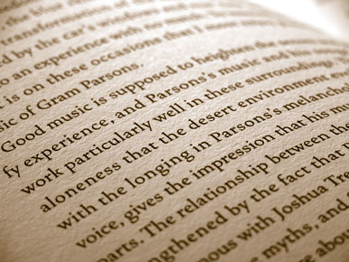
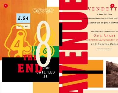
Vendetta used in Joshua Tree
Mrs Eaves used in Emigre #64
Fairplex used in Emigre #64
Coming November 2009
Emigre #70: The Look Back Issue
Selections from Emigre magazine #1 - #69
Published by Gingko Press
This 512-page book, designed and edited by Emigre co-founder and designer Rudy VanderLans, is a selection of reprints that traces Emigre’s development from its early bitmap design days in the mid 1980s through to the experimental layouts that defined the so-called “Legibility Wars”of the late 1990s, to the critical design writing of the early 2000s. Featuring interviews with, among others, The Designers Republic, Allen Hori, Rick Valicenti, Vaughan Oliver, Mr. Keedy, Ed Fella, and essays by Lorraine Wild, Anne Burdick, Zuzana Licko, Kenneth FitzGerald, Andrew Blauvelt, Kalle Lasn, Rick Poynor and many more.
Mrs Eaves XL Font Release 03.25.2009
This latest release from Zuzana Licko expands the popular Mrs Eaves family with the "XL" series, a space economic variant in 3 weights of regular and narrow with accompanying italics and small caps.
Read about the development of the Mrs Eaves XL fonts here:
Mrs Eaves XL Design Information
View and order all Mrs Eaves XL fonts here:
https://www.emigre.com/Fonts/Mrs-Eaves-XL-Serif-and-Narrow
Available in Macintosh, Windows or OpenType formats.
The Mrs Eaves XL OpenType fonts include the following features:
Small Caps, All Small Caps, Alternates, Proportional Old Style Numbers, Proportional Lining Numbers, Tabular Old Style Numbers, Tabular Lining Numbers, Superior Numbers and Scientific Inferior Numbers, Numerator and Denominator and Arbitrary Fractions.
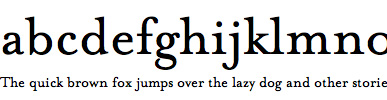
Mrs Eaves Bold Italic Font Release 11.11.2008
Mrs Eaves Bold Italic Addition by Zuzana Licko
Emigre is proud to announce the Bold Italic addition to the Mrs Eaves family. Like the regular Italic, the Mrs Eaves Bold Italic style includes a large collection of ligatures, ranging from the common to the fanciful.
Zuzana Licko designed Mrs Eaves in 1996, as a reinterpretation of Baskerville. Now, the Bold Italic style adds even more versatility to the Mrs Eaves family.
In her rendition of this classic typeface, Licko addressed the sharp contrast, which was highly criticized in Baskerville's time. Her reduced contrast interpretation retains an overall openness and lightness, while mixing a modern drawing approach with familiar classic details, making it a highly legible design that is reminiscent of a time past.
View, order, and read more information about the Mrs Eaves family here: https://www.emigre.com/Fonts/Mrs-Eaves
Available in Macintosh, Windows or OpenType formats.
The Mrs Eaves OpenType Bold Italic font includes the following features:
Extensive Ligatures, Proportional Old Style Numbers, Proportional Lining Numbers, Tabular Old Style Numbers, Tabular Lining Numbers.
Other fonts in the Mrs Eaves OpenType family include the following features: Small Caps, Petite Caps, Extensive Ligatures, Proportional Old Style Numbers, Proportional Lining Numbers, Tabular Old Style Numbers, Tabular Lining Numbers, Superior Numbers and Scientific Inferior Numbers, Numerator and Denominator, Fractions, Arbitrary Fractions, and Ornaments.
Accessing typographic features in OpenType fonts requires an Adobe OpenType savvy application, such as InDesign 2, Photoshop 6 or Quark 8.
Free Offer & New Ceramics 10.23.2008
Pick a free Emigre book when placing an order on the Emigre web site for $150 or more.
Your choice of four books:
Joshua Tree book
Cucamonga book
Emigre #64
Emigre #65

Handmade Ceramics by Zuzana Licko
The Emigre ceramics kiln has been red hot during the past few months. Check out Zuzana Licko's new offering of handmade ceramic vases.
These one-of-a-kind vases feature an assortment of colorful glazes applied to various shades of stoneware. Heights range from 3 to 11 inches.
These unique vases fly off the shelves, so don't procrastinate and place your order now.
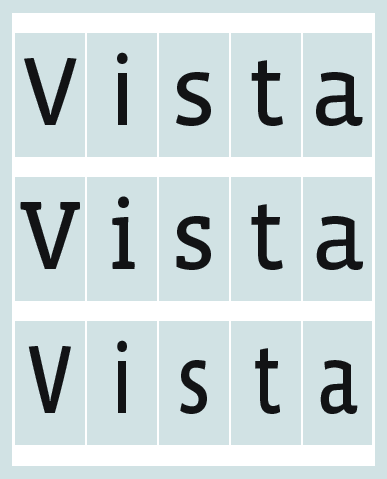
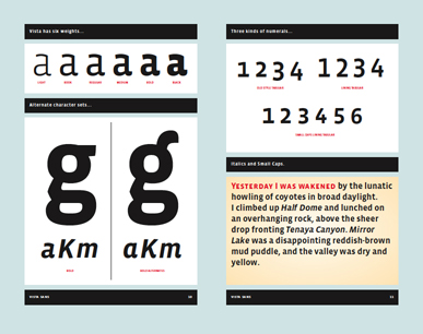
Vista: New Additions by Xavier Dupré
Emigre is proud to announce the Slab and Sans Narrow additions to the Vista family. Xavier Dupré designed Vista Sans in 2004, with the intent to create a typeface family for text and display that would combine the humanist appeal of calligraphic forms with the pragmatic simplicity of the sans. Now, the Slab and Sans Narrow additions add even more versatility to the Vista family, extending it to a total of 108 fonts.
View and order all Vista fonts here:
https://www.emigre.com/Fonts/Vista-Sans
https://www.emigre.com/Fonts/Vista-Slab
https://www.emigre.com/Fonts/Vista-Sans-Narrow
Available in Macintosh, Windows or OpenType formats.
The Vista OpenType fonts include the following features:
Small Caps, All Small Caps, Alternates, Proportional Old Style Numbers, Proportional Lining Numbers, Tabular Old Style Numbers, Tabular Lining Numbers, Superior Numbers and Scientific Inferior Numbers, Numerator and Denominator, Fractions, Arbitrary Fractions, and Ornaments. Accessing typographic features in OpenType fonts requires an Adobe OpenType savvy application, such as InDesign 2 or Adobe Photoshop 6.
Mason OpenType Font Release + Ceramics 04.01.2008
Jonathan Barnbrook's popular Mason fonts are now available in OpenType format.
The Mason OpenType fonts include the following features:
Alternates, Small Caps, All Small Caps, Proportional Lining Numbers, Superior Numbers and Scientific Inferior Numbers, Numerator and Denominator, and Arbitrary Fractions.
The OpenType format incorporates typographic features such as small caps, ligatures, old style numerals and lining numerals, all within one font file, thereby simplifying font management and usage. Do note that accessing these requires an application which supports OpenType typographic features such as Adobe InDesign 2 or Adobe Photoshop 6. OpenType font files are also cross-platform compatible; they work on both Macintosh and Windows platforms.
Upgrades
Registered customers may upgrade to the OpenType format for 50% of the OpenType price.
To order an upgrade, please contact sales@emigre.com
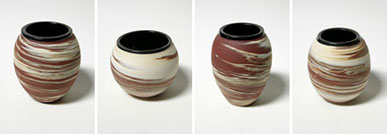
Handmade Ceramics by Zuzana Licko
A new offering of ceramic vases is now available.
This collection includes an assortment of swirled stoneware clays.
Heights range from 3 to 11 inches.
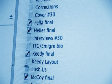
Reading Emigre Online 01.22.2008
In recent months we have been posting select essays and interviews from past issues of Emigre magazine on our website. As Emigre back issues sell out we plan to continue posting their content and making it publicly available.
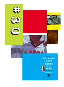
We have just posted the main content of Emigre #30 ("Fallout"). This milestone issue from 1994 was a response to the (in)famous "Ugly" essay written by Steven Heller for Eye magazine. For those of you who missed the typographic debates of the 90s, or for those nostalgic for those turbulent times in design, these interviews are not to be missed as they define a historical moment in graphic design.
Conducted by Michael Dooley, Emigre #30 included interviews with Steven Heller, Mr. Keedy, Edward Fella and Cranbrook student David Shields, one of the designers of Output, the linchpin publication that inspired Heller to write the "Ugly" essay.
Also newly posted is an in depth interview with British design critic Rick Poynor conducted by Mr. Keedy in 1995 for Emigre #33.
Free Puzzler Wrapping Paper Set 12.04.2007
All orders over $6 shipped in December will receive a free set of the Puzzler Wrapping Paper. (Offer excludes font download orders.)
For gift ideas please visit our Art and Design section. A new offering of handmade ceramic vases by Zuzana Licko was just added. And be sure to check out the limited edition photo prints by Rudy VanderLans, as well as the T-Shirts , posters, photo books and the much sought after and highly collectable Emigre magazine back issues.
Holiday Delivery
For delivery by Dec. 21st, place your US express orders by Dec. 16th. Holiday delivery is guaranteed only for express orders within the US.
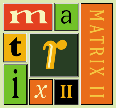
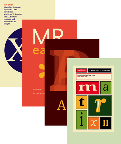
Matrix II OpenType Font Release 08.28.2007
Matrix II A redesign by Zuzana Licko
Matrix II is a complete reworking of the Matrix type family which was originally designed by Zuzana Licko in 1985. The redesign, which started in January 2007, was initiated by the need to create an OpenType version of Matrix. With the hood open, so to speak, Licko used the opportunity to make subtle changes and to fine tune many of the existing characters which were designed some 20 years ago. The contrast between thick and thin strokes was decreased in some instances, and overshoots were corrected. The width of various characters was adjusted and regularized. The cross stroke on the f was simplified on most weights. The design of the lower case g was revisited and an alternate single story version was designed and added to the OpenType version. Seven new fonts were also added to the family: a Semi Narrow, Semi Wide, Semi Tall, Inline Italic, and 3 weights of Italic - a less flamboyant version of Matrix Script. To clearly set this version apart from the original Matrix, and to avoid conflict with previous versions, its name was amended to Matrix II.
To read the full story behind the design and redesign of Matrix, please visit our website: http://www.emigre.com/EFfeature.php?di=105
View and order all Matrix II fonts here:
http://www.emigre.com/Fonts/Matrix-II
Available in Macintosh, Windows or OpenType formats.
Registered customers may upgrade their Matrix fonts to the corresponding Matrix II or OpenType format for 50% of the Matrix II or OpenType price. To order an upgrade, please complete this form.
The Matrix II OpenType fonts include the following features:
Small Caps, All Small Caps, Proportional Old Style Numbers, Proportional Lining Numbers, Tabular Old Style Numbers, Tabular Lining Numbers, Superior Numbers and Scientific Inferior Numbers, Numerator and Denominator, Fractions and Arbitrary Fractions, Ornaments.
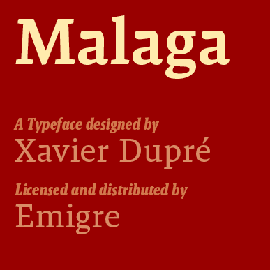
Malaga Font Release 06.01.2007
Malaga is the latest release from French type designer Xavier Dupré . It consists of 32 matching serif types in four weights of Regular and Narrow, with accompanying italics and small caps.
View and order all Malaga fonts here:
https://www.emigre.com/Fonts/Malaga
Available in Macintosh, Windows or OpenType formats.
The Malaga OpenType fonts include the following features:
Small Caps, All Small Caps, Proportional Old Style Numbers, Proportional Lining Numbers, Tabular Old Style Numbers, Tabular Lining Numbers, Superior Numbers and Scientific Inferior Numbers, Numerator and Denominator, Fractions and Arbitrary Fractions, Ornaments.
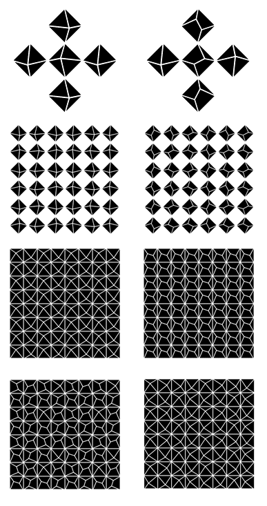
Puzzler Prints Exhibit 03.06.2007
Limited Edition Digital C prints by Zuzana Licko
On Exhibit: March 13 - May 11, 2007
Opening: Wednesday, March 21, 6-8pm
North Berkeley Frame & Gallery
1744 Shattuck Avenue, Berkeley CA 94709
(Between Francisco and Virginia Streets)
510-549-0428
Gallery Hours: Tuesday-Friday 10-5:30 Saturday 10-4:30
With Puzzler, Zuzana Licko revisits and expands upon some of her earlier forays into decoration and geometric constructions of abstract elements.
Licko created the Puzzler elements in digital font format, which she then used for composing these images. These C prints were printed with the Durst Lamda digital laser imager, each in a limited edition of 50.
View all of The Puzzler Prints here:
https://www.emigre.com/PastProjects#id102