Zuzana Licko Answers Frequently Asked Questions
Compiled in 2000.
FAQ: In 25 words or less, What is a typeface?
ZL: A typeface is the ornamental manifestation of the alphabet. If the alphabet conveys words, a typeface conveys their tone, style, and attitude.
FAQ: How did you start your career in typeface design?
ZL: My formal education was in graphic design, during which time I marveled at typefaces. I realized the power that typefaces have on a typographic piece of design; how picking the appropriate typeface has a tremendous effect on the resulting typography. Take a logo for example, often times the design of a few alphabetic characters will constitute the entire logo design.
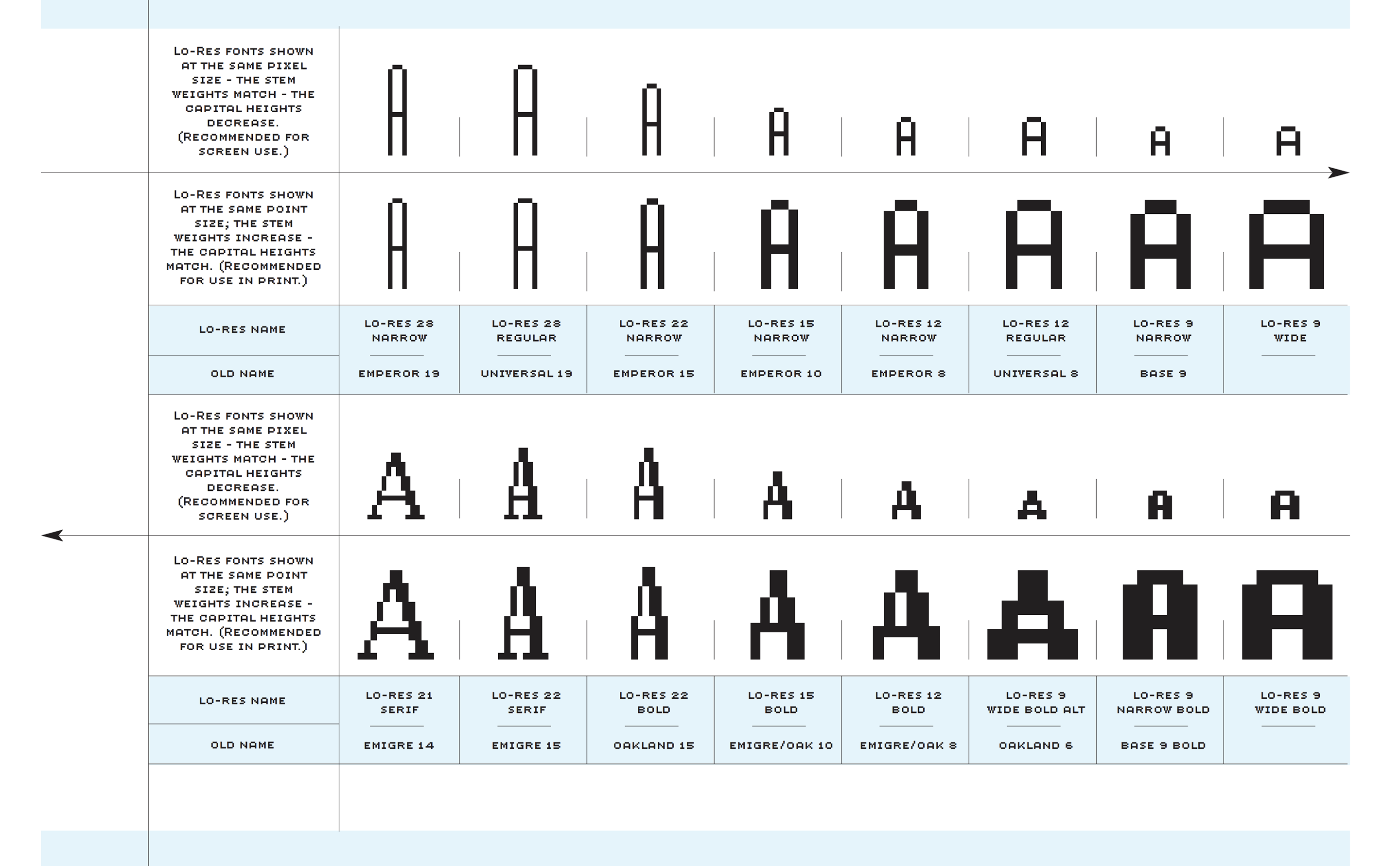
But the process of designing typefaces remained a mystery to me until I got my hands on a Macintosh computer in 1984. Of course, back then the technology was very primitive, and easy to grasp. And, as it turns out, bitmap fonts were the perfect place for me to start learning about type design because I love the building block approach. From then on, my experience and skill with ever more sophisticated typeface designs evolved along with the Macintosh’s ability to produce more complex font programs.
FAQ: How did the Emigre Fonts foundry begin?
ZL: Prior to the Macintosh computer, the design of typefaces had existed for centuries as an exclusive discipline reserved for specialists, who had access to proprietary tools. Today the personal computer provides the opportunity to create custom type designs with an increased potential for personalization and expression. When we began using the Macintosh computer, my husband, Rudy VanderLans had recently started publishing Emigre magazine. Our design of custom fonts for Emigre magazine grew out of our need for unique and more effective fonts than those originally available for the Macintosh in 1984. As graphic designers, we also enjoyed the new found ability to test and implement the faces directly within our design work.
My first Emigre font designs were in the form of bitmap fonts for use on dot matrix printers.
FAQ: Prior to the existence of the Macintosh and PostScript (and Emigre fonts), were there any particular typefaces you preferred to use in your graphic design?
ZL: I do remember enjoying working with Helvetica, Futura and Bodoni in those days, but the Macintosh computer came onto the market the year that I graduated from college. So my pre-Macintosh work was very short-lived, at least as far as type is concerned. While I do remember doing manual paste-up for many years, during the time that page makeup programs evolved into today’s prepress quality, type design and typesetting were the first tasks for which I used my Macintosh.
FAQ: How do you get ideas for new typeface designs?
ZL: Most of my inspiration comes from the particular medium that I’m involved with at the time. I search out a problem that needs to be addressed or a unique result that a production method can yield.
My interest in making type was initiated by my need for legible and visually interesting bitmaps for the early Macintosh computer screen and dot matrix printer.
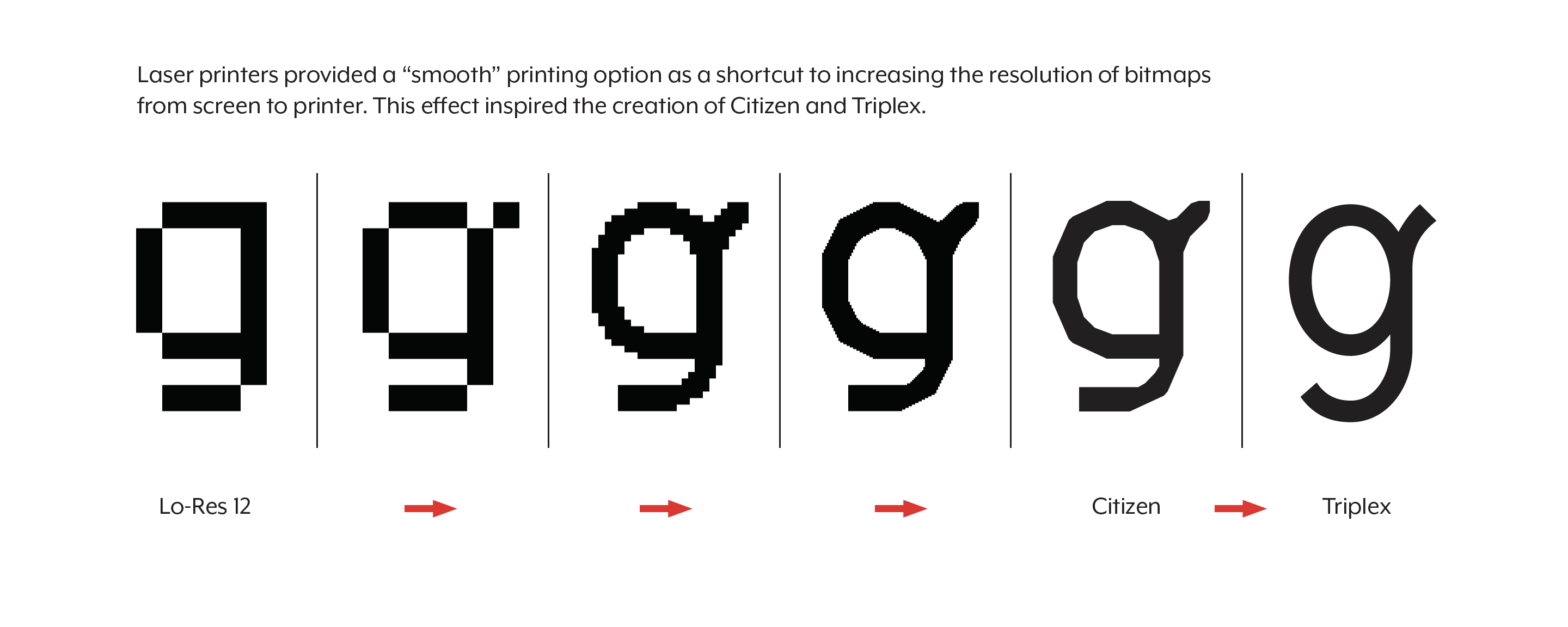
After the introduction of high resolution PostScript outline technology, I developed several high resolution designs based upon my earlier bitmaps. These include the Modula, Matrix, Narly, Citizen and Triplex designs. (Read more details about these early designs in the Digital Fonts Type Specimen pdf booklet.)
Recently I have revisited some of these early bitmap ideas with my Base 9 and Base 12 font designs. The Base families offered compatible screen and printer fonts to solve the dual need of early low resolution screen display and high resolution printing with an integrated typeface design.
After those initial experiments, my interest in creating somewhat more traditional text faces was a result of Emigre magazine’s increased publishing of in-depth articles, which require fonts appropriate for lengthy text setting. My Baskerville revival, named Mrs Eaves, presented me with the opportunity to design some fanciful ligatures which help create visual interest and are reminiscent of customized lettering.
FAQ: How do you judge the validity of a new or experimental typeface design?
ZL: Design is about creating something new each time we approach a problem, even if it’s the same problem. Over time, different solutions are required to address the same design problem because the context changes over time and results in shifting of meaning. Thus, the “same old solution” tends to become boring over time and leads the audience to lose interest.
In addition, new technologies and environments arise to present new problems for the designer to address. The most successful experimental typeface designs are often those that address the new needs of a new, yet unchartered technology.
FAQ: What is your opinion about “cut & paste” or modified fonts?
ZL: The cut & paste phenomenon of font generation has become very popular, mainly because it’s a new found toy. Fonts have become popular because suddenly everybody has the capability of installing a custom selection of fonts on their personal computer. With this same computer anyone who chooses to can also install a font making program, and this has resulted in an increased interest in the making of fonts as well. The fact is, however, that most never get beyond tinkering with existing fonts because the design and manufacture of an original typeface is an incredible amount of work, which requires quite a bit of devotion to master. Of course, there is nothing wrong with experimentation and the customizing of fonts for private use, as long as the user has acquired a legal copy of the font they are experimenting with. The problem comes about when such products are distributed without compensation to, and without proper credit to their originators. Improper proliferation of these fonts serves to confuse the already obscure history of type.
Since type design has been a very exclusive field until recently, there is little information available as compared to other design disciplines. Often, people tend to forget that typefaces are in fact designed, and not merely static forms handed down from generation to generation. One of the frustrations is that credits for typefaces are usually missing from design pieces. Although a design project usually credits the work of the graphic designers, art directors, photographers, illustrators and even printers, seldom are the fonts or type designers mentioned, although the typeface(s) used may constitute a great portion of the resulting work.
FAQ: What impact has the personal computer, specifically the Macintosh, had on design?
ZL: The personal computer has democratized design. It has given virtually equal design opportunities to lay people and design professionals alike.
Before the personal computer, most people were limited to the typewriter as a personal means of communicating the printed word. The design limitations were similar to today’s email; one monospaced font without pictures. It is debatable, however, whether lay people are better able to communicate with today’s choices than they were with the typewriter. Although having an abundance of graphic options and font choices can increase communicative power when used effectively, if used without understanding, communication can actually be impaired as the message can drown in confusion.
Just like the ability to calculate the tangent with a calculator does not bring the user any closer to understanding the inner workings of geometry, the latest desktop publishing applications will not bring the lay person any closer to understanding the inner workings of design. But it gives the illusion of doing so.
As we go forward with ever increasing speed to faster and more powerful computing which will offer us an ever growing number of choices, it will be crucial for designers to become ever more knowledgeable about selecting the most appropriate choices from an increasing availability.
FAQ: What is the relationship between design and art?
ZL: Design is art that generally also has a specific function. It is the functional aspect, however, that has a tendency to make the art inobvious in design. Graphic design is a relatively young profession which has only recently begun to enjoy the critical analysis and documentation that art has enjoyed for ages. This recognition of design’s value and relationship to our culture is crucial to its continuing evolution. Museums are beginning to play an important role as well, by providing a forum for collections and exhibitions. For example, The National Design Museum’s recent “Mixing Messages” exhibit featured design and typography, while the San Francisco Museum of Modern Art continues its series of exhibits featuring industrial and graphic design.
FAQ: Are revivals the next trend for serious type designers?
ZL: I can’t speak for all serious type designers, but my own interest for reviving the classics was sparked by two factors; the sophistication of today’s personal computer, and the current content of Emigre magazine shifting towards more theory and text.
The original restraints that the personal computer put on type design (which made it so exciting for me in 1984) have disappeared within the standard graphic design environment. Of course they persist in low resolution environments, but the designer’s personal computer tools today have plenty of power to render a limitless variety of forms.
The other and more important factor is that my typeface designs remain closely linked to their use in Emigre magazine. Since Emigre magazine currently tends to contain more critical writing and less visual material, it was only natural to develop more text faces, and revivals were a good place to start; a means of getting back to basics.
FAQ: How do you research models for your revivals?
ZL: My research for Filosofia included studying various versions of Bodoni, from Bodoni’s original print work to recent revivals such as ITC Bodoni. However, I did not use any particular specimen as the model. Rather, I drew my Bodoni from memory, akin to the process of transcribing, while following the guideline of rough measurements to retain the basic proportions. I followed the same process for Mrs Eaves, my Baskerville revival.
There are many details in my revivals without a historical origin, such as the rounded terminals of the lower case “s,” in Filosofia, which was a design decision within the context of the rounded serifs which I chose for Filosofia. When drawing a revival, I try to question the form of each character and element according to my own sensibilities, as though I were drawing it as an original design.
FAQ: Are your font names always based on the design, or does the name ever come first? How important is the name?
ZL: Although our typeface names do refer in some way to the design, those sources vary. The name may allude to an historical reference, a technical feature, an ornamental description, etc. The naming process is different for each typeface, as individual as the typeface design itself.
FAQ: How did you arrive at the names Mrs Eaves and Filosofia for your recent classic revivals?
ZL: When we named Filosofia, we were looking for something Italian to reflect the origins of Bodoni. Filosofia is the Italian word for “philosophy,” and it has a real nice ring to it!
Mrs Eaves has a slightly longer story; it is named after Sarah Eaves, the woman who became John Baskerville’s wife. As Baskerville was setting up his printing and type business, Mrs. Eaves moved in with him as a live-in housekeeper, eventually becoming his wife after the death of her first husband, Mr. Eaves. Like the widows of Caslon and Bodoni, and the daughters of Fournier, Sarah similarly completed the printing of the unfinished volumes that John Baskerville left upon his death.
We picked the name Mrs. Eaves for this font, since that is how Sarah was often referred to in the various books documenting Baskerville’s era. In order to differentiate the trademark name of the font from the common word “Mrs.” as it appears in the dictionary, we removed the period.
FAQ: Where did the name “Hypnopaedia” come from and why did you decide to make pajamas?
ZL: The pajamas came about as an extension of the Hypnopaedia pattern font that I developed in 1997. I created each of the Hypnopaedia pattern elements by concentric rotation of a single letter form from the Emigre Fonts library. When repeated, each Hypnopaedia element creates a unique pattern of interlocking letter shapes, which can be combined into an infinite variety of patterns. These patterns, of course, lend themselves naturally to fabric prints, and sleep wear (pajamas) seemed ideal for such a hypnotic subject.
The name “Hypnopaedia” makes reference to sleep learning, or teaching through hypnosis; we chose this name because the repetition of the these elements and their formation into patterns can have a mesmorizing effect. The terms was used in Aldous Huxley’s Brave New World.
Although Emigre currently focuses on developing original typeface designs and publishing our graphic design/culture magazine, from time to time, we take the opportunity to branch out into other directions that interest us as well. Another such project for me is ceramics, which began as a distraction to the tedious aspects of typeface design work, but I’ve discovered that pottery and type design have many connections.
FAQ: What are the future trends for type?
ZL: Information is increasingly being stored, accessed and displayed in digital form. Thus, on-screen design has regained importance for multimedia CDs, electronic bulletin boards and the World Wide Web. Screen display is no longer a temporary analogy for the final printed piece; it has become the final method of viewing much of our information. This presents the challenge of addressing the coarse resolution of the common computer screen.
Meanwhile, the primary function of type remains communication and communication is becoming a basic need in our culture. In order to understand one another, human beings require an order to information; from the layout of the page to the shape of the letters, to the grammar of the text. The cut & paste “destroyed” typefaces and typography, popularized as the “grunge” movement, do not communicate much more than the image of destruction, and I believe this to be a reflection of our society’s desperation about the vast technological changes which are taking away our familiar comforts of more traditional means of communication. As efficient exchange of information becomes a requirement in tomorrow’s information age, it stands to reason that a sophisticated, highly ordered means of typographic expression will be adopted instead.


