

Keedy
Designed by Jeffery Keedy in 1989. More...
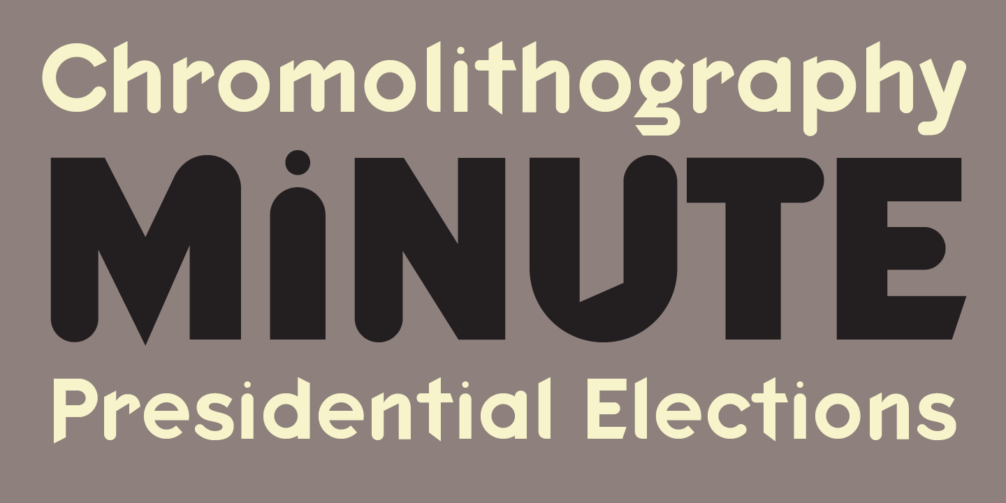
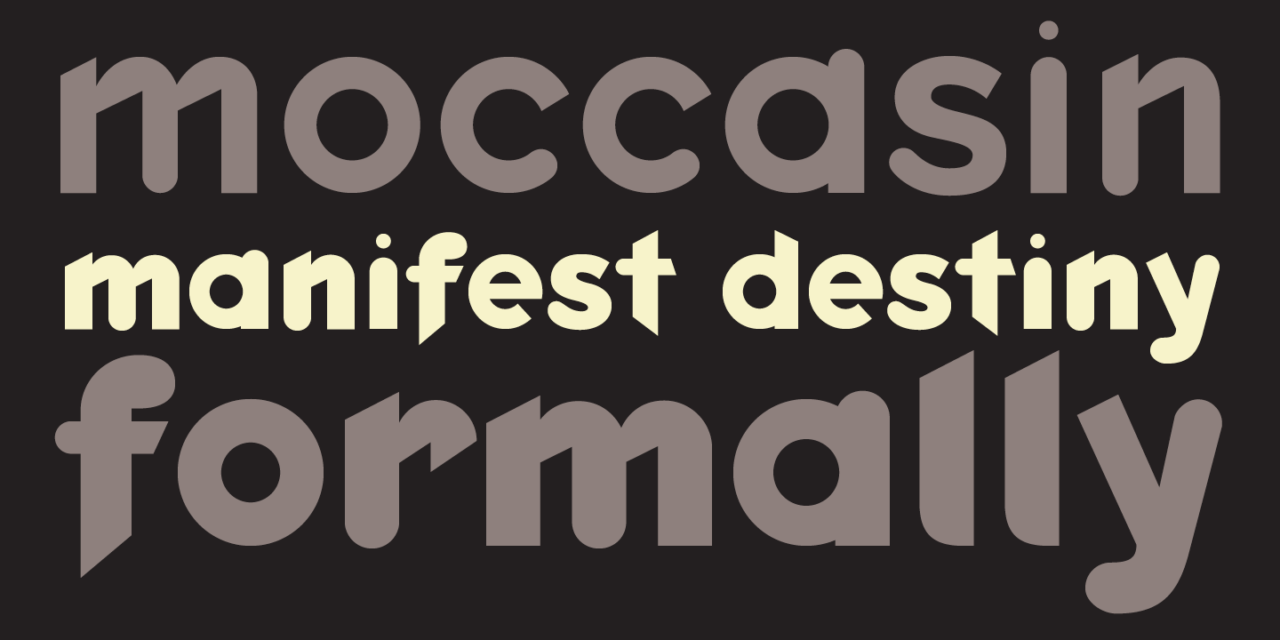
Like many graphic designers of the late 1980s and early 1990s, Keedy was eager to embrace the computer as a tool, but was frustrated by the limited selection of digital typefaces available. Keedy Sans, created in response, was used in layouts for Emigre magazine and embraced by designers everywhere.
Keedy Sans is similar in significance to another important Emigre font, P. Scott Makela’s Dead History, designed to celebrate its experimental nature with letter forms that are intentionally unfinished and incongruous. “Most typefaces are logically systematic; if you see a few letters you can pretty much guess what the rest of the font will look like. I wanted a typeface that would willfully contradict those expectations,” Keedy has said.
In 2011 Keedy Sans was one of 23 digital typefaces included in the permanent architecture and design collection of the Museum of Modern Art in New York.
For more information about Keedy, download the free type specimen.