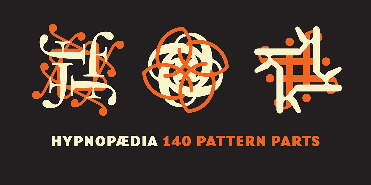
Hypnopaedia
Designed by Zuzana Licko in 1997. More...
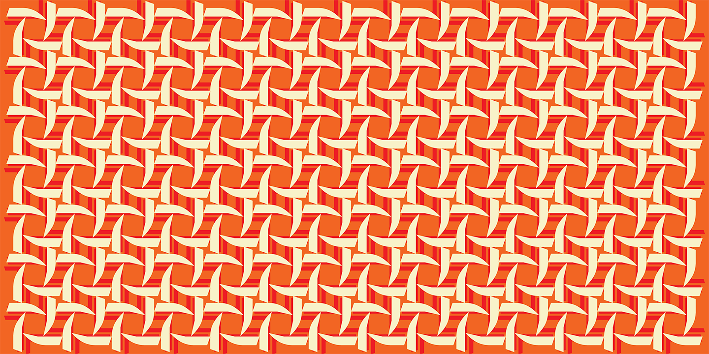
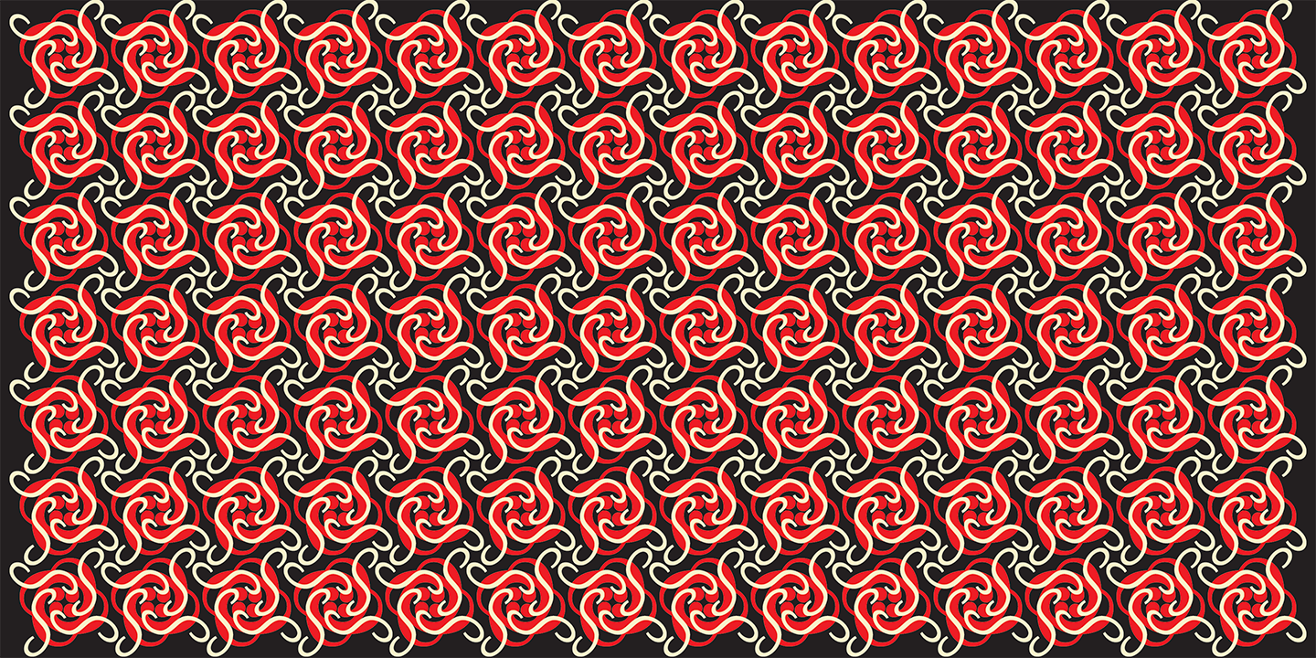
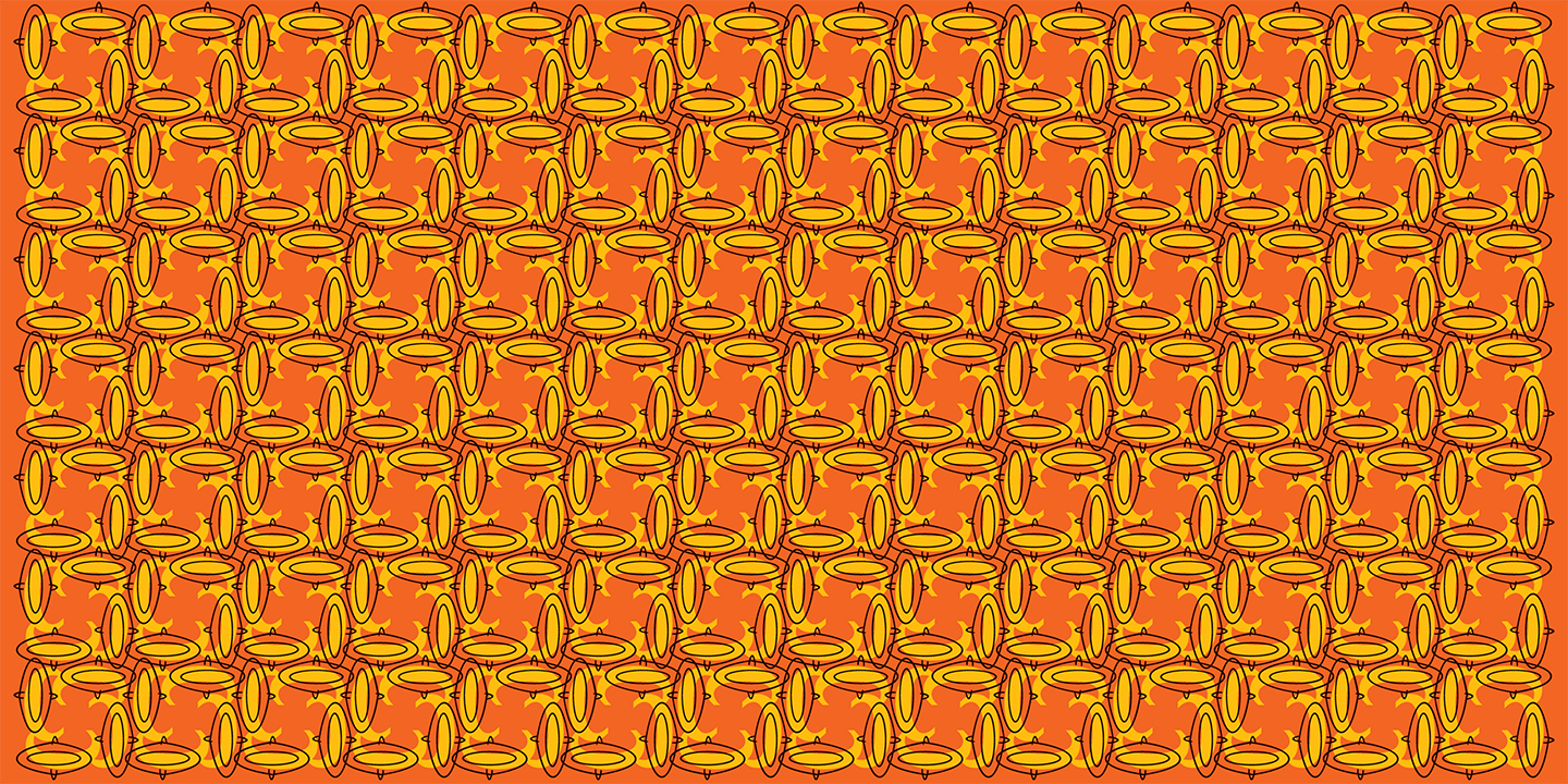
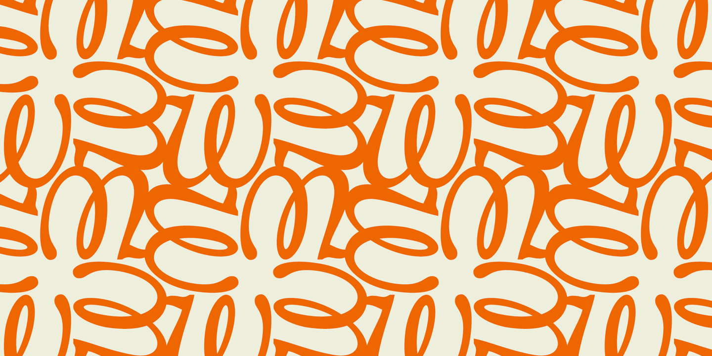
Each of the resulting Hypnopaedia pattern illustrations was created by concentric rotation of a single letter form from the Emigre Fonts library. When repeated, each Hypnopaedia illustration creates a unique pattern of interlocking letter shapes. An infinite variety of patterns can be composed by combining and alternating the basic 140 Hypnopaedia illustrations.
The catalyst behind developing the Hypnopaedia patterns was the lack of legal protection for typeface designs in the U.S. The basic idea behind this lack of protection is that a typeface’s primary function is utilitarian, and that protecting its shapes would restrict freedom of speech. This continues to be a big problem for typeface designers, and is due to the fact that people in general find it difficult to comprehend letters as abstract shapes. It is this inability to distinguish between the ornamental design of letter forms and the alphabetic characters they represent, which has resulted in the lack of U.S. copyright protection for letter form designs.* By turning letter designs into texture, the Hypnopaedia pattern illustrations allow us to make this distinction and appreciate letter shapes on a different level.
Taking letter forms out of their usual context of alphabetic word composition, illustrates that letter form designs have value as independent forms, separate and distinct from their ability to represent alphabetic characters. When applied within the context of pattern elements, the stylistic messages of letter designs are allowed to surface.
Letter forms are constructed as shapes of positive space, but of equal importance to their recognizability as representations of alphabetic characters is their enclosure of negative space as well as the white space that separates letters from one another to facilitate the recognition of words. Within the Hypnopaedia pattern elements, on the other hand, the negative spaces of the original letter forms are altered by rotation and by the positioning or interlocking of adjacent shapes.
When viewing two different letter designs of the alphabetic character “A” , people tend to focus on the similarities between the two “A” s as they both represent the character “A” . Some people might even express difficulty in distinguishing between the two “A” s altogether. Within the context of these patterns, however, it is clear that the patterns created from various “A” designs, for example, are in fact each distinct and separate in visual meaning.
* Beware that certain parts and functions of the font software are copyrightable, and that certain typefaces have design patents, trademarked names, licensing restrictions and other forms of protections.
For more information about Hypnopaedia, download the free type specimen.