Variex
Designed by Rudy VanderLans and Zuzana Licko in 1988. More...
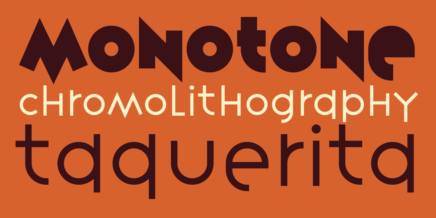
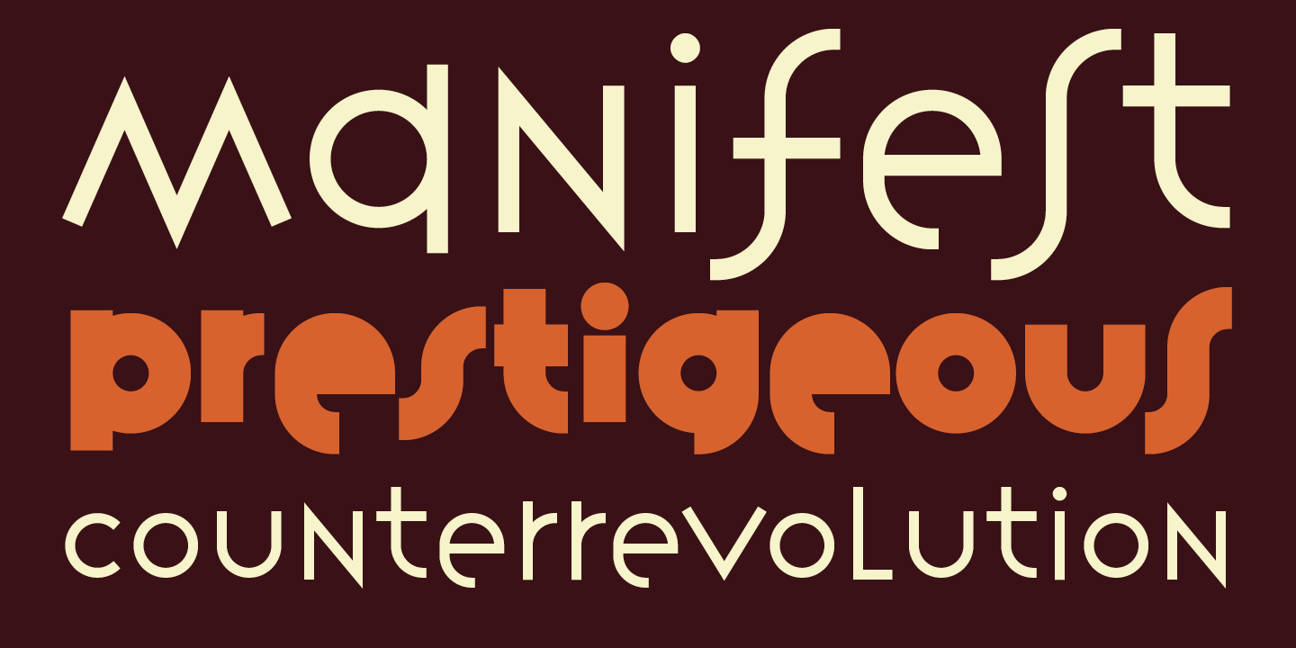
The design of Variex was a direct result of experiments with creating fonts that made efficient use of computer memory space, a serious consideration in 1988. Two separate outlines are usually needed to describe the delicate shapes of traditional letterforms. Single line “stroke” designs, on the other hand, required far fewer data points. So Licko conceived Variex as a “stroke” design, where each character is defined by a center-line of uniform weight from which the three weights were derived.
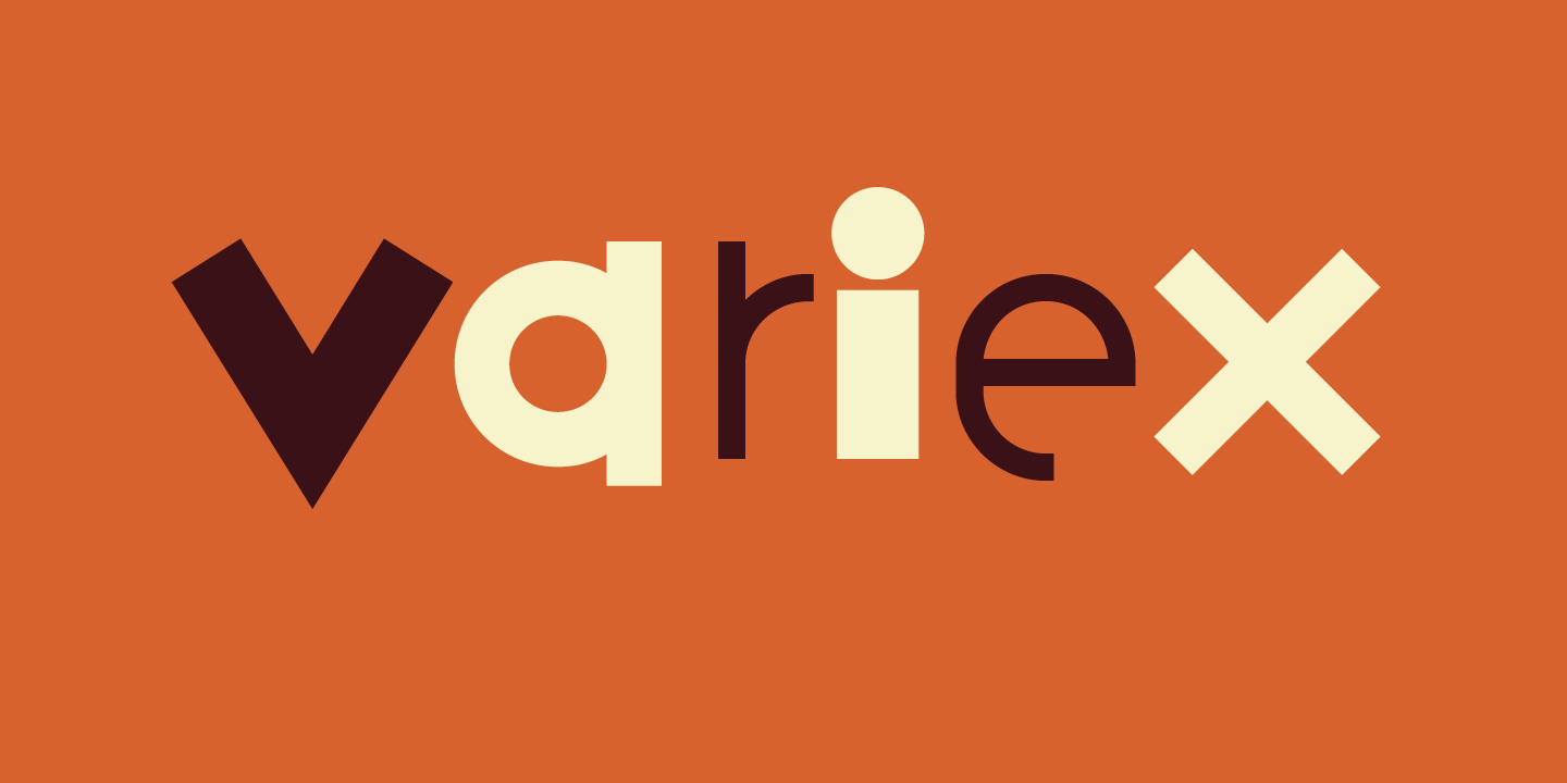
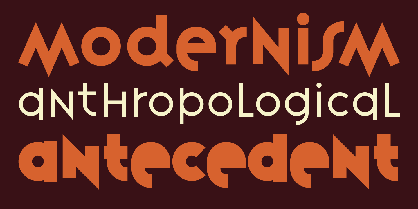
In most fonts, horizontal alignment of the x-height is sacred and is usually accomplished with a great deal of adjustments and optical corrections to the individual characters. Variex ignores this idea and emphasizes the opposite in the service of its overall concept. Varying the weight of a stroke typeface changes the thickness around the center line and thus alters the alignment of characters. Variex incorporates these variations of alignment as a distinguishing design element, making adjustments to the center lines unnecessary when changing the weight. As a result, the x-height varies among the three different weights and among the individual characters. This generates a unusual rhythm along the x-height that lends Variex its unique quality.
To further economize data, elements from capitals and lower case letters were combined into a single alphabet eliminating the redundancy of upper and lower case symbols. Although several alternative characters are provided for headline applications where optimal letter combinations are crucial.
By reducing the letterforms of Variex to their most basic alphabetic shapes, Licko has created a series of glyphs that are reminiscent of the powerful gestures of primitive writing hands. As a conceptual font Variex has limited applicability, but when properly employed it will stand out and make a lasting impression.
For more information about Variex, download the free type specimen.

