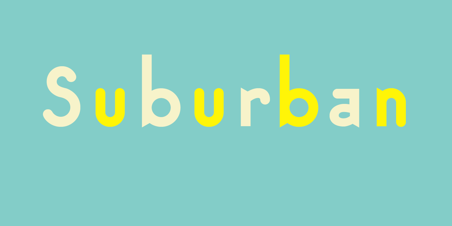
Suburban
Designed by Rudy VanderLans in 1993. More...
Suburban was VanderLans’ first attempt at the design of a complete typeface. The basic character ideas were sketched out by hand and then digitally redrawn and completed by Zuzana Licko.
Like many designers who design their first font, VanderLans’ goal was to incorporate into one design all of those components from other typefaces that the designer always admired. This lead to a cross between Futura and the vernacular scripts you might find on the jersey of your local softball team. The final typeface, therefore, is a combination of fairly rational, geometric shapes sprinkled throughout with whimsical and calligraphy-inspired letterforms.
Designing Suburban also functioned as catharsis, an opportunity that allowed VanderLans to disprove (at least to himself) some of the basic notions he had learned in art school regarding traditional type design. Suburban would be considered a “vermicelli” font, a typeface lacking the necessary visible contrast and stresses between counters and strokes and/or optical corrections to make it a useful typeface. All valid notions, if your goal is to attain the highest level of legibility, but by no means the only route to making type that communicates.
As it becomes increasingly difficult to create original typeface designs, VanderLans is proud to report that Suburban can lay claim to being the only typeface in existence today that uses an upside down lower case “l” as a “y.” Creativity knows no bounds.